
A (very) short introduction to SPSS and Excel |
SPSS (Statistical Package for the Social Sciences) is a powerful and versatile 'number crunching' programme. Once mastered, you will find this an invaluable tool when dealing with large sets of data.
However, be warned, the programme assumes that you know what you want to do! The most common problem students encounter is that they put data in,carry out an analysis and get an output without really understanding what that output is saying. They have no way of deciding whether the output is correct or not. You should check with the signpost page to decide which test(s) are most appropriate for your objectives.
Check with the Glossary if you need a definition of a term you come across.
We have used SPSS v11.5 here but v11 and v12 should run in an identical way to v11.5.
Here are the first two opening windows..
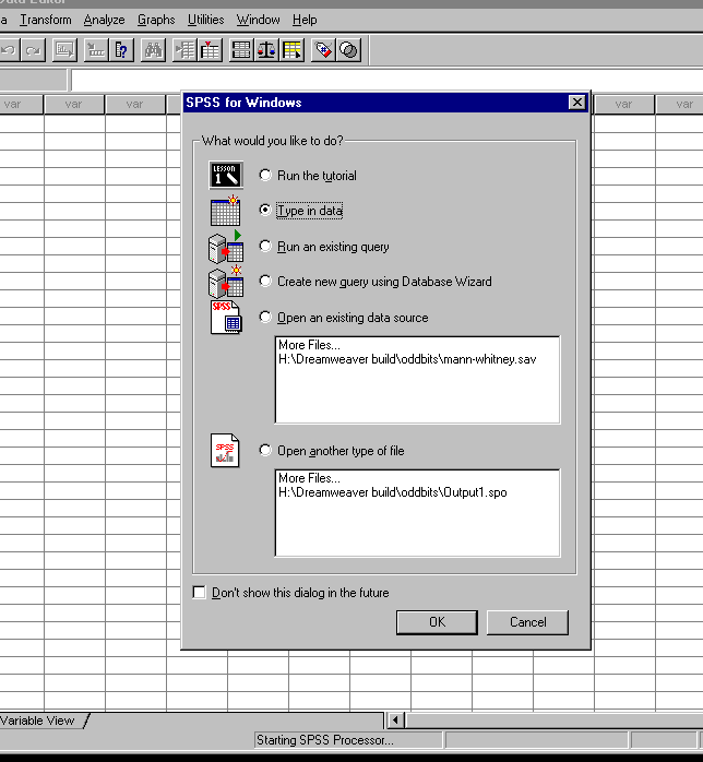
Click the 'Type in data' radio button or 'open an existing data source' if you have the data already stored. Assuming the former, you must now click on 'variable view' to start the data entry procedure...
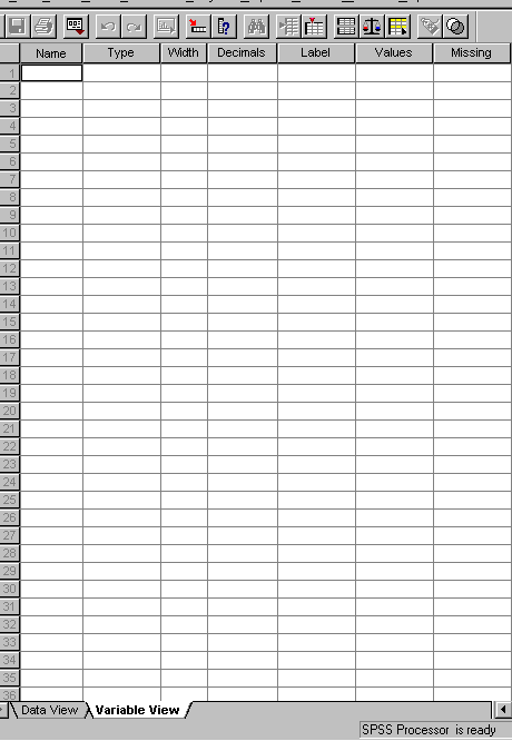
Much now depends upon what type of data you want to enter but the three most important columns will always be 'Name', 'Label' and 'Values'. 'Label' allows you to enter a more complete name for the variable than in column one. The 'Value' column allows you to assign a number to a group of results.
Supposing we were evaluating a new pension scheme and we had three groups of 20 people: Adults aged 18 but under 25, Adults aged between 25 and 50 and people aged over 50. We could assign the value of '1' to the first group, '2' to the second and '3' to the third. SPSS will then be able to distinguish between the three groups.
Note that when you enter 'Name' (i.e. the name of the variable), you are dealing with one variable at a time. When you have completed this input switch to 'Data View'.
Each
of your 'names' will be displayed horizontally and not vertically
as in 'Variable View'. Suppose we entered two variables: 'Unit Price and
Quantity... this is how they will appear in Data View and now you are ready to
enter your data.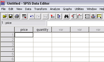
As
we go through each test, the precise 'follow on' from the point now reached will
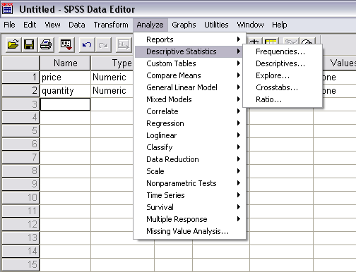
be explained. There are three drop down menus that are going to be essential to
you... Analyse, Graphs and Transform.
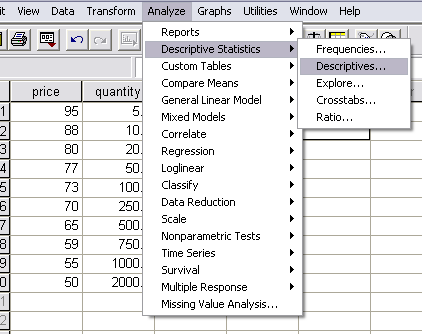
Get into the habit of starting
any analysis with a visit to 'Descriptive Statistics' ,
'Descriptives'.
Let us enter a little data to see how this works...
Now the SPSS transfer window will open and prompt you to transfer one (or both) variables over to the variables box...
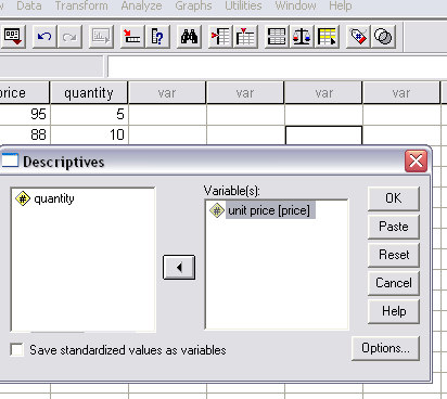
For simplicity, we have chosen to only transfer 'price'. Once you press OK, the computation will begin and the output is generated....
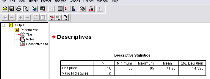
The output immediately gives us the number of entries computed (N), the maximum and minimum values entered, the mean value computed and the value of 1 Standard deviation (more of this later!)
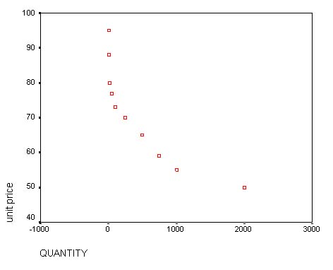
One other quick operation which is often helpful in visualising what your data is doing is to go to: 'Graphs', 'Scatter', 'Simple'.
Insert 'quantity' onto the X axis and 'unit price' onto the Y axis and click 'OK'..
So now you are ready to use SPSS for yourself.
At this stage in any analysis you should stop work, look at the charts, graphs etc and think!
What is this picture telling me about my data? Can you pick up on any relationship and if so, what might that relationship be?
The majority of datasets used in this programme are available in active form (so that you may experiment with them) by opening the SPSS data set index and selecting the one that you want.
Excel will already be familiar to most of you and so this section is simply for those who have used the 'fx' or Chart capabilities of this excellent programme.
When you open the programme a simple spreadsheet appears...
Enter the data as normal in two columns.
We can still find the mean and standard deviation just as in SPSS but it is a little less straightforward. Click open an empty cell where you would like the answer to appear. Go to 'fx' and open the drop down menu, select 'Statistics', Average...
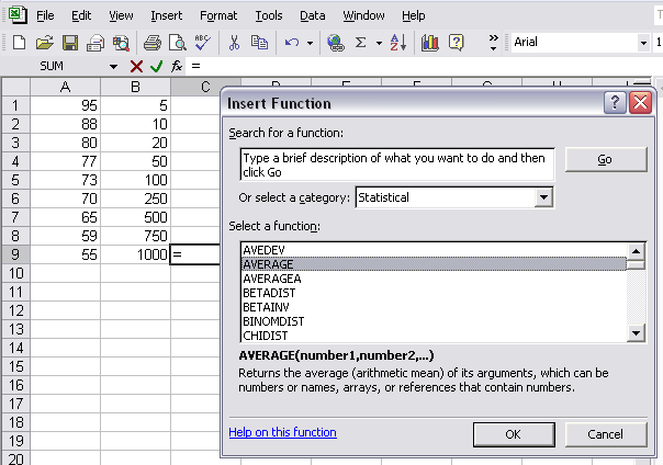
Each column will have to be done separately and again for the Standard deviation.
.....are easy to manipulate and can be easily inserted in other documents.
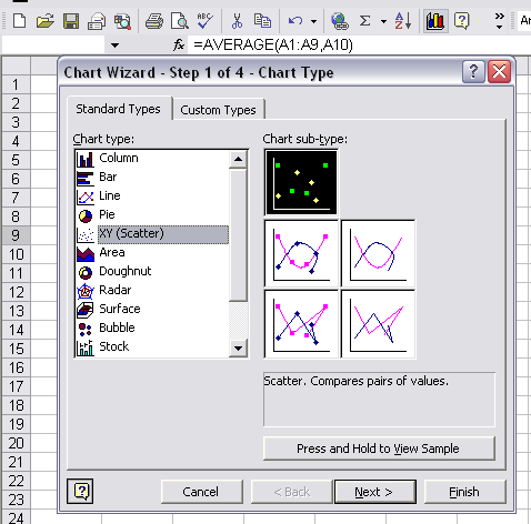
Go to the Graph icon on the menu bar and the graph Wizard will open.
Choose 'Scatter' and simply follow the on screen instructions regarding titles,gridlines etc. Keep modifying your choices until you are satisfied.
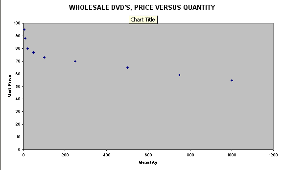
Initially, 'Press
and Hold' may be sufficient to tell you if the eventual chart is going to be of
any use to you. If it is, follow the Chart Wizard through to insert Titles, X
and Y labels etc.
Save the output as a separate chart....
Finally,'Chart
options' allows further modifications such as the insertion of lines etc.
In this instance, a logarithmic trend line has been added.....
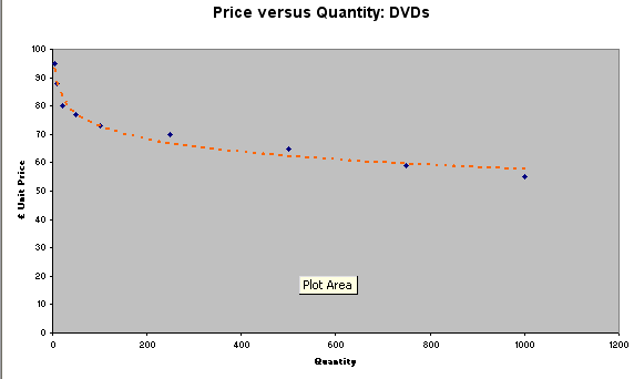
Q. Compare the two graphs produced by SPSS 11.0 and MS Excel; what do you feel are the advantages and disadvantages of each?
Most data is inter-transferable between the two programmes.
Note
that the graphics outputs provided by SPSS v12 differ considerably in appearance from those provided in SPSS v11; especially with respect to Bar Charts and Box plots. |
![]()
Back to 'Quick view' Contents page