[Focus 11]Simple, two-variable Linear RegressionA note on testing the significance of a regression line |
Regression analysis might be more accurately called 'preliminary prediction analysis'. By generating a 'line of best fit' we can use that line to find a value for the 'y' variable given a specific value for the 'x' variable. All data used must be parametric.
Two useful ways to analyse a relationship are Correlation and Regression. Correlation sets out to determine if there is a relationship between two variables and also measures the strength of any discovered relationship but regression goes one step further.
Linear regression is used to find a model (a formula for the 'line of best fit') for that relationship so that new values of one variable (y) might be predicted given a value for the other (x)...(note that it is never the other way round). The data used must be parametric and normally distributed.
The intention is to place a 'line of best fit' through the plotted points on a scattergraph. This line will have a number of interesting properties....it is always straight and the steepness of the slope (an indication of the way that one variable changes as the other changes) may suggest that the relationship is proportionally balanced or very disproportionately balanced. A line at 45 degrees would indicate equal proportionality.
Both
procedures require a scattergraph as their starting point. As with correlation
(remember: no line
is drawn though), the direction of the slope (up or down)
will indicate whether the relationship is positive (directly proportional) i.e.
as one variable increases, so does the other.... or negative ( inversely proportional)
i.e. as one variable increases, the other decreases.
We will be looking at the dependence of one variable upon the other and this in turn may indicate that a 'cause and effect' relationship exists. However, be very cautious about saying that "changes in one variable have caused changes in the other"; causation is very hard to prove.
So whereas correlation looks for an association, regression goes further and utilises any association in order to make predictions of a value in 'y' given a specific value in 'x'.
The predictor (what has actually been measured) is always placed upon the X axis and the variable upon which we wish to make value predictions is always placed upon the Y axis. Put another way; the independent variable (the error free variable) should be plotted on the X axis and the dependent variable on the Y axis. Remember also that we are always using paired data and as such, values must not become uncoupled from each other.
| What does the term "The Error Free variable on the X axis" mean? A scattergraph; with a line of best fit inserted, will show each point to be situated a determinable distance from the line. We only take account of that distance in relation to the vertical i.e. on the Y axis. We record the vertical distance from the line. The horizontal distance; the error in x, is therefore always zero. Look at the following chart.....
so the error in y (when x = 2.8) is 3.6 - 2.7 = +0.9
|
The next consideration is how to create this 'line of best fit'...it is not simply a 'by eye' exercise but has to be done mathematically. The line must pass through the mean value of 'x' and the mean value of 'y' but that is insufficient information because it would fail to tell us about the angle or slope of the line. Simply passing through the two mean values would merely give a point of rotation for the line.
We need an equation for the line that takes into account the location of all the intersecting points on the scattergraph....
y = a + bx
where....
'y' is the dependent variable,
'x' is the independent variable,
'a'
is the line's interception point on the Y axis (the regression constant)
'b'
is the regression coefficient and is a measure of the steepness of the slope.
If the line cuts the Y axis at a value for 'x' that is less than zero, then 'a' becomes negative. Furthermore, 'b' can be either positive or negative depending upon which direction the slope of the line takes.
If the scattergraph appears to suggest a curved relationship, the data could be transformed first. Transforming the data (for example, by taking the log of the values of one or both variables) can produce a straight line from a curved one.
One special case should be mentioned and that is where the regression point passes through the origin i.e. both x and y values = zero at this point. Special formulae exist in these cases and the procedures outlined here do not apply.
Before dealing with the mathematics, let us consider the following situation....
 An international cosmetics company has embarked upon a long-term sales campaign
of some new products and this initiative has been supported by an advertising
campaign on television. Here are the 24 monthly results for the 2 year period
of the campaign. The money spent can be viewed as the independent variable and
the sales achieved, as the dependent variable. I Is the relationship proportional,
disproportional or inversely proportional?
An international cosmetics company has embarked upon a long-term sales campaign
of some new products and this initiative has been supported by an advertising
campaign on television. Here are the 24 monthly results for the 2 year period
of the campaign. The money spent can be viewed as the independent variable and
the sales achieved, as the dependent variable. I Is the relationship proportional,
disproportional or inversely proportional?
| Advertising
costs(£'000) (x) |
Sales value (£'000) (y) |
|
18 |
50 |
|
30 |
202 |
| 31 |
210 |
| 39 |
287 |
| 40 |
107 |
| 42 |
163 |
| 50 |
303 |
| 50 |
219 |
| 55 |
199 |
| 58 |
140 |
| 58 |
189 |
| 60 |
175 |
| 61 |
265 |
| 62 |
330 |
| 66 |
330 |
| 68 |
245 |
| 75 |
722 |
| 78 |
689 |
| 78 |
405 |
| 81 |
300 |
| 83 |
310 |
| 90 |
491 |
| 99 |
358 |
| 100 |
860 |
| Totals:..1472 |
7549 |
Remember the values are paired.
Mean value for x = 1472 ÷ 24 = 61.333
Mean value for y = 7549 ÷ 24 = 314.542
As usual, the first task is to produce a scattergraph to look for patterns in the data. [The SPSS routine to do this is explained later]
There is quite a strong pattern showing which suggests that a relationship does exist between these two variables. We have calculated a mean value for 'x' and a mean value for 'y'. Any 'line of best fit' is going to have to pass through the special point where those two values intersect but in order to calculate the slope of that line about the intersection point requires the use of the y = a +bx formula.
| [The 'R Sq Linear' figure
is part of the SPSS requested output. The Sq root of the figure shown is the Pearson correlation value (rp) for the dataset, in this case, = 0.704; a fairly strong positive correlation] |
When
using SPSS for Regression analysis, a very large and comprehensive output is generated.
Of the 7 outputs, the sixth is the most important because
it gives us the exact values for the formula of the 'line of best fit'...
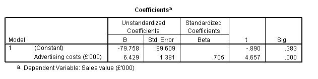
The regression constant ('a') is shown as -79.758 (very confusing that SPSS refers to this as 'B') and our regression coefficient is shown as 6.429 (i.e. 'b' in our basic equation). [The best way to remember which figure is which is by inserting them in the equation in the order in which they are needed.]
Complete into the equation to crosscheck the math's, using the known mean value for 'x' (61.333). [We know what the answer should be as the mean value for 'y' has already been derived from the table above i.e. 314.542]
Deriving the mean value for 'y' using the 'straight line formula' route...
y = a + bx
y = -79.758 + [6.429 x 61.333]
y = -79.758 + 394.310
y = 314.55 (rounded)...Correct!
Interpolation and Extrapolation
Now that we have proved the formula is correct, we can insert any value for 'x' and calculate y' (a predicted value).
Never reverse this procedure because that would suggest that the dependent variable was able to influence the independent one. In the above example it would mean that the sales value directly set the advertising budget. There are more advanced methods of regression analysis that do enable us to predict values for x' but we will not be dealing with them here.
Suppose the company wanted to know the predicted sales value when 'x' = £25,000 and when 'x' = £75,000. This process is know as Interpolation.
y' = -79.758 + [6.429 * 25] = 80.97, that is: £80,970
and
y' = -79.758 + [6.429 * 75] = 402.44, that is: £402,440
Go back to the graph and see if these results are reasonable.
There
is a problem where we try to determine a figure outside of the range of
collected values . Such
a procedure is called 'extrapolation' and is not
to be recommended. Simply because we have
established a straight-line
relationship between two variables over a finite range, does not mean that this
relationship continues above or below that tested range. The behaviour of stocks
and shares over time is a good example where changes might occur suddenly and
in a stepwise fashion.
We cannot say therefore, that an advertising expenditure of £125,000 would produce sales of £723,870 because we just do not have the evidence. Extrapolation using Time Series Analysis is discussed in a later Focus page.
The Manual method of calculating simple regression
This is a somewhat lengthy process but it is important to understand how the 'line of best fit' has been derived. It is a line which represents the "least square differences of all points along that line".
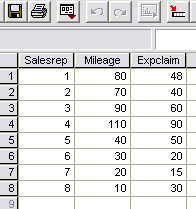
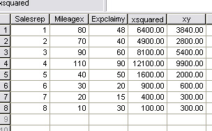
 A small news production company needs to check the expense claims and recorded
vehicle mileage's of 8 of their regional teams. They want to introduce a more
regularised allowance scheme and in order to do this, it is necessary to set up
some standardised expenses for standardised journey's.
A small news production company needs to check the expense claims and recorded
vehicle mileage's of 8 of their regional teams. They want to introduce a more
regularised allowance scheme and in order to do this, it is necessary to set up
some standardised expenses for standardised journey's.
For example: What is currently the predicted claim for a 50 mile journey?
Here are the results:
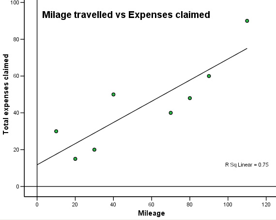
The scattergraph seems to show a wide variation. However, we can see a pattern and the slope would appear to be a positive one. For all regression charts, we start from a known value on the X axis, move upwards and then read across for the predicted value on Y.
Q. How would you interpret this pattern? Calculate rp.
Q. What is the main weakness in using this data when trying to make predictions?
Q. Can you make an estimate of the claim for a 50 mile journey by just using the chart?
The 'line of best fit' manual calculation...
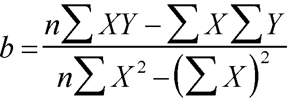
Firstly
we need to calculate 'b', the slope ( regression coefficient). The formula is
not as frightening
as it looks! However, we do need to sum 4 columns (x,
y, x squared and xy) and to square each individual 'x' value. You would be wise
to produce a table of the 5 individual values required to avoid confusion before
commencing with the equation..
To calculate 'b' .....
| Sigma x | 450 |
| Sigma (x squared) | 34,500 |
| (Sigma x) squared | 202,500 |
| Sigma y | 353 |
| Sigma xy | 25140 |
n = 8
As
with so many apparently complicated statistics formulae, once we have all the
sigma totals done,
it is only a question of substitution...
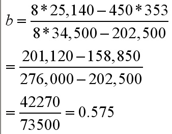
So the regression coefficient; b = 0.575
The
line of best fit has to pass through the mean of both variables so next
we transform the equation
to read:
![]()
The
mean of x is (450 ÷ 8) = 56.25 and the mean of y is (353 ÷8) = 44.125.
So using the above formula to calculate 'a'......
a = 44.125 - (0.575*56.25)
a = 11.78
So now we have the full and final equation for the line of best fit for this particular set of data...
y = a + bx
y = 11.78 - 0.575x
Checking
in SPSS..... (Remember that you can use the 'Transform'
function to display the x squared
and y squared columns if you wish)>>>>
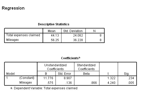
Let us go back to the original data and check out the claim for a 50 mile journey and for an already recorded journey of 40 miles.
y = 11.776 + ( 0.575*50) = 40.53 = £40.53
y = 11.776 + (0.575*40) = 34.78 = £34.78
Q. But y (for 40 miles) had an actual value of £50.00, why the difference? (clue: read the text box at the top of this page about 'error free' , 'error predictions' and 'residuals')
Now that we have the equation for the line, we can solve questions such as "If the mileage recorded is 72.5 miles , how much expenses should be claimed?
y = 11.776 + (0.575*72.5) = £53.46.
Check against the graph....correct!!
Do not be tempted to interpolate in the other direction, i.e. given the amount of expenses claimed..can we estimate the mileage? No!
If you wished to do this it would be necessary to reverse the x & y variables but this is dangerous because you must not reverse the dependency and independence of the respective variables.
Q. Would we be justified in making any statement about 'cause and effect' in this example?
Task: Write a paragraph of explanation of the findings for the team accountants and make your own recommendations for a suitable expenses scheme.
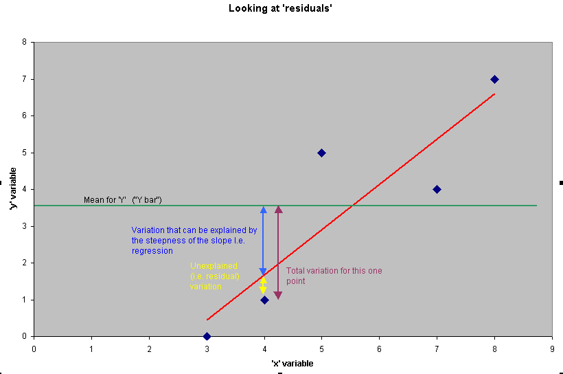
An important note about 'residuals' and Residual Analysis
(see also the note earlier concerning error)
You
will have noted that some data points lay much closer to the regression line than
others.
Compare the last two data points in the above example for instance.
These 'distances from the fitted line' are referred to as the 'residuals'. It
is possible to work out both the 'x' and 'y' residuals for any point on the scattergraph
but in practice (and for significance testing) we look only at the variation in
'y', that is, along the 'Y' axis as explained earlier.
Let us first take the data point where the mileage was 90 and the expenses were £60.
Just
as before, we simply insert into the line formula the value for 'x' to produce
a value for 'y' that
will sit on the line....
So when x = 90 what should the value of y be?
y'
= 11.776 + (0.575*90) = 63. 53 and so the residual
(on y) is, in this case quite small
(60 - 63.53 = -
3.53) and you will see that the point is below but very close to
the line.
However let us now carry out the same calculation when the
mileage was 40 and the claim was £50...
y' = 11.776 + (0.575*40) = 34.78 and here the original value for y was £50 and so the residual (on Y) is now...
50 - 34.78 = +15.22.....a much larger value
[Note that values below the line are negative and those above are positive.]
| There is another useful output that SPSS can yield which looks at the values of all the residuals on Y and compares them with the values derived from the line of best fit. It is the 'scatterplot of standardised residuals against predicted scores'. If these two sets are plotted against each other we should see a wide scatter of points with no obvious patterning. This confirms the linearity of our plot because the values above and below the line have 'balanced each other out'. If patterning is apparent then the dataset needs to be reexamined because the assumption of linearity would now be suspect. For this example it would look like this.... |
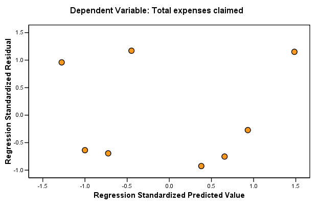
....and you can see that the scatter is random.
The diagram below attempts to show how the variation in a residual value can be
broken down into its component parts....
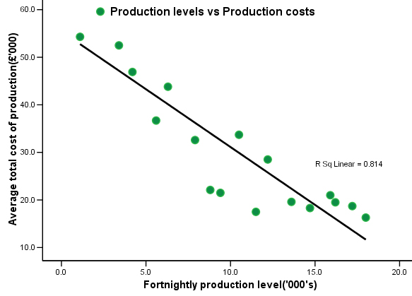
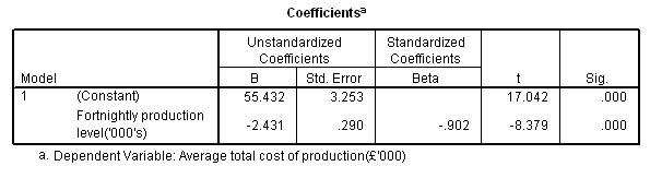
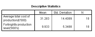
 Sparky Audio plc build
sound systems. In the annual report to shareholders they have included a dataset
that showed how the company had monitored the cost of production. The data covered
9 months' production and was updated fortnightly.
Sparky Audio plc build
sound systems. In the annual report to shareholders they have included a dataset
that showed how the company had monitored the cost of production. The data covered
9 months' production and was updated fortnightly.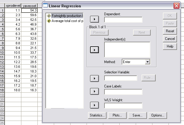
 Now substitute the mean of x into the formula:
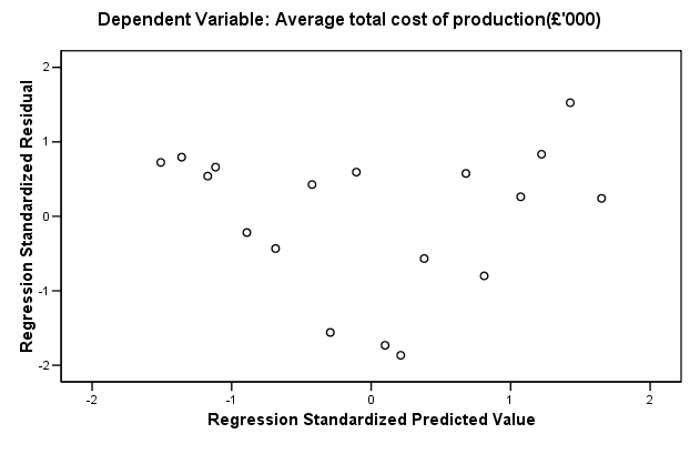
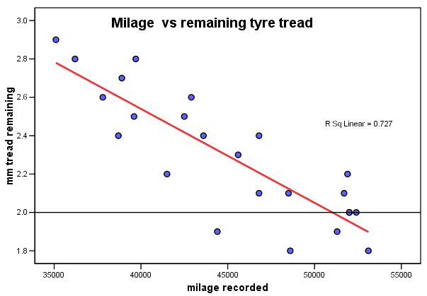
 The Bournemouth Bus Company (BBC) is trying to save
money by rationalising their vehicle maintenance programme. As part of this exercise,
they are monitoring tyre wear throughout the fleet. 24 of the coaches were inspected
and the mean value for the remaining tyre tread was calculated and a note of the
vehicle mileage travelled since the tyres were fitted was also recorded.
The Bournemouth Bus Company (BBC) is trying to save
money by rationalising their vehicle maintenance programme. As part of this exercise,
they are monitoring tyre wear throughout the fleet. 24 of the coaches were inspected
and the mean value for the remaining tyre tread was calculated and a note of the
vehicle mileage travelled since the tyres were fitted was also recorded. 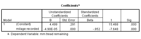
 Is the sale of Wines linked to the amount of shelf space dedicated to these products?
Metromart plc assessed the sales figures generated
in May 2005 from 15 of their suburban stores. 'Shelf space' becomes the independent
variable and 'sales' is the dependent variable.
Is the sale of Wines linked to the amount of shelf space dedicated to these products?
Metromart plc assessed the sales figures generated
in May 2005 from 15 of their suburban stores. 'Shelf space' becomes the independent
variable and 'sales' is the dependent variable.