
[Focus 18]Time Series Analysis'Trends' and 'Smoothing' |
Time series and trend studies belong to a broad group of techniques known as 'Longitudinal Studies'. This means the study of the same sample, the same variable over a period of time. Both qualitative and quantitative data can be used. Longitudinal studies are used to try to better understand 'change' over time.
For example:
|
Task: try to think of 5 more 'areas' where analysis over time might effectively be used.
What is a 'Time Series'?
In the simplest context, a Time Series is a bivariate dataset where one of the variables is the 'ultimate' independent variable: 'Time'. The purpose of these particular analyses is to measure and plot changes over time. We can differentiate two types of workable datasets at the outset: with the first type, we record the actual value for the variable at a specified time e.g.. stock value at 12 noon each day. In the second type, we record the aggregate of the variable over a specified period of time such as the total sales for each 24 hour period. Generally, the former uses non-derived variables and the latter uses derived variables. (See Main Glossary)
One of the most useful features of Time Series analysis to try to "predict future trends or events". In Focus 11 [Regression] we looked at the possibility of being able to predict a value for y (y') by first of all constructing a regression line and then using a known value for x to predict the corresponding value for y'. This process is know as interpolation. We also warned of the dangers of trying to 'extend the line ' in order to use values for x that were outside of the range of data being used. This would be the process known as 'extrapolation'.
However, what if we do need to predict a value for a variable on the Y axis beyond the range of the existing data?.
Both continuous and discrete variables may be used in time series analysis. The former might include stock values, £ sales , mileage etc. The latter might include units of production, birth / death figures, absenteeism figures and employment figures. In other words an array of variables can be plotted against time.
The technique is widely used in the business sector where forecasts are essential to balance supply with demand, to balance income with expenditure and to balance loans with assets e.g. Mortgage rates. In manufacturing, it is very important to align the supply of raw materials to your production schedules and to then ensure that the products reach the customer at the correct and optimum time. All these considerations require forecasts....i.e. "predicting the future".
The advertising industry uses sophisticated statistical models based on time series analysis to measure the efficacy of advertising campaigns on sales of product over time. In particular they try to predict what level of sales might be expected from a given campaign. This is essential information for all concerned, especially the client, because he/she has to base the advertising investment upon the predicted return.
The Objectives of Time-Series Analysis:1) Description... Plot the data and simply look for pattern, direction and repetition in the plot 2) Explanation... Analysis will allow hidden patterns (e.g. ' Trends' to be revealed) 3) Prediction... Forecasting future values is possible (with caution) if the analysis of existing (previous) values can be utilised. There are dangers in assuming that past behaviour will indicate future behaviour,particularly in 'volatile' situations such as the stock market 4) Control... We have the opportunity to ' build in' 'feedback mechanisms' if we can accurately predict future values. This is especially important in manufacturing where quality control of automated systems relies heavily on delicate control of variables. Inputs can be rapidly adjusted if outputs start to show a 'drift' outside of the pre-set parameters. |
Using a Simple Linear Regression model for forecasting
The unsuitability of extrapolating a 'line of best fit' has been mentioned before and it is generally not to be recommended. However, it does represent a simple exercise in forecasting and so, if used with great caution, can be an acceptable tool in some business situations. The problem lies in the dangerous assumption that "past performance might be an indicator of future performance".
 Perfect Pensions plc have monitored the sales of their
Whole Life policies over a ten year period.
Perfect Pensions plc have monitored the sales of their
Whole Life policies over a ten year period.
| Year |
Policies sold
('00) |
| 1 |
430 |
| 2 | 405 |
| 3 |
508 |
| 4 | 586 |
| 5 |
555 |
| 6 | 595 |
| 7 |
613 |
| 8 | 653 |
| 9 |
689 |
| 10 | 719 |
[Using
Excel and the fx functions; correl, intercept and slope.
Column A (x) is
notated as A2:A11 and Column B (y) as B2:B11] . Trendline fitted......
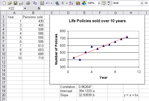
Let us suppose that we wish to know what the likely sales will be for the next two years. We know that future sales are likely to be influenced by many factors but at least the figures will give us a 'benchmark guide'.
So forecast sales for year 11: y = 394.133 + 32.94*11 = 756.5 ('00's)
and for year 12: y = 394.133 + 32.94*12 = 789.4 ('00's)
Q. Comment on the value of rp
| Note that there are Time Series facilities within SPSS (Go to the drop down menu; 'analyse') but are not included with this Focus page as a description of the various techniques is all that is required at this stage. |
 Now look at the following chart which tracks the flight arrivals at Gatwick Airport
per quarter over 6 years (measured in passenger millions).
Now look at the following chart which tracks the flight arrivals at Gatwick Airport
per quarter over 6 years (measured in passenger millions).
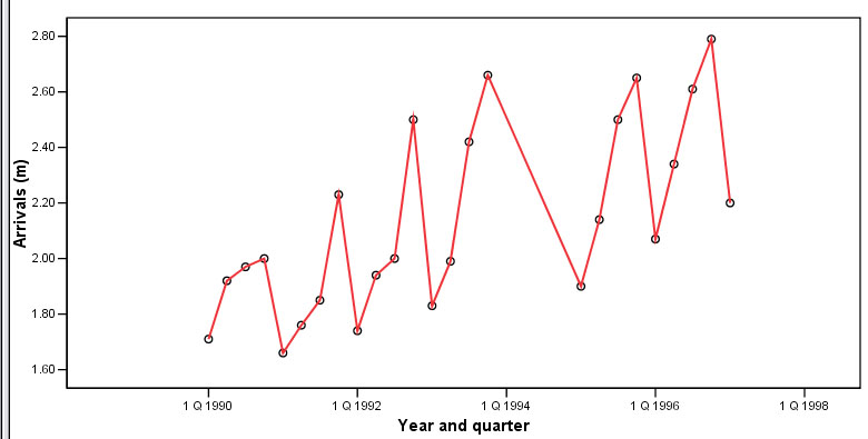
Some texts call this type of chart a 'historigram'
Task: You have been asked to interpret this chart to the Airport Board of Directors...write 200 words of clear explanation.... but without any statistical analysis.
Q. Do you feel that this is a satisfactory method of analysis?
Short to mid-term variation (within a variable) over time
The most obvious characteristic of the chart illustrated above is that there is a great deal of variation over time. The first task therefore is to characterise the types of variation that we have to deal with and this is done by segregating the types by their pattern..
There are four main types of pattern fluctuations that need to be considered...
T1. Trend: the general movement in the values of a variable over time. The term tends also to infer changes over an extended period of time. For example, the trend towards eating more vegetarian foods, the trend towards long haul holiday destinations, the trend towards using credit cards instead of cash etc. In most business situations, short term fluctuations must be distinguished from long term tendencies and this can only be done by looking at the data over an extended period. The determination of what constitutes an 'extended period' naturally depends upon the nature of the data. C2a.
Cyclical Fluctuations: consumer
activity and business activity can be affected by 'fashion', 'fads' or ' boom
and slump' phenomena....e.g cigarette sales will always fall after a cancer campaign
on television only to climb again. An increase in petrol prices will mean a temporary
reduction in sales at the pumps....The sale of 'tie-in' goods will peak soon after
the release of a popular film. House prices tend to follow a long cyclical pattern. (M)2b.
Mid-Cycle variations: often difficult to identify and they
occur over long periods e.g house prices inflate and deflate in a long cyclic
fluctuation but a 'mini-slump' in prices in a generally increasing market and
visa versa. S3.
Seasonal Fluctuations: data can vary according to the time of year...e.g
more Ice Cream sales in the summer; new car sales peak when the new registration
plates begin each January and August. Sales of fruits and vegetables vary according
to the season. Sales may be weather dependent or national holiday dependent e.g
Christmas and Easter. R4. Residual (or Random) Fluctuations: 'one-off' events such as food scares, flood, fire, 'flu epidemics, strikes, new tax impositions or shortages of raw material can cause rapid and dramatic variation in the data. This component is sometimes referred to as the Irregular component in that it is what is left over when all other components have been allowed for.
|
There are a multitude of forms that a time-series chart might take but here are three of the more common ones:
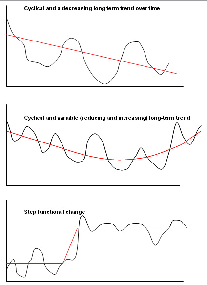
Remember, whenever possible, plot your data first; you will obtain a clearer idea of how to progress with it if you do.
Modelling the Future !
Using Time Series Analysis to make future predictions requires caution because there are two unreliable assumptions that are often made. Firstly that the trend pattern identified will continue and that future behaviour will follow the same general pattern as past behaviour. Where fluctuations have been recorded, we will see that trend analysis attempts to incorporate them in the forecasts that are created.
There is also an assumption that residual and / or cyclical fluctuations; [R] and / or [C] contribute little to the overall trend. The 'textbook view' is that the net effect of the 4 types of fluctuation act together.
Models of variation
The final result of all the variations within a time series may be regarded as following one of two main types of model:
Additive Model: A (actual data) = [T] + [S] + [R] (factors are independent but cumulative). The values for the variable simply use the arithmetic means and this is further explained below. The values for the random factor [R] needs to be small if useful models are to be achieved, so in effect R would be taken as 0, therefore....
A = T + S
Multiplactive: A =[T] * [S] * [R] (factors interact). Here the geometric means must be used. We are suggesting that the values for [A] are explained by the general trend [T] and a proportion ( or percentage) influence of [S]. Again the influence of [R] needs to be small and ideally is taken as 1 for multiplactive purposes, therefore.......
A = T * S
| Additive models are used when the variations around the trend are roughly of the same magnitude whereas multiplacative models are used when the variation about the trend appears to be more severe. If
the fluctuation of the values seem to increase or decrease proportionally to changes
in the trend; then the multiplacative model should be used. |
In both of the models described, seasonal fluctuations [S] are generally the largest single source of fluctuation. They can, to a degree, be 'neutralised' by using a technique known as 'smoothing'. This process begins with the intricate technique of calculating 'moving averages'.
Calculating 'moving averages'
Moving averages are usually calculated using consecutive values for given periods; weekly, monthly or annually are the most common.
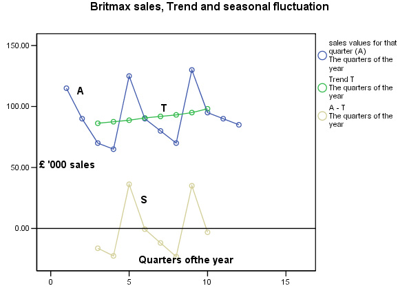
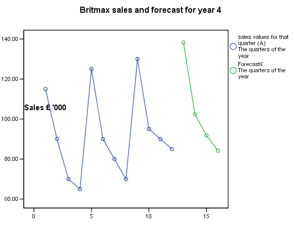
 Britmax Motorcycles
have decided to use the additive time-series procedure to produce a forecast of
sales (£'000) for trading year 4 (given the
sales figures for years 1, 2 and 3). Study the following table very carefully.
The first thing to notice is that the sales figures are given as quarterly totals.
We wish to create a four-point moving average, so
we will divide by 4 as soon as 4 earlier quarterly values are available. If these
were monthly figures to be averaged over a year, we would naturally divide by
12.....
Britmax Motorcycles
have decided to use the additive time-series procedure to produce a forecast of
sales (£'000) for trading year 4 (given the
sales figures for years 1, 2 and 3). Study the following table very carefully.
The first thing to notice is that the sales figures are given as quarterly totals.
We wish to create a four-point moving average, so
we will divide by 4 as soon as 4 earlier quarterly values are available. If these
were monthly figures to be averaged over a year, we would naturally divide by
12.....
Take the first 2 quarters, add them up and divide by 2 thus producing the first (slightly artificial ) 4-point moving average (85). Move down the list one place at a time (each rolling set of 4 quarters has been given a different colour) and repeat the process to give each 4-point MA (87.5) . Finally, calculate the centered point value [T] of these two (86.25) and by convention, display it on the line of the third quarter.
The last column [S] represents the net value
for the Seasonal Fluctuation and is the difference (+/-) between the actual sales
[A] for a given quarter minus the Centered moving average [T],
e.g. 70 - 86.25 = -16.25. This data is displayed (gold line) on the
second chart below....
| Year | Qtr | Sales value A (y axis )(£'000) | 4
point Moving Average MA | Centred
Moving Average [T] |
S =A -T |
| 1 | 1st | 115 | |||
| 2nd |
90....90
| 85 | |||
| 3rd | 70....70 ... .70 |
87.5 |
86.25 |
-16.25 | |
| 4th | 65 ...65 ... .65 .. .65 |
87.5 |
87.50 |
-22.50 | |
| 2 | 1st | ...... 125 ..125 ..125 .125 | 90 |
88.75 |
36.25 |
| 2nd | ................ ..90 ....90 ....90 ....90 |
91.25 |
90.63 |
- 0.63 | |
| 3rd | .............................80 ...80 ....80.....80 |
92.5 |
91.88 |
-11.88 | |
| 4th | 70.................................70.....70.....70 |
93.75 |
93.13 |
-23.13 | |
| 3 | 1st | .............................................130...130 |
96.25 |
95.00 |
35.00 |
| 2nd | ............................................... ..... ...95 |
* |
* |
* | |
| 3rd | 90 | ||||
| 4th | 85 |
Task: Calculate the values for the * marked cells yourself.
Note: This output would suggest that a mutiplactive model should be used if forecasting were really required, however we will continue with the additive model procedure..
The dataset is available : SPex 56 T.series maths
Estimating the seasonal effect and the Adjusted Seasonal effect:
Remembering the basic formulae: A = T + S, so S = A - T
| Quarter of the year |
A -T calculation |
Seasonal variation [S] |
| 1.3 | 70 - 86.25 = | -16.25 |
| 1.4 | 65 - 87.5 = | -22.50 |
| 2.1 | 125 - 88.75 = | 36.25 |
| 2.2 | 90 - 90.63 = | -0.63 |
| 2.3 | 80 - 91.88 = | -11.88 |
| 2.4 | 70 - 93.13 = | -23.13 |
| 3.1 | 130 - 95 = | 35.00 |
| 3.2 | 95 - 98.13 = | -3.13 |
| |
The next step is to calculate the best estimates of the seasonal effects by looking at each quarter's results individually, producing the annual total and the annual average....
| Year | Q1 | Q2 | Q3 | Q4 |
| 1 | - 16.25 | - 22.50 | ||
| 2 | 36.25 | - 0.63 | - 11.88 | - 23.13 |
| 3 | 35.00 | - 3.13 | ||
| Totals | 71.25 | - 3.76 | -28.13 | - 45.63 |
| Averages | 35.63 | -1.88 | - 14.07 | - 22.82 |
The values for the quarterly averages; when summed should be less than 1 and should theoretically be zero. If they are not, then a small adjustment has to be made. Sum the averages and determine whether the result is zero or not. In our example above: 35.63 + (-1.88) + (-14.07) + (-22.82) = - 3.14
Determine whether it is too high or too low. (Here it is too low so we must add some compensation figure)
Take the sum of the averages ( = - 3.14) divide by 4,
- 3.14÷ 4 = - 0.79 So we must add 0.79 to each of the above to bring the final total to zero:
| Seasonal effect (adjusted) | 36.42 | -1.09 | -13.28 | -22.03 |
This shows us that the first quarter of the year is the busiest and the last quarter is the quietest in terms of sales, the earlier chart above confirms this.
Forecasting:
Now we are finally in a position to make forecasts about the four quarters of year 4. Just as the actual values [A] were equal to the trend [T] plus seasonal variation [S]; the same applies to the Forecast values [F]:
[F] = [T] + [S]...
but exactly
what trend figures are we to use? We have to extrapolate the trend line into year
4. Refer back to the chart and you will see that the green Trend line approximates
quite well to a straight line.
We require a formula
for that line.
There are a number of options here but in this example we will carry out a simple regression analysis between Quarters of the year (X axis) and [T] on the Y axis. The relevant SPSS outputs are shown below. There is a near perfect correlation between the two variables and so our assumption that the Trend approximates to a straight line is true.
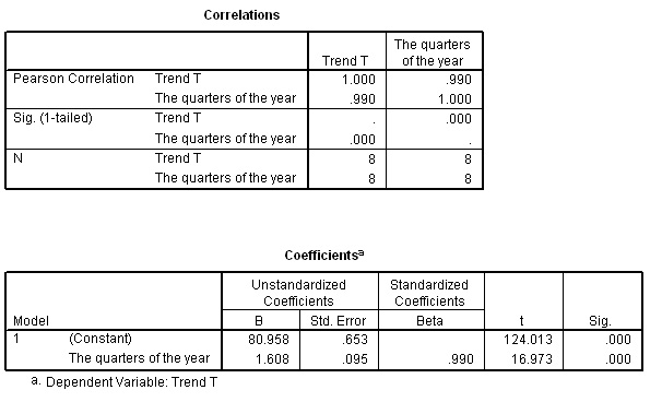
You should understand that the formula for the 'line of best fit' will be: y = 80.958 + 1.608x.
To predict values for y in quarters 13,14,15 and 16; simply substitute these values for x in the formula. Remember that y values are actually [T]
| x |
13 | 14 |
15 | 16 |
| y |
101.86 |
103.47 |
105.08 |
106.67 |
So these will be the predicted Trend values for the four quarters of year 4 that we will have to use in completing the predicted sales figures. Next, include the seasonal fluctuation component. You will notice how the seasonal fluctuation has a far greater effect upon the forecasts than does the Trend.
F = T + S.......
| Quarter |
13 |
14 |
15 |
16 |
| Seasonal effect (adj) [S] | 36.42 | -1.09 | -13.28 | -22.03 |
| y values = Trend [T] | 101.86 | 103.47 | 105.08 | 106.67 |
| Overall forecast sales [F] (£ '000) | 138.28 | 102.38 | 91.80 | 84.24 |
Task: Now add these latest values to the SPSS data set to produce the following chart:
Running medians smoothing is similar to the moving averages method but uses median values instead of means; important if the variable being plotted is non-parametric e.g. 'sports' scores set against the clock.
There are other types of smoothing such as exponential smoothing which is a technique particularly used to reduce irregularities (random fluctuations[R]) in time series data. Both of these techniques are described later.
Calculating 'Average inflation:E.g. What was the 'average inflation rate for the years 1977 to 1981 (you will need a calculator here). The base year for the inflation figures was taken as 1972 (i.e. 100). The third row shows the inflation % converted to a scale factor increase.
= 1.158 *
1.083 * 1.134 * 1.180 * 1.119 = 1.8779. So this is
the scale factor increase over the 5 year period and would correspond to +87.79%
over that period.
The geometric mean of those five figures is calculated using the following formula:
n is 5, so we need the 5th root of 1.8779 = 1.1343. This translates to 13.43% per annum over 5 years i.e 'Average inflation' was 13.43% Task: Take 1977 as 100 and multiply it by 1.1343, then multiply the answer by 1.1343. Do this a total of 5 times. You will see that the figure is 1.8777 or 87.77%. |
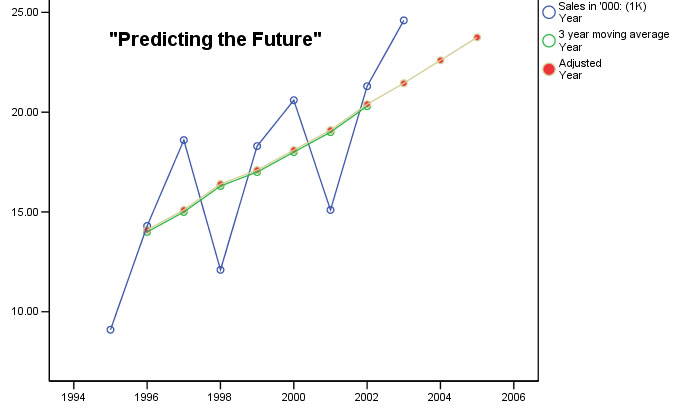
The mathematical determination of a Trend
Here is another worked example.....
 At the end of the 2003/4 season, a small Football club
needed to assess their mid-term viability if they were to secure a development
loan from the local bank. Their firm of accountants were asked to analyse the
gate sales figures (£ '000) between 1995 and 2003 (inc) and produce a short
report on their findings for the client and the bank.
At the end of the 2003/4 season, a small Football club
needed to assess their mid-term viability if they were to secure a development
loan from the local bank. Their firm of accountants were asked to analyse the
gate sales figures (£ '000) between 1995 and 2003 (inc) and produce a short
report on their findings for the client and the bank.
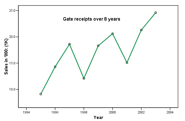
Q. What are the discernible patterns in this chart?
| Here is the data....
| Calculating
the 'Moving Average... |
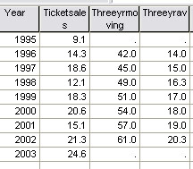
If we now plot the three year average against the year....
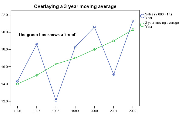
Q. Why have 1995 and 2003 now been omitted?
Note that each point on the moving average is plotted as the middle of the three years with respect to the X axis. This also reflects the fact that we have chosen to use an odd number (3) to work out our averages. If we used an even number, say 4, the point would be located half way between the second and third values with respect to the X axis and whilst this is not unreasonable, it does mean that the points on the chart will be midway between the second and third values and this can be confusing.
| The purpose
of using moving averages is to eliminate variation; especially seasonal variation....
A 4-quarterly moving average removes the seasonal variations from quarterly data. A 12-monthly moving average removes the seasonal variation from monthly data. |
Next we can calculate the individual yearly variations by subtracting each actual value from the corresponding moving average. Sigma is the sum of these differences.
| Year |
Gate
receipts [ A ](£) | Three
Point Moving Average(£) | fluctuation[S]* |
| 1995 |
9.1 | ||
| 1996 |
14.3 |
14 |
0.3 |
| 1997 |
18.6 |
15 |
3.6 |
| 1998 |
12.1 |
16.3 |
-
4.2 |
| 1999 |
18.3 |
17 |
1.3 |
| 2000 |
20.6 |
18 |
2.6 |
| 2001 |
15.1 |
19 |
-
3.9 |
| 2002 |
21.3 |
20.3 |
1.0 |
| | |
| Sigma
calc value = 0.7 |
*
When using long data sets (say, 1+ years), the Sigma
value [S] should approach zero but there is an easy correction factor adjustment
to make if [S] is not close to zero......
The Scalc value is 0.7 was too high and has to therefore reduced...
cf = (Sigma value ÷ number of values used).... in this case: 0.7 ÷ 7 = 0.1).
Calculator Check....
|
[
S]* |
[S] - 0.1 |
|
0.3 |
0.2 |
| 3.6 |
3.5 |
| -
4.2 | -
4.3 |
| 1.3 |
1.2 |
| 2.6 |
2.5 |
| -
3.9 | -
4.0 |
| 1.0 |
0.9 |
| | Sigma = 0, correct ! |
Caution:
the use of the symbol: ![]() (sigma) is used to denote a summation
and is more commonly associated with standard deviation calculations. Do not confuse
the two uses.
(sigma) is used to denote a summation
and is more commonly associated with standard deviation calculations. Do not confuse
the two uses.
So we are going to reduce each MA value by 0.1... We can re-insert these 'annually' adjusted figures into the table and redraw the chart showing the 'annually adjusted moving average'.
| Year
Number* |
Three Point MA |
MA, (annually adjusted) |
[T] |
| 1 | |||
| 2 |
14 |
13.9 |
|
|
3 |
15 |
14.9 |
14.40 |
| 4 |
16.33 |
16.2 |
15.55 |
| 5 |
17 |
16.9 |
16.55 |
| 6 |
18 |
17.9 |
17.40 |
| 7 |
19 |
18.9 |
18.40 |
| 8 |
20.33 |
20.2 |
19.55 |
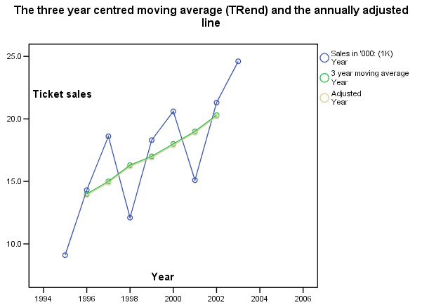
Once we have established an accurate mathematical 'picture' of the gate receipts(£) over the time period in question, we can estimate the actual 'trend' and be able to present it as a statement.
Trend Extrapolation: notes of cautionWe have already stated that time-series predictions are based on the assumption that past trends will continue. In volatile situations such as the stock market, fashion sales, tourism and travel, such an assumption must be viewed with some caution. The factors causing past trends may change or disappear altogether. Another reason for caution may be reflected in the type of data involved. In the real world, very few situations arise where a trend continues in one direction indefinitely. For example, if a baby was born on January 1st, 2000 and was 1.4m tall and exactly one year later she was 1.6m tall. By extrapolation we could say that by 2002 she would be 1.8m...by 2004, she would be classed as a giantess!! |
In the case we have been studying, because the annually adjusted moving average line is reasonably straight, it is possible to continue with one of three methods: 1) simply extrapolate the line 'by eye', 2) use simple linear regression (as in the previous example), or 3) use the following formula where M indicates : Moving Average(adjusted)
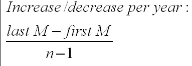
| Year
Number* |
MA, (annually adjusted) |
| 1 | |
| 2 |
13.9 |
| 3 |
14.9 |
| 4 |
16.2 |
| 5 |
16.9 |
| 6 |
17.9 |
| 7 |
18.9 |
| 8 |
20.2 |
So: (20.2 - 13.9) ÷ 6 = 6.3 ÷ 6 = +£1.05k pa
The figure is positive and thus indicates an increase; if the figure was negative; it would indicate a decrease.
Calculator check:
|
Year |
MA (annually
adjusted) | start
MA, plus 1.05 increases |
| 1 |
13.9 |
start |
| 2 |
14.9 |
14.95 |
| 3 |
16.2 |
16.00 |
| 4 |
16.9 |
17.05 |
| 5 |
17.9 |
18.10 |
| 6 |
18.9 |
19.15 |
| 7 |
20.2 |
20.20 |
Statement: "The overall trend in gate receipts is upwards and has been increasing at the average rate of £1.05k per year calculated over 7 years".
The generalised formula for calculating the average increase / decrease in the Trend [T] is:
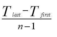
In the above example; by using the annually adjusted moving average and the seasonal adjustment (0.1) and multiplying by the number of periods into the future (in this case; x 1 year at a time), we can give a forecast for the numerical trend in receipts for the next year...
Again, we could carry out a regression test on the constructed moving average line. This would achieve two things. Firstly we will obtain a formula for the line and that will allow us to interpolate historical values for y given specific values for x. Secondly, the rp correlation value will tell us whether a straight line is a good fit for our moving average line.
Task: Carry out your own regression analysis on the adjusted values / year number.
In this instance, you should find the formula for the line is: y = 11.88 + 1.02x
rp = .998 and P<0.05.
The adjusted year analysis and the regression extrapolation results for gate receipts(£) are now compared.
| Year |
Year Number |
Moving Average, (annually
adjusted) forecast (£'000) | Regression
Extrapolation(£'000) |
| 2003 |
8 |
20.20 |
20.04 |
| 2004 |
9 |
21.25 |
21.06 |
| 2005 |
10 |
22.30 |
22.08 |
The comparison between the two mathematical methods illustrates a useful lesson. There is often more than one way to legitimately solve a statistical problem. In this instance, the results of the two methods are within 1.0% of each other.
Q. How would you best deal with the situation experienced in 2003 with regards to actual receipts (£24.6k) and the fact that the best forecast was £21.07k?
Task: Interpret all these results and write your report.
Forecasting is not an exact science. Not only are there many differing methods, all of which aim to give accuracy but all are in some way based on past performance and the manipulation of earlier results. This is never a guarantee that predictions are anything more than that. Nevertheless, they are a valuable tool for companies in at least 'pointing in a direction'.
Below is a chart showing the quarterly sales figures (£'000) for Britmax
Motorcycles.
You will need to use the dataset: SPex 54 Britmax T Series but you will need to complete columns 4 & 5 first!
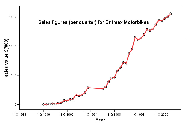
Note that data for 1994 is missing. Q. How will this affect the trend curve?
As described earlier; we could carry out a simple linear regression on the data. Here is part of that analysis....
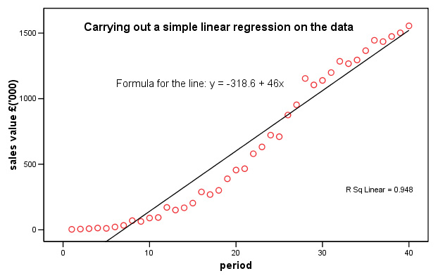
Task:
Now carry out the same regression analysis yourself. Remember to use the 'periods'
column
and not the year date for the Independent variable.
Q. Why was this analysis option not acceptable? Clue: look at the residuals plot and refer back to Focus 11 about assumptions concerning linearity and homogeneity.
Q. So now, using the method of moving averages (use 3 values at a time), what is the estimate of sales for the first two quarters of 2001?
More methods for 'Smoothing'
1. Running Medians
Referred to briefly earlier; this technique is similar to moving averages but the medians are used instead of the means. The technique can be used where a non-parametric variable (therefore no mean values possible) has to be used on the Y axis.
The main advantage however, is that extreme values (outliers) have a reduced influence over the outcome.....
 The Southern Clarion is a new regional evening /Sunday
newspaper (i.e. published
7 times a week) and here are the circulation figures ('000) for the first three
weeks of trading. It was always expected that Sunday sales would not follow the
same pattern of sales as on the other days of the week and so if we use a moving
average method; this fact will have an undue effect on the smoothing process.
The Southern Clarion is a new regional evening /Sunday
newspaper (i.e. published
7 times a week) and here are the circulation figures ('000) for the first three
weeks of trading. It was always expected that Sunday sales would not follow the
same pattern of sales as on the other days of the week and so if we use a moving
average method; this fact will have an undue effect on the smoothing process.
The natural periodicity of this dataset is still going to be 7 (days)....
Dataset may be found at: SPsmex25
running medians
| Mon |
Tue |
Wed |
Thur |
Fri |
Sat |
Sun | |
| Wk
1 | 4.8 |
5.6 |
6.1 |
5.3 |
7.5 |
8.1 |
3.7 |
| Wk
2 | 5.2 |
5.2 |
6.1 |
4.9 |
6.9 |
7.5 |
3.8 |
| Wk
3 | 6.0 |
6.4 |
7.2 |
5.5 |
7.9 |
8.3 |
4.0 |
Q. What patterns can you discern in this dataset?
We will use the technique of running medians on a 7-point (i.e. one week) basis and so the first calculated value will appear in the first 'Thursday box'. Select the first 7 values and calculate the median value for that set. Now delete the 4.8 (Monday) value and replace with the second Monday value of 5.2. Recalculate the new median value and so on......
| Mon |
Tue |
Wed |
Thur |
Fri |
Sat |
Sun | |
| Wk
1 | - |
- |
- |
5.6 |
5.6 |
5.3 |
5.3 |
| Wk
2 | 5.2 |
5.2 |
5.2 |
5.2 |
6.0 |
6.1 |
6.4 |
| Wk
3 | 6.4 |
6.4 |
6.4 |
6.4 |
- |
- |
- |
Task: By simple arithmetic, which are the best two and worst two days of the week?
Using
SPSS to plot the two lines simultaneously requires the overlay
facility.
Go to 'Graphs', 'Scatter', select 'overlay' and 'define'.
Transfer the two Y-X pairs, 'papersales--day' & 'medians--day' (ensure
that both pairs are this way round, if they need to be swopped; highlight the
pair and click 'swop pairs').
Go to 'Options' and select 'exclude cases
variable by variable'. If you do not, you will only get the values that are paired,
presented on the graph.
Click 'OK'....
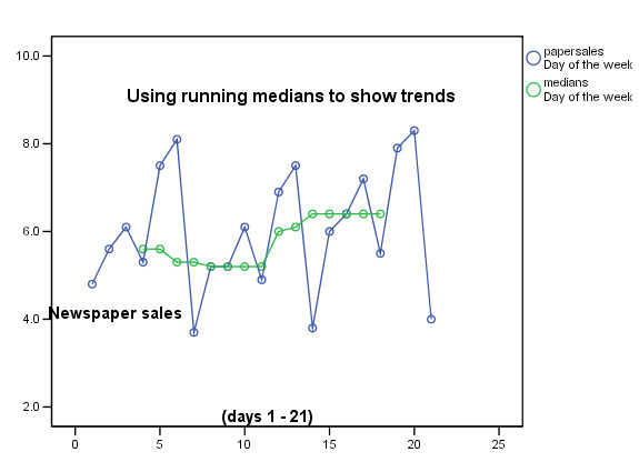
This chart would be typical for a new publication. The initial interest shown in week 1 has declined slightly in week 2 but then in week 3 there are signs that the paper is attracting a steadily increasing number of readers. This trend has been picked up despite the fact that the daily sales figures show large variations. Note also that the maximum and minimum values have hardly changed during the three cycles shown.
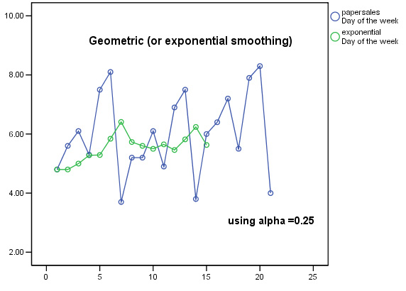
2. Exponential (or Geometric) Smoothing
This technique (sometimes referred to as exponentially-weighted moving averages (EWMA)), first devised by C.C.Holt in 1958, is useful when neither trend nor seasonal patterns are discernible and yet the values recorded are not independent of time. If the values in a time series are truly independent of time then their mean value is still the best piece of information to use for forecasting.
Although the maths is complicated, the concept behind Exponential Smoothing is logical: that the most recent (latest)values are more likely to reflect the ensuing forecast value better than the more distant (earliest) values.
"Recent
data is proportionally more useful than older data" |
Therefore the most recent values have to be given a weighted value in some way. So we need to utilise a 'smoothing factor' for each actual value to calculate the estimated value.
The 'smoothing constant' (alpha, using 'ã' here) is not calculated mathematically but is selected by you. It has to be selected to be some value between 0 and 1. Think of it as a 'damping factor'. The choice of value depends on experience with the data.
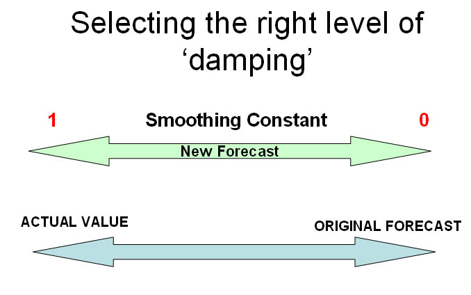
| If ã approaches 0, the new forecast will equal the old forecast, therefore, no improvement If ã approaches 1, the new forecast equals the old actual value A 'high' value for alpha (>0.6) will make the forecast very sensitive to changes in the actual data A 'low' value for alpha (<0.2) will make the forecast somewhat immune from changes in the actual data It has been found be experience that the optimum value for 'ã' lies between 0.1 and 0.6 We will use 0.25. |
To start the process it is normal to assume that the initial value and the forecast are the same.
Let us use the first two weeks of the previous example:
| Day |
1 |
2 |
3 |
4 |
5 |
6 |
7 |
8 |
9 |
10 |
11 |
12 |
13 |
14 |
15 |
| 'Actual'
Sales (y) | 4.8 |
5.6 |
6.1 |
5.3 |
7.5 |
8.1 |
3.7 |
5.2 |
5.2 |
6.1 |
4.9 |
6.9 |
7.5 |
3.8 | 6.0 |
| Forecast
(y') | (4.8) |
4.8 |
5.0 |
5.28 |
5.29 |
5.84 |
6.41 |
5.73 |
5.60 |
5.50 |
5.65 |
5.46 |
5.82 |
6.24 | ? |
The formula for the calculation is:
next forecast value (y') = (ã * immediate previous actual value) + ((1-ã) * immediate previous forecast value)
So the first forecast value was calculated as follows:
0.25 * 4.8 + 0.75 * 4.8 = 4.8
&
the next: 0.25 * 5.6 + 0.75 * 4.80 = 5.00
& the next: 0.25 * 6.1 + 0.75
* 5.00 = 5.28
& the next:
0.25 * 5.3 + 0.75 *
5.28 = 5.29
& the next:
0.25 * 7.5 + 0.75 * 5.29 = 5.84
& the next: 0.25 * 8.1 + 0.75 * 5.84
= 6.41
& so on.........
The
forecast for day 15 would now be :
0.25 * 3.8 + 0.75 * 6.24 = 5.63
So now let us replot the chart using the derived exponential values....
Task: Carry out the above analysis again using 0.45 as the value for the smoothing constant.
Task: Make comments about the relative merits of the two smoothing methods.
Note in particular that with the Exponential smoothing technique, no data is 'lost' at the beginning and end of the time series. Compare this with the earlier chart showing the 21 day running median output.
| It should become clear that the choice of the value for alpha will govern the degree of 'smoothing that is achieved. Remember that we chose a value of 0.25 in the above example. There is a balance to be found between too much sensitivity to the 'actual' figures and too little sensitivity until the forecast become so bland as to be meaningless because too much smoothing will produce a result that veers towards the actual values. |
Also, if the relationship between successive values is strong, then emphasis should be placed upon the most recent 'actual' value so a larger value for alpha should be used. Conversely, with a weak relationship (scattered values as above) then lower values for alpha are suggested. There are no dogmatic rules to be followed here and so alpha will always be chosen somewhat arbitrarily. The use of spreadsheets and more advanced computer analysis allows us to 'choose the best fit' value for alpha.
If a time series containing trend and seasonal variation has to be dealt with, then the Holt-Winters procedure can be used. An even more advanced technique known as the Box-Jenkins forecasting model incorporates a number of stepwise stages to ensure that the forecasting model is as all-embracing as possible.
Accuracy of Forecasts
We have pointed out that forecasting, whilst a valuable business tool must be used with caution. Many companies will blame their statisticians for "poor forecasting" when in fact human judgement, optimism / pessimism or unexpected market forces are to blame.
Nevertheless, there are at least four mathematical methods to gauge the accuracy of a forecast. The quickest is the 'Mean Square Error' (MSE) method. Look at the newspaper sales volume data table again:
| Day |
1 |
2 |
3 |
4 |
5 |
6 |
7 |
8 |
9 |
10 |
11 |
12 |
13 |
14 |
sigma |
| 'Actual'
Sales (y) | 4.8 |
5.6 |
6.1 |
5.3 |
7.5 |
8.1 |
3.7 |
5.2 |
5.2 |
6.1 |
4.9 |
6.9 |
7.5 | 3.8 |
|
| Forecast
(y') | (4.8) |
4.8 |
5.0 |
5.28 |
5.29 |
5.84 |
6.41 |
5.73 |
5.60 |
5.50 |
5.65 |
5.46 |
5.82 | 6.24 |
|
| difference | 0.0 | 0.8 | 1.1 |
0.02 | 2.21 | 2.26 | -2.71 | -0.53 | -0.40 | 0.60 | -0.75 | 1.44 | 1.68 | -2.44 | |
| difference squared | 0.0 | 0.64 | 1.21 | 0.0004 | 4.88 | 5.11 | 7.34 | 0.28 | 0.16 | 0.36 | 0.56 | 2.07 | 2.82 | 5.95 | 31.38 |
Sigma [difference squared] = 31.38. Now divide by n (14 in this case) = 2.24
MSE
= 2.24
Now the whole sequence is run
again using different values for alpha each time,
say 0.35 and 0.45.
The idea is to revisit the MSE value a number
of times in order to secure a forecasting scheme for your data that reduces the
MSE to a minimum. In this way the forecast will be as realistic as possible.
This procedure is not available in SPSS.
There are many other smoothing techniques (e.g. Brown's double exponential smoothing method) but they are more advanced than is necessary here.
This is the last Focus page on the website........ Congratulations!!
![]()
Go back to 'quick view' contents page
Go back to Focus 17