[Focus 10]Association
between two variables |
We have commented on a number of occasions that the human brain is conditioned to absorb graphical images, shapes and patterns much more readily than pages of tabulated data. We can utilise this attribute to compare two variables to see if and how they relate to each other and to see what happens to one value if we alter another...
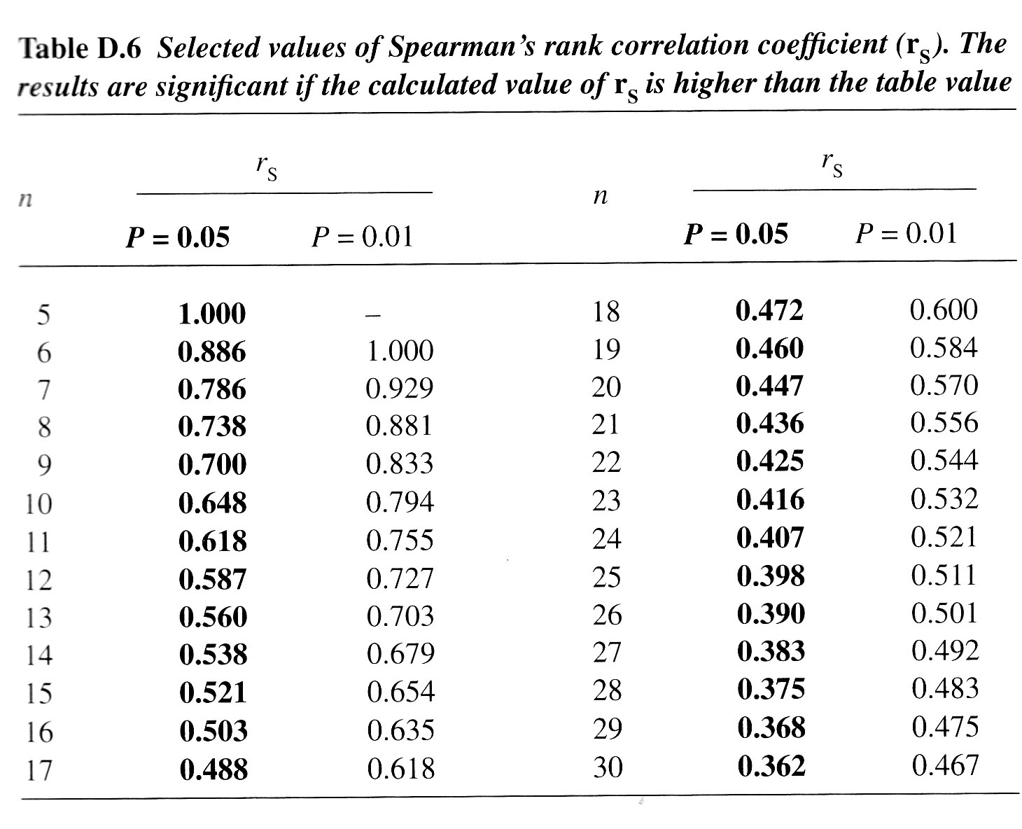
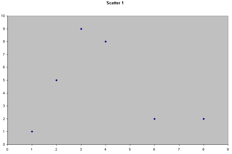
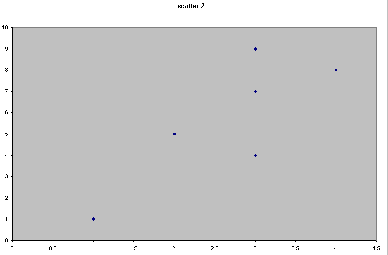
Consider the following 4 scattergraphs....
(do not concern yourself with what the variables or values actually are...just concentrate on the patterns).
 |  |
 | 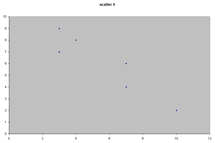 |
It should be apparent that the relationship between the variable measured on the X axis and that on the Y axis is quite different in all four cases. We could start by trying to define that relationship just by using words...
|
| "Apparent relationship" |
| Scatter 1 | There seems to be little or no relationship here. 'x' and 'y' seem to vary independently of each other |
| Scatter 2 | There seems to be a relationship because as 'x' increases, so does the value of 'y'. Call this a weak or medium (but positive) correlation |
| Scatter 3 | This suggests a very strong relationship because as 'x' changes,' y' changes by an exactly equal degree. We would call this a perfect and positive correlation. |
| Scatter 4 | Here there appears to be a relationship similar to Scatter 2 but now as 'x' increases; 'y' decreases. Call this a medium but negative correlation. |
It would be very useful to be able to place some numerical value on the closeness of the relationship between 'x' and 'y'. This is referred to as the 'degree of association'.
We can also define the direction of the relationship as positive or negative, that is: does one variable increase in value when the other one does or does one decrease as the other increases?
We had already learnt from using Chi-square and the K-S tests that we can determine if a (statistically measurable) relationship exists but unfortunately these tests do not tell much about the strength or direction of that relationship. Correlation begins to do this.
| Q. Which axis should be used for the Independent Variable and which should be used for the Dependent Variable? A. For correlations, it does not technically matter but it is good general practice to stick to the idea of always putting the independent variable on the X axis because when we move on to discuss Regression (Focus 11); it is imperative. |
Go back to Scatter 2 and 3 and imagine that we superimposed a 'line of best fit' onto both. It might be that the location and slope of the lines would be the same in both cases but clearly the data sets are different.
Using correlation formulae, we create a correlation coefficient (r) which gives us a comparative measure of how close our values are to an imaginary 'line of best fit'.
The 'correlation coefficient' is a continuous scale (index) that has limits of -1 (through zero) to +1...
| r = +1 | 100% positive correlation |
| r = 0 |
totally random spread, no association between 'x' and 'y' at all |
| r =-1 | 100% negative correlation |
Points to consider:
1) In the tests that follow we will be calculating 'r' and 'r squared' as our test statistics.
2) We still need to devise a null hypothesis and we will also be testing for significance.
3)
The exact choice of test will be decided by the particular scale of measurement
that our test
data is on...
| VARIABLES: 'x' & 'y' | TEST to use: |
| one or both are on the Ordinal scale (or Interval / Ratio but NOT normally distributed) |
(A) Spearmans Rank Correlation Coefficient (SRCC) |
| both are measured on the Interval or Ratio scales and are normally distributed |
(B) Pearsons Product-Moment Correlation Coefficient (PPMCC) |
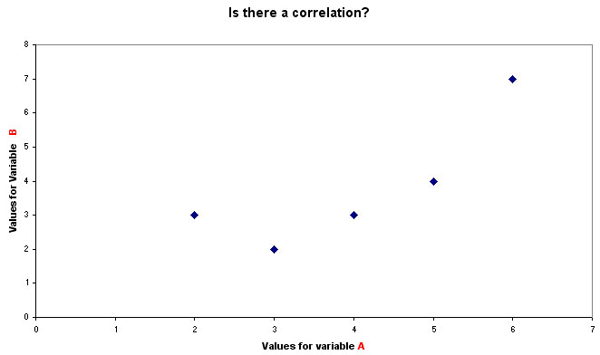
As the name suggests, we will be ranking each variable separately and then comparing the ranking positions of each value within each pair. Never uncouple the 2 rank positions achieved for each case.
E.g..
| Variable A (rank position) | Variable B (rank position) | difference (d) i.e. A-B | |
| Case 1 | 5 |
4 |
+1 |
| Case 2 | 2 |
4 |
-2 |
| Case 3 | 3 |
2 |
+1 |
| Case 4 | 6 |
7 |
-1 |
| Case 5 | 3 |
2 |
+1 |
Plotting A against B would give the following graph......
An 'interpolation line' would simply 'join up the dots' whereas a 'line of best fit' tries to produce a line that equalises all the distances from the line to each fixed value.
 10 new television programmes have been shortlisted for an award in the annual
'Emma' awards ceremony. There are two judging panels, one representing England
and Wales (Panel A) and the other representing Scotland and N.Ireland (Panel B).
10 new television programmes have been shortlisted for an award in the annual
'Emma' awards ceremony. There are two judging panels, one representing England
and Wales (Panel A) and the other representing Scotland and N.Ireland (Panel B).We need to know if these two panels are scoring in a comparable way. Do they draw similar conclusions? Are they complimentary ? We will test the strength of association between their two sets of rankings.
We can start by doing a simple Spearman's test. We will look at the results for the 10 programmes (labelled as A - J) as judged by the two panels. All 10 programmes were given a 'score' by each panel so that they could be placed in a rank order from best to worst (i.e. Ordinal data).
Once again we must remember to start with a null hypothesis but we must also consider whether this is a one or two tailed test. A one tailed test would be attempting to discern for example if 'Survey A' scores were higher than 'Survey B' scores. This is not what we want to do. A two-tailed test simply asks if there is a real difference between the two panels. The term "directionality" is used here to suggest that the differences noted (if any) can go up or down.
So.......
H0 "There is no correlation between the rankings given by 'Panel A' and those given by 'Panel B' "
Q. Write down a suitable alternative (H1) hypothesis.
It is important to remember that these are ranks and not actual values, the final rank was arrived at by totaling up scores from all parameters the panels were asked to consider such as; quality of the script, quality of the acting, special effects, costume, lighting, storyline etc etc. Remember also that this is paired data and must not be split (each programme was judged by both panels; we did not use 10 programmes for 'Panel A' and a different 10 for 'Panel B').
Any condensing or summarising of raw data must be undertaken before the final rankings are used (see cautionary note below).
We will be calculating the difference between the rank values for each pair and also squaring that difference to remove negative values. These are not scores. Here are the ranked results...
| TV
programme (n =10) | Rank awarded: [Panel A] | Rank awarded: [Panel B] | difference (d) | difference squared |
| A |
1 |
3 |
-2 |
4 |
| B |
2 |
4 |
-2 |
4 |
| C |
3 |
1 |
2 |
4 |
| D |
4 |
2 |
2 |
4 |
| E |
5 |
6 |
-1 |
1 |
| F |
6 |
5 |
1 |
1 |
| G |
7 |
7 |
0 |
0 |
| H |
8 |
10 |
-2 |
4 |
| I |
9 |
8 |
1 |
1 |
| J |
10 |
9 |
1 |
1 |
| Sum of 'd squared' = | 24 |
Have you remembered to construct a null and alternative hypothesis?
We now have to use the Spearman's formula to calculate our test statistic (rs)
So: rs = 1 - (6 x 24) ÷10*(99)
= 1 - (144 ÷ 990)
= 1 - 0.145
= 0.855 (note that on this occasion the figure is positive)
Remember this chart:
| r = +1 | 100% positive correlation |
| r = 0 |
totally random spread, no association between 'x' and 'y' at all |
| r =-1 | 100% negative correlation |
So this means that we have found quite a strong positive correlation between the two schemes with a mathematical value of 0.855.
But what does that actually mean?
Plotting the two sets of rankings...
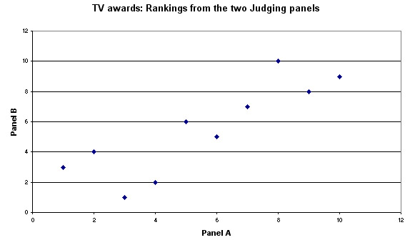
You
should be able to see that there does appear to be a clear pattern to the
points and that the slope
is positive. Also, we now have a good idea of what
a positive r value of 0.855 looks like!
As usual, the lowest level of significance that we would be prepared to accept would be at the 95% level. If we look up in the specific SRCC tables (eg. Wheater and Cook(2000) p 221)(or see below); to be 95% confident of the correlation (and for n = 10) our value for rs has to be located beyond a 'critical band'.
The edges of this 'band' have values of either more than +0.648 or less than - 0.648 (this also indicates that we are using a two-tailed test). The equivalent figures for P (0.01 and n = 10) is ± 0.794. That is, our result must be outside of these ranges on either extreme if we are to accept H1 at those respective levels.
You
can see that if we had obtained a value for rp
of say; +.700; this would be significant at the 95% level but NOT significant
at the 99% level.
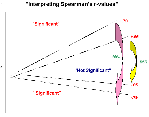
Caution! (this chart relates only to n =10)(the
values shown will be different for other values of n)
Q. Our result (0.855) is outside of both these ranges so do we accept H1 and conclude that there is a significant correlation?
For reference, the whole of the critical values table is enclosed here as a page scan:
Open SPSS
Go to Variable view and name the two variables: Panel A and Panel B
Go to data view and enter the data in the usual way....
Choose: 'Analyse', 'Correlate', 'Bivariate'
Transfer both variables to the right hand panel
Tick the Spearman box and also tick ' flag significant correlation' .........Click 'OK'
(Note
that many of the tests, from this point on, will flag significance levels directly,
the interpretation is
as follows: one *... 95%, 2*'s... 99%,3*'s... 99.9%)
Your output should look like this.
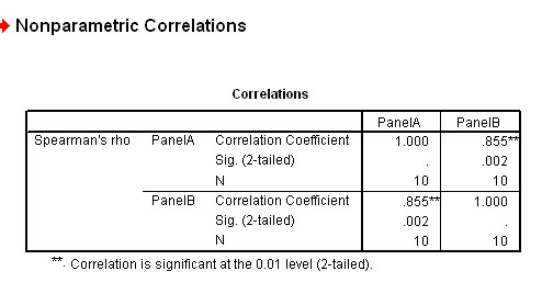
Note
also that the output gives two correlation's in fact, 'Panel A' related to 'Panel
B' and 'B' related to 'A'.
Why is this?
Here is a more complex example (but exactly the same methodology). If 2 or more cases give the same score, then the middle position has to be taken for the ranking.
Do not get confused between 'scores' and 'ranks'. It is the 'ranks' that are being analysed but they have all been derived from 'scores'. Start with least values in your exercise, that is; least scores get rank 1..
 Suppose we wished to 'Rank' the scores achieved from a set of attributes measured
at Wickgate Airport
Suppose we wished to 'Rank' the scores achieved from a set of attributes measured
at Wickgate Airport
8 possible 'attributes' were listed and each was scored out of 10.
So the airport scored highly for 'cleanliness' but badly for 'staff attitude'....
| Attribute |
Scores out of 10 | Ascending
Rank Position |
|
| ||
| Parking |
7 |
7 |
| Information signs | 5 |
5.5 |
| Que waiting times |
5 |
5.5 |
| Cleanliness |
8 |
8 |
| Quality of advice | 4 |
4 |
| Documentation |
3 |
2.5 |
| Staff attitude | 1 |
1 |
| Shops |
3 |
2.5 |
The score '3' and the score '5' appeared twice and this has to be accounted for. Both 3's have to be ranked the same ('split the difference') and as there are 8 scores we cannot have more than 8 ranks. Take a little time to study this table to make quite sure that you are comfortable with what has been done.
Note also that the total 'score' of 36 out of a possible 80 is not used here but if we utilised all the total scores from a number of airports; then we would have pseudo-Interval data and then some researchers would be tempted to use parametric tests ... but even then; only if we tested to make sure that the data was normally distributed.
SPSS note: If you wish to rank the data yourself; drop down the 'Transform' menu but as stated, be aware that for the Spearman's test, SPSS does this transformation anyway but try both routes and you should get the same results!
 A large fleet car hire firm wish to review their pricing policies. They are anxious
to introduce a new pricing policy in order to increase revenue. The managers need
to know what the possible customer reactions might be. A questionnaire was sent
to 30 client companies in order that a more precise understanding of customer
attitudes might be obtained.
A large fleet car hire firm wish to review their pricing policies. They are anxious
to introduce a new pricing policy in order to increase revenue. The managers need
to know what the possible customer reactions might be. A questionnaire was sent
to 30 client companies in order that a more precise understanding of customer
attitudes might be obtained.
One of the issues was: "Do clients that change their fleet vehicles regularly expect to pay lower monthly charges?"
Two questions were asked...
Q1) How frequently do you change your fleet vehicles? n.b. This is a direct rating-type question
| VALUE LABEL (changes) |
SCORE AS >>>> |
| more than once a year | 1 |
| about once a year | 2 |
| about once in two years | 3 |
| about once in 2 1/2 years | 4 |
| about once in 3 years | 5 |
| less than once in 3 years | 6 |
Q2) What do you consider an acceptable charge per month for a new 1600cc car contract? (another direct rating question)
| VALUE LABEL (charges) |
SCORE
AS >>>> |
| £200.00 |
1 |
| £250.00 |
2 |
| £300.00 |
3 |
| £350.00 |
4 |
| £400.00 |
5 |
| MORE THAN £400.00 | 6 |
Q. What will be our Ho and H1 hypotheses?
You should also appreciate that the scores' will be meaningless if the individual scores given by each of the 30 clients(for the two questions) become 'uncoupled'. Remember that SPSS requires all the scores to be entered individually...
In SPSS ....
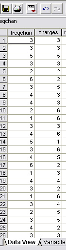
Name the variables as 'freqchan' and 'charges'
Here is part of the data set of the pairs of scores recorded by the 30 clients who were given the questionnaire.
Enter the data....
First open 'Graphs', 'Scatter', 'Simple'
Transfer 'changes' to the X axis and 'charges' to the Y axis
Click 'OK'
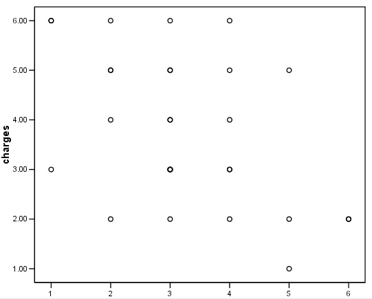
Q. What pattern (if any) can you see here? Why are there apparently only 19 points displayed?
We once again rank these sets of scores....
Click 'Analyse', 'Correlation', 'Bivariate data'
Transfer both variable over to the variables box.
Tick only 'Spearman's', 'two tailed' and 'Flag any significance'
Click 'OK'
Note again that SPSS will automatically rank the data for you when this test is used
And here is the output..
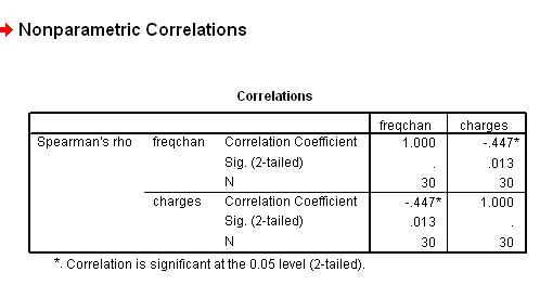
We have obtained an rs value of - 0.447, this represents a moderate to weak negative correlation.
For (n =30) the critical values values for P(0.05) and P(0.01) are ±0.362 and ±0.467 respectively (refer back to the table above). Our result falls between these two values. Thus the result is significant at the 95% level (so accept H1) but not quite at the 99% level.
You will now be able to interpret the P-value directly from the SPSS output above (0.013) i.e. at the 98.7% level. In simple terms, there is less than a one in fifty chance of our obtaining this result by chance but we cannot say that it is as unlikely as one in a hundred but between these two levels. It is actually one chance in 77!
We can conclude by saying that there is a statistically significant [P<0.05] and negative correlation between the number of vehicle changes and the charges made.
The data set is available: SPex42 car hire
Conclusion: there is a strong negative correlation between the number of vehicle changes and the client's willingness to pay. The more frequently the vehicle are changed; the less money the client expects to pay and our Spearman's test and significance test has shown that there is only one chance in 77 that this result was arrived at by chance.
Here is a further data set to work on yourself...
We often hear the expression "You get what you pay for" but is this always true?
 10 different DVD
recorders were given to an expert panel for their assessment. They were asked
to score on 8 different attributes and after conferring, rank them with '1' being
the worst and '10' being the best. The retail price of each camcorder was not
known to the assessors in advance.
10 different DVD
recorders were given to an expert panel for their assessment. They were asked
to score on 8 different attributes and after conferring, rank them with '1' being
the worst and '10' being the best. The retail price of each camcorder was not
known to the assessors in advance.
Here are the tabulated results:
DVD
recorder | A | B | C | D | E | F | G | H | I | J |
Retail
Price £ | 149.00 | 162.00 | 166.00 | 175.00 | 210.00 | 245.00 | 255.00 | 299.00 | 325.00 | 340.00 |
Retail
Rank | 1 | 2 | 3 | 4 | 5 | 6 | 7 | 8 | 9 | 10 |
Quality
Ranking | 2 | 1 | 4 | 3 | 6 | 9 | 10 | 5 | 7 | 8 |
difference
(d) | 1 | -1 | 1 | -1 | 1 | 3 | 3 | -3 | -2 | -2 |
difference
squared | 1 | 1 | 1 | 1 | 1 | 9 | 9 | 9 | 4 | 4 |
So the sum of d squared = 40
Note that whilst the retail Price data could be treated as Interval data; the Quality Rankings are places and NOT individual 'scores'. You must be wary of confusing scores with ranks.
So the worst machine (in terms of quality) was 'B' and the best was 'G'.
Task: Construct H0 and H1. Calculate the Spearman's rank correlation between retail price and assessed 'quality'
Open: SPex 73 DVD recorders
You should firstly produce this scattergraph....
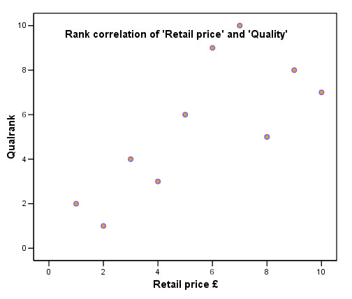
Q. What does the chart tell you about the relationship between the two variables?
Task: Carry out the analysis as before....
Click 'Analyse', 'Correlation', 'Bivariate data'
Transfer both variables ('Retail£' and 'Qualrank') over to the variables box.
Tick only 'Spearman's', 'two tailed' and 'Flag any significance'
Click 'OK'
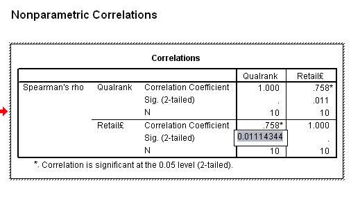
Task: Look at the SPSS output above (with exact significance flagged). So what advice would you give to a friend intending to buy one of these machines?
Task: Here is the manual maths for verification .....check this for yourself
So: rs = 1 - (6 x 40) ÷10*(99)
= 1 - (240 ÷ 990)
= 1 - 0.2424
= 0.7576 (0.758) (note that on this occasion the figure is positive)
Task: Rework the above calculation as though the sum of d squared had been 80. This would have happened if the differences between the ranks had been greater. What happens to rs and how do you interpret this in terms of the level of correlation calculated?
Another example to work through on your own...
 In some recent 'mock' exams, 10 students took a Statistics test and an Economics
test. The chart below does not give their actual scores but it does show their
rankings in both tests. Is their any correlation between the two sets?
In some recent 'mock' exams, 10 students took a Statistics test and an Economics
test. The chart below does not give their actual scores but it does show their
rankings in both tests. Is their any correlation between the two sets?
| Student |
'Statistics' placing |
'Economics' placing |
| A |
1 | 6 |
| B |
2 | 3 |
| C |
3 | 2 |
| D |
4 | 10 |
| E |
5 | 1 |
| F |
6 | 9 |
| G |
7 | 4 |
| H |
8 | 7 |
| I |
9 | 8 |
| J |
10 | 5 |
Tasks:Write out H0 and H1 fully. Enter the data into SPSS yourself.
Your Rank correlation chart should look like this....
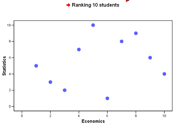
Give your conclusions making especial note of any correlation that might exist between the two subjects.
Use the following dataset: SPex 44 ranking students
![]()