
[Focus 10a]Pearson's Product Moment Correlation Coefficient (PPMCC) |
We
have seen that a correlation test can be performed using the Spearman's Rank test
if one or both
or the variables falls on the Ordinal scale.
Following
on from that, if both variables reach the Interval or Ratio
scale... and are Normally
distributed we can use the more robust
Pearson's test. The actual theory behind the test
is different
but the outcome is similar in that we eventually calculate rp
(the Pearson correlation) and the possible range is still -1 through zero to +1.
Remember, as the rp value approaches
+1 or -1 so the correlation gets stronger and at zero there is no association
between the variables at all or so it would seem.
| General
rule: Always
bear in mind though that your research designs (or field observations) are rarely
so pure that you can state with certainty that the variables you have chosen to
measure have not been affected by some other non-recorded influence. Neither animals, people, the weather or business systems are ever that cooperative !! Always be clear but cautious when drawing your conclusions. |
One very important difference between the Spearman's test and the Pearson's test is that we have to use the actual values (and cannot resort to using ranks) e.g. £ vs time, weight vs length or hours vs numbers of people or expenditure vs income etc. It is here that we can see that the PPMCC test is going to be more robust as there is no 'condensing' of the data and no 'blending' of arbitrary 'scores' to produce ranking.
Remember
to construct a scatter plot
before
commencing the analysis because it will give you a good early indication of what
rp is going to be and will reassure you that you
have done the
subsequent calculation correctly.
The manual procedure requires a rather lengthy table to be constructed because, besides values for x and y; we need to calculate x squared, y squared, xy and sigma values for each of these 5 columns as well as sigma x squared and sigma y squared!!
The null hypothesis is tested by comparing our PPMCC test statistic (rp) with a critical value from the tables. As with the Spearman's test, we must accept the alternative hypothesis if the calculated test statistic (rp) falls outside of that +/- range indicated by the critical value.
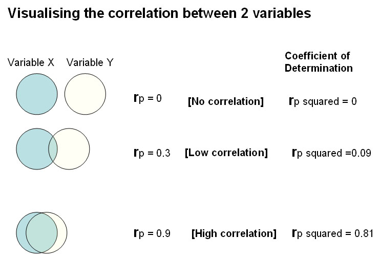
The Coefficient of Determination
Because the correlation coefficient is an index, it only gives us an indication or general interpretation of the correlation. Usually this is sufficient but we can also calculate a derivitive value that is much more precise... The Coefficient of Determination is a measure derived from the Pearson correlation coefficient and is in fact, simply the squred value of it. This offers an easy way of getting a clearer idea idea of the true degree of correlation between two variables. It is the percentage of variance in one variable that is accounted for by the variance in the other.
In the chart below there are three situations outlined. In the first there is no correlation so rp and rp squared are both zero. In the second situation, there is an overlap, the correlation is 0.3 and therefore coefficient of determination is 0.3*0.3 = 0.09. This indicates that they share about 9% of the variance betwen themselves.
In the last example, they overlap heavily , the correlation is high and they share about 81% of the variance between themselves.
Correlation and Significance
Just as with rs, rp indicates the strength or degree of the supposed association between the two variables. The value for the probability (P) relates to H0 and H1. It gives us the ability to judge the likelihood of H1 or H0 representing the true state of affairs.
It is part of the task to try to explain the variation present in a dataset. Thus, the higher the correlation co-efficient value; the more of the variation that becomes 'explained' and of course, the less variation there actually is. In the chart below, we see a high correlation value and a low level of variation.
How sure are we that any measured supposed association is the true state of affairs?
Task:
Write out a simple H0 and H1 for
the charts below, take note of the Pearson correlation value....
and the significance
levels:
Q. Which of your two hypotheses did you accept and why?
---------------------------------------------------------------------------------------------------------------------------
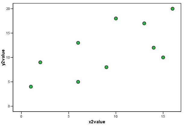
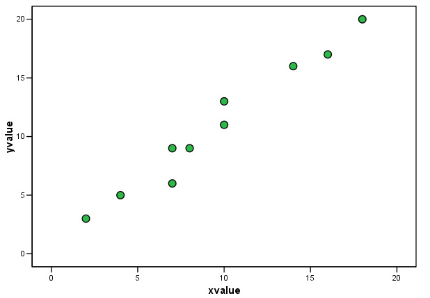
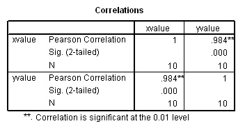
Task: Compare the two rp values with the patterns displayed on the respective charts.
In both cases the direction and slope of the scatter points seem broadly similar. In the first chart, rp = 0.984; an almost perfect positive correlation and the correlation is highly significant (P< 0.01). As the data becomes more 'scattered' (i.e. more variation), even though there is still a clear similarity to the direction and pattern of the data, we become less sure of the significance of the relationship between x and y.
..... It is usual to see that as the correlation diminishes; so does the significance.
| Cautionary note 1: There is always the possibility that there is a strong relationship between two variables but that it is not linear. If, for example, the scattergraph produces a definite curve, the low correlation coefficient might be misinterpreted as indicating no strong correlation. However, there may still be a strong correlation but it is not linear. If this occurs, and you suspect that there is a non-linear relationship, you may wish to consider transforming the data first. (See also Focus 11) |
| Cautionary note 2, about 'cause and effect': You must be satisfied that both variables are normally distributed before using PPMCC and the status of the two variables you are using. In the next example, we have placed 'raw materials costs' on the X axis as the independent variable and 'retail price' on the Y axis as the dependent variable. The problem is that we are making certain assumptions about a relationship existing even before we begin the analysis and this is dangerous. |
The manual calculation of PPMCC
 At the Britmax motorcycle factory... The retail price
of their best-selling bike, the GT 80, has been compared to the raw materials
unit costs every 6 months over the past 6 years.....
At the Britmax motorcycle factory... The retail price
of their best-selling bike, the GT 80, has been compared to the raw materials
unit costs every 6 months over the past 6 years.....
| Raw
materials cost (£) [x] |
Retail Price (£)
[y] |
| 540 |
975 |
| 580 |
990 |
| 580 |
1040 |
| 590 |
1020 |
| 620 |
1095 |
| 640 |
1045 |
| 650 |
1060 |
| 712 |
1140 |
| 740 |
1100 |
| 760 |
1195 |
| 790 |
1195 |
| 805 |
1225 |
| Totals:..8007 |
13080 |
| Totals
squared: 64,112,049 | 171,086,400 |
First plot the graph.... any deductions to be made at this stage? Clue: has the raw material cost altered (as a percentage) when compared to the retail price? In order to maintain their original margin, the latest retail price should be £1454, why do you think it is not?
Q. What can you say about the relationship between values for 'x' and 'y' so far?
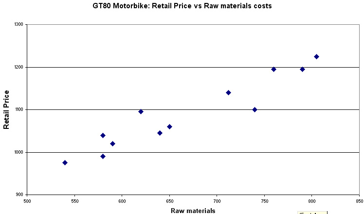
The graph suggests that there is a strong positive relationship here between the two variables and there appears to be a specified uni-directional difference. Hence we will adopt a one-tailed approach to the test. If we merely wanted to know if there was any relationship, positve or negative, then a two-tailed approach would be more appropriate.
A note about one and two-tailed tests; This is a system for testing a null hypothesis against different alternative hypotheses. There are three possible situations for the alternative hypothesis 1)
the value of the parameter is different from that in the null Case 1) would require a two-taled approach to testing whilst 2) and 3) would a one-tailed approach |
We will need to know the number of degrees of freedom when we check the critical values for rp. The d.f. is calculated as the number of data pairs minus 2, i.e. n = 12 here, therefore d.f = 10)
Question: "Is there any correlation between unit cost of raw materials and the retail price? We are not asking "Is one factor dependent upon the other", we are asking "is there a relationship, if there is; is it positive or negative and can we quantify the strength of any relationship?
The null hypothesis will be that there is no correlation between these two variables.
That is.........Ho: rp = 0
The alternative hypothesis will state that there is a correlation between the two variables.
We now need to calculate all the derivatives. In order that the very large figures involved, do not lead to calculator errors, it is legitimate to move the decimal place. In this case, we have moved it two places to the left e.g 540 become 5.4 and 975 become 9.75 etc ...
| Raw
materials cost (£) [x] |
Retail Price (£)
[y] |
| 540 |
975 |
| 580 |
990 |
| 580 |
1040 |
| 590 |
1020 |
| 620 |
1095 |
| 640 |
1045 |
| 650 |
1060 |
| 712 |
1140 |
| 740 |
1100 |
| 760 |
1195 |
| 790 |
1195 |
| 805 |
1225 |
| Totals:..8007 |
13080 |
| Totals
squared: 64,112,049 | 171,086,400 |
|
(The
decimal placed has been moved prior to deriving these values)
| ||
| x
squared | y
squared | xy |
| 29.16 |
95.06 |
52.65 |
| 33.64 |
98.01 |
57.42 |
| 33.64 |
108.16 |
60.32 |
| 34.81 |
104.04 |
60.18 |
| 38.44 |
119.90 |
67.89 |
| 40.96 |
109.20 |
66.88 |
| 42.25 |
112.36 |
68.90 |
| 50.69 |
129.96 |
81.17 |
| 54.76 |
121.00 |
81.40 |
| 57.76 |
142.80 |
90.82 |
| 62.41 |
142.80 |
94.41 |
| 64.80 |
150.06 |
98.61 |
| 543.32 |
1433.35 |
880.65 |
Do be very clear
that you appreciate the difference between 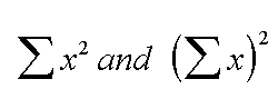 ...in
the above example, the former would be 5,433,269 and the latter would be 8007
squared = 64,112,049. The former means " the sum of all the x squareds";
the latter means " the sum of all the x's and then square that sum"
...in
the above example, the former would be 5,433,269 and the latter would be 8007
squared = 64,112,049. The former means " the sum of all the x squareds";
the latter means " the sum of all the x's and then square that sum"
The formula to use looks daunting (see below) but once you have completed the table (as above) it is really quite straight forward unless the figures become too large and unmanageable. As with many statistical formulae; it is a question of substitution. This is a clear example where the computer has the advantage over a manual system but it is still important that you appreciate how and why a particular result is obtained before relying too heavily upon an SPSS output.
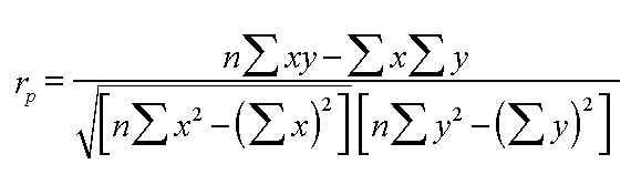
Here
is the full maths workings to show that they are not that complex if you simplify
in set stages.
So in total we need 8 mathematical values to do this calculation
and it is a good idea to re-tabulate the figures you need before inserting them
into the equation....
| Sigma
xy | 880.65 |
Sigma
(y squared) | 1433.35 |
| Sigma
x | 80.07 |
(Sigma
x).... squared | 6411.2 |
| Sigma
y | 130.80 |
(Sigma
y).... squared | 17108.6 |
| Sigma
(x squared) | 543.32 |
n |
12 |
Thus......
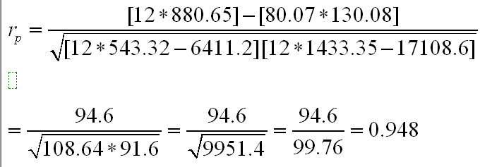
So rp = 0.948; a strong positive correlation. Note that with such large numbers, rounding effects can be quite noticeable. In this instance values for rp could vary from .947 to .951. It is usual to only give a correlation coefficient to three decimal places.
Check back to the scatter plot. Does this result seem to agree with the display?
A strong positive correlation but is the result significant? After all, our sample size is quite small and as we have often warned, do not be tempted to draw definitive conclusions where small sample sizes are concerned unless you have properly tested for significance.
Remember
what the confidence (P-value) is telling us in these cases.
We are only
ever able to look at samples but it is really the whole population that
we are interested
in so we are saying in effect "how confident can we
be that our result would accurately reflect the
true situation to be found
in the whole population?".
From
tables (see below) giving the critical values for rp:
rp critical
value [with P(0.05), d.f = 10)] = ± 0.576
(from Wheater and Cook(2000), p220) and displayed fully below:
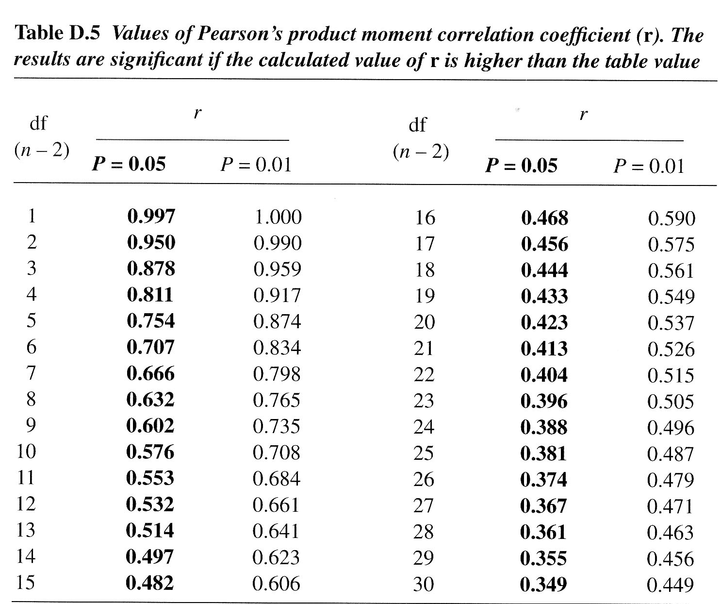
0.948 > 0.576. In other words, our test statistic is well outside of the critical value and so we must accept the alternative hypothesis viz: there is a significant correlation here. Now read off the P(0.01) critical value and again compare to our test statistic.....
In conclusion we can say that there is a strong positive correlation between the raw materials cost and the retail price and that the result is significant at the 95% level and also at the 99% level.
In
simple terms, the higher the costs, the higher the retail price (Care!
there may be other factors that
can influence the retail cost such
as wages and competition so as always; be very careful about drawing extended
conclusions from your research.)
If you wish to check the calculation using SPSS, your output should look like this:
(The procedure is exactly the same as for the Spearman test except that you tick the Pearson box instead).

The data set is available:SPex46 Britmax costs
| Useful tip: Not all text books carry tables giving critical values of rp. However, the student t-test probability / d.f tables (eg. Curwin and Slater (2002) Appendix D) can be used but an extra stage of formula maths has to be used to calculate the individual test statistic.
In the above example, we would look up the critical value for 10 d.f and 5% sig level = 1.81. Now insert rp =0.948 into the equation and eventually we find: t =(0.948 * 3.162) ÷ 0.3178 = 9.43 Compare the values: 9.43 > 1.81 Therefore reject H0 and accept H1 |
In the interests of cost -efficiency; Brimax Motorcycles
have asked you to investigate the relationship between productivity and the number
of line workers on duty. It is clear that the relationship is not a simple one....
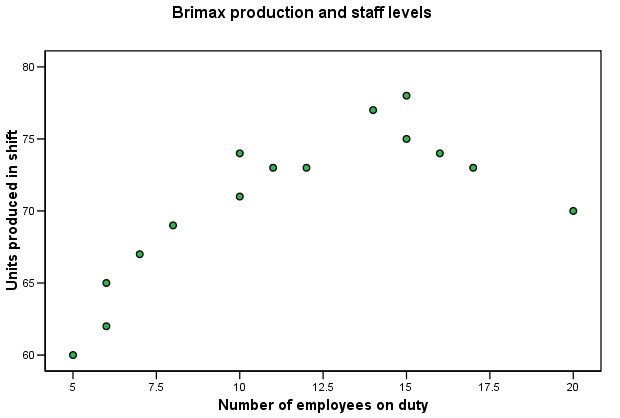
Tasks: Comment on the 'shape' of the chart, is there an apparent optimum staffing level? Clue: remember that charts can be deceptive, notice how different the X and Y scales are. Look at the first point: 5 staff produce 60 units whilst 10 staff only manage another 11 and 20 twenty staff produce no more than 10 do! The shape of the chart indicates that production actually falls when 15+ staff are on duty.
Construct
H0 and H1. Carry out a Pearson's
correlation test.
The
data set is available: Spex45
Britmax production
Write a short report to the M.D about your findings, conclusions and recommendations.
Q. Can you suggest a reason why a Pearson correlation test might be inappropriate in this instance? Clue: Although there is quite a strong correlation shown in your SPSS output (.722), you should remember that correlations only measure essentially linear relationships, also the sample size is quite small. Ideally, sample sizes of 30+ are more reliable for this type of analysis
 Fli-Lo plc, the low-cost airline have seen their share prices increase
by 39.4% over an 11 year period. How does this fact compare with the changes in
the companies profits? The profits have fluctuated considerably during the same
period even though the overall increase is 29.5%. The latest share price stands
at 145.
Fli-Lo plc, the low-cost airline have seen their share prices increase
by 39.4% over an 11 year period. How does this fact compare with the changes in
the companies profits? The profits have fluctuated considerably during the same
period even though the overall increase is 29.5%. The latest share price stands
at 145.
The dataset is available: SPex 47 Fli-lo profits
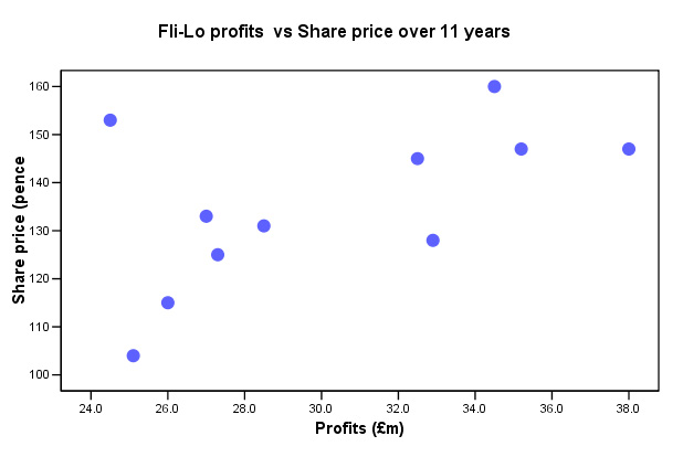
Tasks: Write H0 and H1. Carry out the correct analysis in SPSS. What is the value of rp? Is the result significant at the 10% level, the 5% level. Why do you think the correlation is not stronger than it is? Clue: Sample size?
Q. What other commercial factors may be at work here? Clue: Other market forces, maintenance costs, competition from other low-cost airline, fuel costs, reinvestments, lower dividend payouts?
Q. How would you define 'dependent variable' and 'independent variable' in this instance? Clue: which variable has been allocated to which axis in the chart above?
Another SPSS data set to work through....
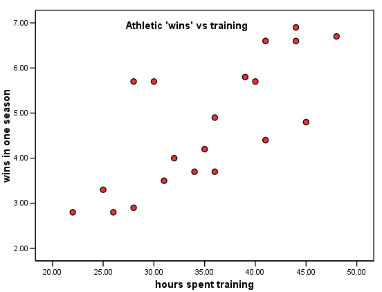
 The National Athletics Foundation (N.A.F) wants to
know if there is a relationship between the number of hours per week that athletes
train and the mean number of 'wins' each of them has in a full season (this actually
has to be 'number of wins' ÷ 'number of competitions entered').
The National Athletics Foundation (N.A.F) wants to
know if there is a relationship between the number of hours per week that athletes
train and the mean number of 'wins' each of them has in a full season (this actually
has to be 'number of wins' ÷ 'number of competitions entered').
They
ask the Head Coach to monitor his top 20 athletes. Use your calculator to complete
the table...
| Athlete |
Number of training hours per week(x) | number of 'wins'(y) | x squared | y squared | xy |
| A |
35 |
4.2 | |||
| B |
36 |
3.7 | |||
| C |
41 |
4.4 | |||
| D |
28 |
2.9 | |||
| E |
40 |
5.7 | |||
| F |
45 |
4.8 | |||
| G |
25 |
3.3 | |||
| I |
48 |
6.7 | |||
| J |
36 |
4.9 | |||
| K |
22 |
2.8 | |||
| L |
30 |
5.7 | |||
| M |
39 |
5.8 | |||
| N |
44 |
6.6 | |||
| P |
31 |
3.5 | |||
| Q |
32 |
4.0 | |||
| R |
26 |
2.8 | |||
| S |
28 |
5.7 | |||
| T |
41 |
6.6 | |||
| U |
44 |
6.9 | |||
| V |
34 |
3.7 | |||
| Totals: |
|
|
| You may wish to learn other important capabilities* within SPSS at this point; The 'Transform / compute' commandOpen: SPsmex17 athlete wins In the spreadsheet, you will notice that the fourth column ( y squared) has been left blank. *We will now produce a column which contains all the y squared values.... Drop down the 'Transform' menu and click on 'Compute', the 'Compute Variable' window will appear Type 'winsqd' in the target variable box, then transfer 'wins' to the numeric expression box, click * on the keypad for multiplication and then transfer 'wins' again. The expression should now read: 'wins*wins'. Click
'OK' and the new data will appear in the 'winsqd' column * The compute command can also be used to correct for linearity and the above example might be treated in this way.Try using the log values of x and y (already saved in your dataset) and see if this makes a difference to the correlaton outcome and / or the appearance of the plotted chart. |
TASK: Write H0 and H1. Using SPSS, calculate the Pearson & Spearman r values and respective P-values and write your conclusions in the form of a brief report for the N.A.F. Management team.
Q. Did the Spearman's and Pearson's test give similar results?
Task: Comment on the chart shown below, what can you say about the 'spread' of the points around 25 hours and around 45 hours?.
Thinking about Focus 11 next (Regression).... Q. If we were to compute a 'line of best fit' through this data, how would you best describe the differing distances that each point displays from that line?
Q.
What recommendations (based upon your findings) would you make about future research
into
the subject?
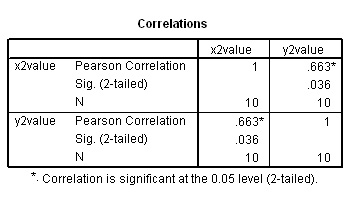
Multiple Correlations using SPSS..
When there are more than two variables being considered, SPSS can give a correlation matrix as part of the output, The results above the principal diagonal (blue below) are duplicated below it (indicated in black below). We deal more fully with the issue of multi-variable analysis in Focus 14 and Focus 15 where the importance of the correlation matrix is highligted. At this stage it is simply necessary to make the link between simple two-variable correlation and multiple correlation.
In the correlation matrix below, there are 6 variables under test so there
are 15 pairs of comparisons possible and so there are going to be 15 rp
values created:
Variable | A | B | C | D | E | F |
A | rp1 | rp2 | rp3 | rp4 | rp5 | |
B | rp6 | rp7 | rp8 | rp9 | ||
C | rp10 | rp11 | rp12 | |||
D | rp13 | rp14 | ||||
E | rp15 | |||||
F |
In the next example, we have only 3 variables (all clearly parametric ) to consider and so there will be 3 rp values produced....
Fli-Lo plc have planes up to 18 years old in their
fleet. They wish to investigate the degree of association between age (in months),
annual £ maintenance cost(£'000) and miles flown between overhauls
(m 0'000). 30 planes are checked.
You will now have to calculate three different Pearson correlations. You will begin to appreciate at this point, that once we move from dealing with two variables, to dealing with three or more; statistical procedures get more difficult.
| Get into the habit of controlling
zero's without misplacing decimal points. When seen in a large table; a series of noughts and commas will only confuse. Once you have moved a decimal point for a given variable, do not then change it. |
So the first line shown below indicates: Aeroplane 1) 203 months old, maintenance cost: £61,000 p.a. and 700,000 miles flown
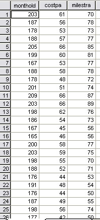
Use: SPsmex16 Age of Planes for the analysis
SPSS will generate a 'correlation matrix' if all 3 variables are carried over (in 'Bivariate data')....do not confuse this procedure with 'Multiple correlation'. In other words, the three correlations examined individually will be: X~Y, X~Z & Y~Z.
Here is the first comparison....
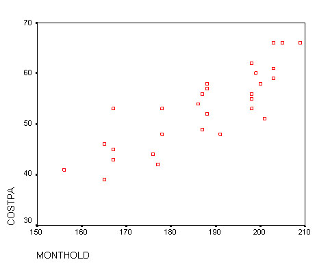
Task:
Write H0 and H1. Now work out how
to plot all three comparisons on one chart as illustrated below.
Do not try
to fit any lines!
To produce a 3-D plot with SPSS: >>>> Select 'Graphs' from the drop down menu. Select
'Scatter', '3-D' and in the dialogue box; transfer 'CostPA' to the Y axis, 'Monthold'
to the X axis
|
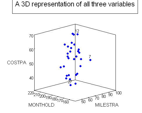
Task:
Comment upon the three rs values you have obtained. Note
the critical values....
From tables: P (0.05)(28d.f = 0.361) & P (0.01)
(28d.f = 0.463)
Q. Of the three associations measured which is the strongest?
Q. Would you say that there is any graphical evidence of 'clustering'? (This refers to the possibility of patterns or 'clouds' of data points appearing in a 2D or 3D chart).
Task: Produce and comment upon the findings for planes numbered 7, 12 & 27 from the chart above. For example, which of these planes would you say was the most efficient in terms of maintenance costs vs distance travelled.
A more complex Correlation matrix....
 Here is a data set about the value of cars. There are 4 different parametric variables
involved so there will be 6 possible rp
values to calculate. 10 motor cars, all registered in October 2000, were compared.
The 4 variables were:
Here is a data set about the value of cars. There are 4 different parametric variables
involved so there will be 6 possible rp
values to calculate. 10 motor cars, all registered in October 2000, were compared.
The 4 variables were:
| A | Mileage at 3 years old |
| B | Original price |
| C | Value at 3 years old |
| D | Predicted value at 5 years old |
Use dataset: SPex 74 Car values
Open
SPSS:
Go to 'Analyse', 'Correlate',and 'Bivariate'
Transfer
all 4 variables to the Variables box and continue as before...
Remember to
tick the 'flag all significant results' box.
Remember again: this procedure is not the same as 'multiple correlation'.
Here
is the SPSS output: 
There
is a strong positive correlation between and the value at both 3 (.855) and 5
years (.948) old.
There is a fairly strong negative correlation between mileage
and value at 3 (-.690) and 5 years (-.685) old.
Here is just one of the possible chart outputs......
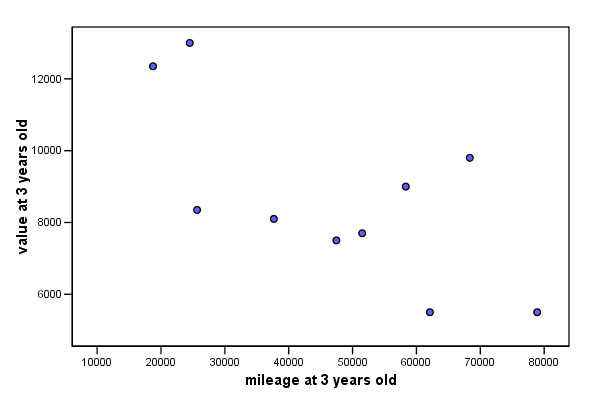 rp
= -0.690
rp
= -0.690
Q. Is this what you would have expected?
There is another 'family' of statistical techniques known collectively as the 'Analysis of variance'. They are used when you want to find out about differences between a number of groups but all in one process rather than as a number of 'mini-comparisons'. They derive in part from t-tests(Focus 6 and 6a). We will explore the subject in Focus 12 (Analysis of Variance).

Caution! Computers are not intelligent! There is little actual point in trying to correlate mileage with original price because the mileage would have been zero! But SPSS will compute all combinations of the 4 variables entered. It is up to you to understand what outputs are valid and which are spurious. |
Often correlations between two variables are made that are quite unrealistic. For example, is there a correlation between the number of Christmas presents received and how many chimneys your house has got? The usual example cited here is the birth rate in the UK and the number of Storks and in America, the amount of coffee consumed correlates with the national divorce rate!
| Caution:
Be aware that spurious correlations are easy to make... but not always easy to
spot in the work of others! |
Often correlations are used to try to prove that a particular cause has produced a particular effect such as smoking and lung cancer but it should be remembered that non-smokers can also suffer from lung cancer. Correlations do not set out to prove a relationship but try to establish a possible association and to quantify that association, that is all.
In many cases of association, there will be a number of other factors / variables (see: Confounding variable: (Focus 1) that interplay to give the outcomes that are observed. So do not be tempted to go beyond 'reasonable doubt' when writing conclusions in your reports.
![]()
Back to Focus 10
On to Focus 11
Back to 'Quick View' contents