
[Focus 9]More about Frequency AnalysisTesting for NormalityThe 2 Kolmogorov-Smirnov (K-S) tests...(for normality and two-sample) |
You may first wish to re-read the material about normal distributions in Focus 3 and 3c interactive.
We
have seen that a properly constructed histogram can quickly reveal the main features
of a distribution and it will show up the presence of any unusual features such
as 'skewness' or a
bimodal (two peaks instead of just one) profile.
A note about Binomial distributions.The data generated by a particular variable may be found to have two outcomes. 'Male' or 'Female', 'Yes' or 'No' are examples. If the outcomes are independent in the sense that one outcome has no bearing on the next, then the variable is binomial. Do not therefore, confuse a bimodal histogram with a binomial distribution. |
We have commented many times that before embarking upon any statistical procedure, it is essential to establish exactly which tests are appropriate. If your data set does not comply with a normal distribution then non-parametric tests (or other lines of enquiry) are necessary. Non-parametric tests may be weaker in terms of reliability of results.
| We have discussed the issue of dealing with Ordinal data as though it were Interval data. Although this is common in market research circles; the practice is technically and ethically wrong and should not be condoned. |
In some cases, a transformation (of the variable to the log or square of the values for example), will 'create a normal distribution' mathematically and thus allow parametric tests to be used in preference to non-parametric tests.
So essentially, we need in some way, to test definitively for Normality..
There are two courses of action here....
1) graphical & 2) using one version of the K-S test i.e. the test for Normality.
The aim of a linear transformation is to produce a line which replaces yet represents the familiar bell-shaped curve. The line might be straight, curved or deflected in one area only. The key point to remember is that the straighter that line is, the closer the approximation is to a normal distribution. Generally, this technique is somewhat unsatisfactory because the degree of 'straightness' is still arbitrary as the following example demonstrates.....
We will discuss transformations again in Focus 11
We must revisit another concept here and that is the Standard Normal Curve . To refresh your memory, this is a perfectly symmetrical curve where the mean is zero and the standard deviation is one. You will see this curve notated as: N (0, 1) and if we perform a linear transformation on such a curve then a perfect straight line will be produced.
 Motoquoto plc (car insurance) have recently set up a complaints hotline
for their customers at their national call centre. They want to monitor the
response times to customer complaints. Here we have the logged figures
for the month of June. There were 66 complaints in all...
Motoquoto plc (car insurance) have recently set up a complaints hotline
for their customers at their national call centre. They want to monitor the
response times to customer complaints. Here we have the logged figures
for the month of June. There were 66 complaints in all...
The mean response time (x bar) was found to be 3.4 days.
Here is the full data set:
(the data has been arranged to run from smallest to largest values)
| 1 |
2 |
3 |
3 |
3 |
4 |
5 |
6 |
| 1 |
2 |
3 |
3 |
3 |
4 |
5 |
7 |
| 1 |
2 |
3 |
3 |
3 |
4 |
5 |
7 |
| 2 |
2 |
3 |
3 |
3 |
4 |
5 |
|
| 2 |
2 |
3 |
3 |
3 |
4 |
5 | |
| 2 |
2 |
3 |
3 |
3 |
4 |
5 | |
| 2 |
3 |
3 |
3 |
3 |
4 |
6 | |
| 2 |
3 |
3 |
3 |
3 |
4 |
6 | |
| 2 |
3 |
3 |
3 |
4 |
5 |
6 |
Let us first construct a bar chart of this data and mark the mean time value:
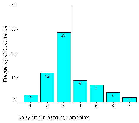
Q. Why a bar chart rather than a histogram here?
Certainly
the graph indicates one peak but the tails indicate a longer tail to the right
, in other words,
the data is positively skewed. Note that with regards to
'skewness' we always refer to the skewness
of the tails
and not to the relative position of the peak.
Right
skew = positive and Left
skew = negative
Q. Is this distribution uniform enough to be considered as a normal distribution?
Next we must produce a Cumulative Frequency Table as we have done before. (Also check out Ogives if you need to remind yourself).
| Value (in days) | Frequency
of occurrence | %
freq | Cumulative
freq % | (nearest table value; from book) | z-value
(from tables) |
|
1 |
3 |
4.5 |
4.5 |
.0455 |
-1.69 |
| 2 |
12 |
18.2 |
22.7 |
.2266 |
-
0.75 |
| 3 |
29 |
44.0 |
100-
66.6 = 33.4 | .3336 |
0.43 |
| 4 |
9 |
13.6 |
100-
80.3 = 19.7 | .1977 |
0.85 |
| 5 |
7 |
10.6 |
100-
90.9 = 9.1 | .0901 |
1.34 |
| 6 |
4 |
6.1 |
100-
97.0 = 3.0 | .0301 |
1.88 |
| 7 |
2 |
3.0 |
100
.(>0) | .0002 |
3.50 |
Now plot cumulative f against z; a perfect straight line would indicate that the data is normally distributed....
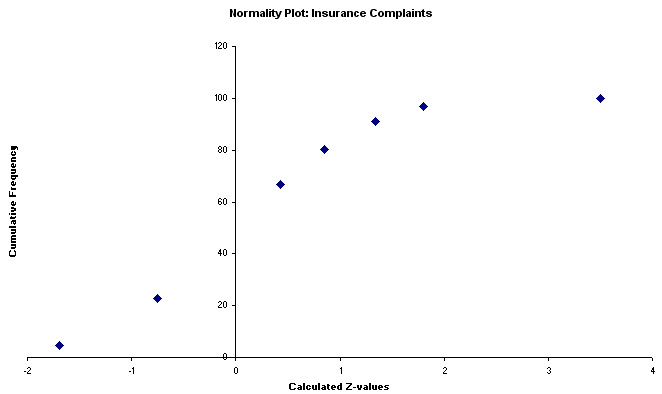
But
we have a problem.....the Excel chart above shows an approximation to a normal
distribution except that the downward kink at the top indicates that our
data is in fact, skewed to the right.
However, the overall distribution of
the points does seem to lay approximately along a straight line, the implication
would be that the samples do come from a normally distributed population.
The decision is certainly not clear cut because one might equally say that the
line follows a gentle curve! So which hypothesis is correct!!?
Q. Can we treat this as normally distributed data or not? Discuss.
Often called probability plots, they are similar to the one described above and again, are intended to produce a straight line if the input data is normally distributed. ('Q' stands for quantile in this case)
Using SPSS open the dataset: SPsmex11complaint days
Go
to 'Graphs', 'Q-Q', tick 'standardise data'
Ensure that the distribution
type for comparison is the default setting 'normal'.
Click 'OK'.
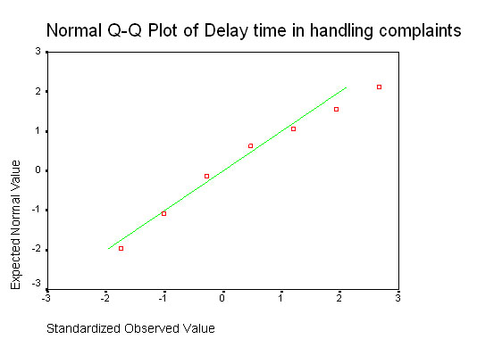
Once again, we have a plot that approximates to a straight line but is nevertheless not truly straight! What is needed is a mathematical procedure upon which a recognised level of confidence on the outcome can be placed.....
We have shown that the graphic method(s) is indicative but not definitive. Some sort of 'benchmark of confidence' needs to be laid down. Fortunately there is a test that can be applied to Ordinal, Interval and Ratio data that will help us to make that final decision.
This is an absolutely essential 'goodness of fit' test.
We will soon be able to place a 95% confidence level on our decision if we use this test for Normality version of the K-S test.
Both versions of the K-S test have one thing in common, they compare two cumulative frequency distributions. They look at differences between the distributions of sets of 2 samples. A significant difference might mean that the population medians are different (if Ordinal data is used), the variances are different or that the shapes of the distributions are different.
Now:
what if, instead of working with two sets of experimental data for comparisons,
we specified
that one of the data sets had to be a
standard normal distribution to begin with? We have given ourselves a 'benchmark'
to which we can try to relate our test dataset. How closely will the test
dataset superimpose upon the benchmark standard normality curve?.
If
there is little or no discrepancy, we can say that our test set is normally distributed
(H0). Conversely,
if the P-value that we calculate
yields P>0.05, then our sample does not come from a population that
is normally distributed (H1). We are objectively comparing
our test distribution with a known theoretical one.
The K-S test of normality (called 'goodness-of-fit' in SPSS) uses a similar philosophy to the one we encountered for Chi-squared...that of OBSERVED Vs EXPECTED frequencies..
Looking back to the Q-Q plot (complaints data) above, we would be asking "how closely does the line through our data relate to a line produced by a standard normal distribution".
The null hypothesis will therefore be:
H0 "There is no difference between the distribution of the test sample and a standard normal distribution". That would mean that our test dataset was normally distributed.
H1 "The alternative hypothesis will state that there is a difference and therefore our sample is not normally distributed".
Open SPSS
Choose: enter data
In variable view name the variable (think what the variable here is)
Switch to data view and enter the data from the above table (66 complaints etc)
Choose 'Analyse', 'Nonparametric tests', '1-sample K-S' (SPSS will now know that the comparison with a n.d is to be made)
Transfer the variable to the Test variable list
Check that the default 'Normal' checkbox is ticked
Click 'OK'
Your output should look like this:
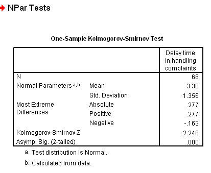
A Z value of 2.248 has a corresponding standard normal probability value of 0.9877. This result is clearly significant and so we must accept the alternative hypothesis.
We therefore conclude that this data is not normally distributed.
The dataset is available at: SPsmex11 complaint days
Q. Can you write out an accurate concluding statement based on this result? (refer back to the histogram).
In SPSS, it is possible to assess for Normality... with an automatic graphs output.
 24 journalists were given a standard psychometric test to assess their suitability
for promotion to a senior position within a large newspaper group. In order that
statistical analysis of the group could be carried out later, it was necessary
to find out if they were a representative group. So test 1 was to find out if
their individual scores (range 0.0 - 20.0) were normally distributed?
24 journalists were given a standard psychometric test to assess their suitability
for promotion to a senior position within a large newspaper group. In order that
statistical analysis of the group could be carried out later, it was necessary
to find out if they were a representative group. So test 1 was to find out if
their individual scores (range 0.0 - 20.0) were normally distributed?
Open the dataset: SPex40 Psychometric tests
Go to: 'Analyse', 'Descriptives', 'Explore'.
Transfer 'Test' to the factor box (although there is only one factor in this instance) and 'Score' to the dependent box.
Tick 'Display both'. Click 'plot' and tick 'Histograms and 'Normality Plots with tests', click 'continue'
On the 'Options' button click 'Exclude cases pairwise', click 'continue' and 'OK'
You should see a long output that includes the K-S result, the histogram & the Q-Q plot all together. Spend a little time studying these outputs in order to understand what they are telling you. Look carefully at the normal Q-Q plot in particular.
A non-significant result (P>0.05) indicates normality (i.e no significant difference). P= .200, therefore we confirm the null hypothesis.... that there is no difference between a normal distribution and the data under test.
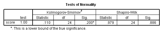
Q. So does this dataset approximate to a normal distribution or not?
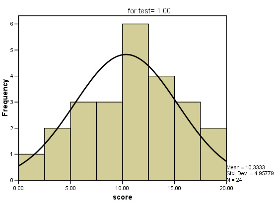
This route will have already generated the appropriate histogram and we can quickly superimpose a n.d curve over it....
Double left click over the histogram to bring up the Chart Editor.
Double left click the image and the 'Histogram Options' window will open.
Tick the 'Normal Curve' option, this will superimpose a normal curve...
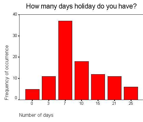
 In a recent questionnaire, 100 office staff were asked about the amount time they
spend abroad each year (measured to the nearest number of whole days).
In a recent questionnaire, 100 office staff were asked about the amount time they
spend abroad each year (measured to the nearest number of whole days).
Task: Use the SPex22 holiday time dataset and carry out the analysis yourself. Can we accept this data as normally distributed or not?
| If
ever you are in doubt about the data you are working with, it is essential to
carry out the above test before attempting to use any parametric tests. If the data proves not to be normally distributed you must only use Non-parametric tests throughout. |
Here we are testing to see if two samples are similarly distributed to the point where it is statistically probable that they came from the same population.....
H0: Both samples are from the same population, H1: samples are from different populations.
Alternatively, we might wish to establish whether or not there is a meaningful difference between two independent distributions. Both may be normally distributed but with a different range or standard deviation. One or other may be normally distributed or neither may be. The main point is; "what level of similarity there is between the two sets of sample values?". The data must be at least on the Ordinal scale.
If the shapes of the two distributions neatly overlap each other, it would be reasonable to suggest that they do come from the same population. We are not wholly concerned with the specific 'shapes' of the 2 distributions; only how closely matched they are to each other.
Here is a worked example....
 The West Mexington Police force have compiled a database of all the cases of shop-lifting
in the County. The report understandably distinguishes between male and female
offenders and between different age groups. We wish to now establish whether there
is any statistically significant difference between males and females with regards
to shop lifting.
The West Mexington Police force have compiled a database of all the cases of shop-lifting
in the County. The report understandably distinguishes between male and female
offenders and between different age groups. We wish to now establish whether there
is any statistically significant difference between males and females with regards
to shop lifting.
We can tell very little from the total numbers because it is a sample from a population of unknown size and the offenders caught may not be representative of the whole population or of the overall Police effort in fighting crime. Remember that now we are comparing the two sets of data with each other, we are not trying to establish whether or not they are normally distributed. It is not necessary for the two sets to be of the same size.
Our H0 will be:
" There is no difference in the shop lifting pattern exhibited by males and that exhibited by females "
The
method is to establish the maximum absolute difference (D)
between the two cumulative %'s and then compare that to a critical value found
in the K-S tables or from formula calculation. If the sample sizes of both
sets is less than 50,
it is possible to go straight to the K-S tables to look up the critical value
for both the 5% confidence level and the more stringent 1% level.
If
the sample sizes exceed 50 (in either set), we have
to use two formulae to obtain the tabulation critical value to compare with our
calculated D-value.
Here is the data set for 2004:
| Age |
Males caught | Females caught | %
of Male total | %
of Female total | Cum
% Male | Cum
% Female | D
= max diff.... ..100 |
| 6
- 12 | 15 |
46 |
18.5 |
33.1 |
18.5 |
33.1 |
0.146 |
| 13
- 17 | 12 |
26 |
14.8 |
18.7 |
33.3 |
51.8 |
0.185 |
| 18
- 30 | 30 |
37 |
37.0 |
26.7 |
70.3 |
78.5 |
0.082 |
| 31
- 60 | 20 |
28 |
24.8 |
20.1 |
95.1 |
98.6 |
0.035 |
| 60+ |
4 |
2 |
4.9 |
1.4 |
100.0 |
100.0 | |
| TOTALS |
81(Na) |
139(Nb) |
100.0 |
100.0 |
The largest differential
(the maximum absolute difference) is shown by the 13 - 17
age group
51.8 - 33.3 =
18.5, so our D-value is
0.185
For the comparison, we must calculate the critical K-S value use the following formulae because our sample sizes both exceed 50 .....
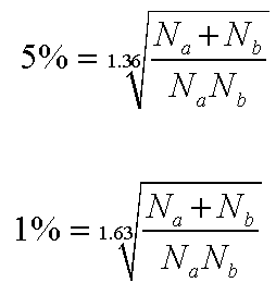
Inserting the actual figures using the 5% values.....
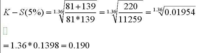
So K-S tabulated critical value (5%) = 0.190
& similarly, K-S tabulated critical value (1%) = 0.228
Our calculated test result (D)(0.05) was 0.185 and is less than critical value and this means that it has not reached a 'critical mass' sufficient to make us accept H1 and so we confirm the null hypothesis. You can also see that we are understandably even further away from accepting any alternative hypothesis at the 1% level!
If you wish to use SPSS for this type of analysis, follow the navigation shown below but do note the difference in output. Here we are given a Z value and a specific P value of 0.329 ( a long way from being significant!):
When entering the data in 'data view' you will need 2 value labels for 'sex' and 5 for 'age group'.
Then go to 'Analyse', 'Non-parametric', '2 Independent samples' and tick 'Kolmorogov-Smirnoff Z'......
Your grouping variable is 'Gender' and the test Variable is 'Caught'
Here is the output....
Note: Under 'Frequencies' the output refers to the fact that there are 5 male age categories and 5 female age categories and that there were 'caught' members in all 10 groups. It does not refer to the number of individuals involved.
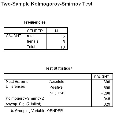
The
high Z-value of .949 indicates that there is no evidence for accepting the alternative
hypothesis
and that suggests that our two gender groups have indeed been
drawn from the same population!
The data set is available as: SPsmex 14 shoplifters
Q. Are the final conclusions still the same? What weaknesses in methodology can you suggest with this type of investigation.
Work the following example for yourself....
 A County Council have devised a staff questionnaire concerning the preferred mode
of transport their office staff use to get to work. The question type involved
here is a determinant choice question i.e choose
1 out of n choices.
A County Council have devised a staff questionnaire concerning the preferred mode
of transport their office staff use to get to work. The question type involved
here is a determinant choice question i.e choose
1 out of n choices.
Gender: M/F [ ] Which of the following modes
of transport is your preferred choice for coming to work? 1.Bus [ ], 2.Train [ ], 3. Car [ ], 4. Bike [ ], 5. Walk [ ] |
We want to know if the distribution (of preference) is the same for men as it is for women.
H0 = "there is no significant difference between the male and female population with regards to preferred modes of transport".
830 men and 830 women were asked to complete the questionnaire.Can you see that the two distributions appear to be quite different but "just how different" is the question?. If we were to show that there was no difference then we would have to accept the null hypothesis.
Put
another way: "Have the samples been drawn from the same population"?
The Plot below shows the frequency of the preferred modes of transport and
the 5 possible modes that were investigated.
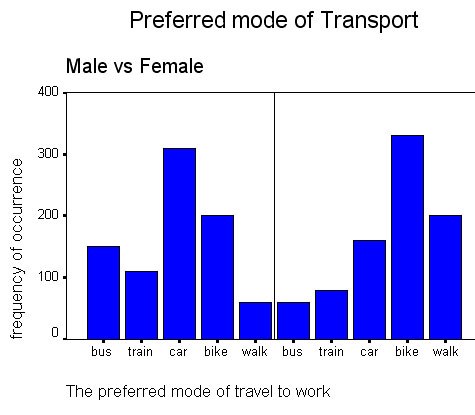
The data set is available as: SPsmex 13 travel to work
Task: Construct H0 and H1 and carry out the analysis as before. Comment on your findings.
![]()
Back to Contents Page
Go back to Focus 8a
Go on to Focus 10