[Focus 2 a]Aspects of Central Tendency... |
DistributionWhat do we really mean by "the Average"?What is "Dispersion?" |
Distribution describes the manner in which the values of a variable occur. The term suggests a 'spread' of values measured against the frequency of occurrence of any particular value. It is the shape of that 'spread' that gives rise to the term 'dispersion'.
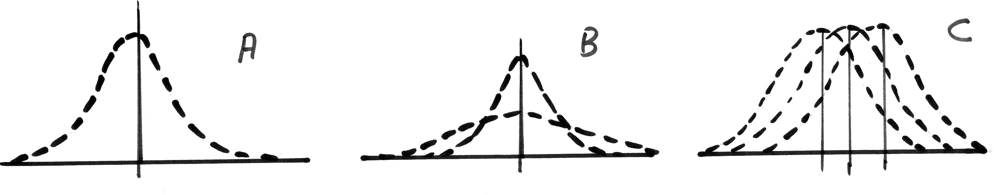
Look at the outline chart below:
'Score' is on the X axis & 'Frequency' is on the Y axis. In 'A', we see a 'Normal distribution' (see Focus 3 and 3c) where the height of the dotted line indicates the frequency of occurrence of a particular value located on the X axis. The vertical line represents the mean value. There are as many values appearing to the left of that line as there are to the right. Also, the area enclosed under the line is exactly the same on both sides of the vertical line. In 'B', there are two cases demonstrated, the peaked curve suggests that most of the values are clustered around the mid-point. We would say that this curve displays narrow dispersion. The flatter line conversely, displays a wide dispersion. In 'C', we have three distributions, all with the same degree of dispersion but displaying different means. |
We have been looking at ways of describing data in pictorial ways and this is always the best way to start but now we must look at ways of extracting deeper information from collected data.
The term 'the average' is used (and much abused) all the time but in a very imprecise way. It is often meant to mean "what is typical" or "what is straightforward". So we hear reference to the 'average person', 'the average family car' and the 'average wage'. Does this mean that that the average person always earns the average wage or if not; does he / she cease to be average?
The word is even used as a term of disparagement such as: " That film was pretty average"or phrases such as "Emma is only average at Netball".
Even within the confines of 'Statistics', the term has a number of possible meanings and the collective term for all of them is: 'measures of central tendency'.
We have already discussed the desirability of being able to take a large amount of numerical data and 'condense it down' to just a few meaningful summary figures...or even down to just one. In business and in research, one has to be realistic and it is always desirable to be succinct because of time, cost and practicality considerations. The danger is not to loose important information when condensing data.
| The great strength of 'Statistics' is that it allows us to see truths that are buried in large sets of numbers. |
Trying to determine what is a 'general case' or a 'general trend' or what is the 'general view' is often the first step in describing the characteristics of a particular set of data.
Even when used correctly, the notion of 'average' can be misleading. It cannot tell us about individual or specific cases. The 'average' global temperature of the earth is 14.36°C but such knowledge will not impress someone living in Siberia at minus 6°C or someone in Ethiopia trying to survive at 31°C. There is nothing inherently special or magical about the temperature 14.36°C. It tells us nothing about the range of temperatures encountered on Earth or where this particular temperature may be found.
| When writing reports and dissertations it is important to use the exact terminology and not general terms like 'average' or 'probably' which might have a more specific technical meaning. |
Many of the inferential tests we will examine later go to great lengths to distinguish between what we have deduced from our samples and how far we can use those results to predict what is happening in the larger population that those samples were indeed taken from.
Consider:
 The Police in Boscombe are to have a 'crackdown' on speeding drivers. Here are
the number of speeding tickets they issued over a period of 20 consecutive days.
The total for the period was 240. In the first 10 days, 77 penalty tickets were
issued, in the second 10 days 163 were issued.
The Police in Boscombe are to have a 'crackdown' on speeding drivers. Here are
the number of speeding tickets they issued over a period of 20 consecutive days.
The total for the period was 240. In the first 10 days, 77 penalty tickets were
issued, in the second 10 days 163 were issued.
| 6 | 6 | 6 | 7 | 8 | 8 | 9 | 9 | 9 | 9 | 11 | 11 | 13 | 15 |
15 | 15 | 16 | 20 | 22 | 25 |
The local newspaper might make any one of the following three statements.....
"The 'average' was 12" (that is: the mean value)(240÷20 = 12)
"The 'median' was 10" (where the blue bar is shown)
"The 'mode' was 9" (the day figure that occurred most often: 4 times)
All 3 are measures of central tendency . There is one thing in common; they are
trying to condense the whole mass of data down to a single figure.
The first figure calculated was the mean. This is simply the sum total of all values divided by the number of readings. i.e. 240/20 = 12 and is the most useful measure of central tendency of the three.
The
simple formula is: 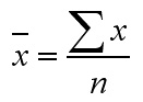 where
Sigma x is the sum of all the values and n is the number of values in the set.
where
Sigma x is the sum of all the values and n is the number of values in the set.
We
normally mean the 'sample mean' and this is given the symbol 'x' with a bar across
the top and is known as "x bar". We may want to refer to the
mean of a whole population as opposed to that of the sample. The Greek letter
'mu', [![]() ] is then
used. When writing the mean, only go to one more decimal place beyond that of
the original data. Only Interval and ratio data can have a calculation of the
mean.
] is then
used. When writing the mean, only go to one more decimal place beyond that of
the original data. Only Interval and ratio data can have a calculation of the
mean.
Note that even when the data involves discrete numbers (such as speeding tickets), the mean can still be a fractional number.
The second value shown was 10 and this is the median or middle value. In the above example there were 20 days and so we need to have ten values on either side of the mid-point . The two values that straddled the midpoint were 9,11 and so the midpoint is between these , i.e. 10. Had there been 21 values, then we would not need to 'split the difference' but would have simply used the eleventh value intact. The formula for working out the middle value of a list of values is:
(n + 1) ÷ 2
Ordinal data can have the median value calculated but not a mean.
The next result was the one that occurred the most frequently (4 times) and is know as the mode or modal value. The mode is only used on data that examines frequencies and is particularly useful for opinion surveys etc. The newspaper would use the result of '9' to mean that 9 is the number that occurred most often. Nominal data cannot have a median or mean value but only a modal value.
Look at the student name list below:
'Sally' becomes the Modal value for the set because it occurs the most frequently but we could not conceive of a 'middle' value and certainly not contrive a mean value! |
The median has one advantage over the mean in that it takes no account of the actual size or value of all the readings..it is always the middle value of the set... regardless.
The mean is very easily distorted by even one very large (or very small ) value but is not required to always be a whole number.
Imagine that on the last day of the campaign, only 5 summons were issued......the number of summons issued would have been 220...
Now the mean would now be 11 but the mode remains at 9 and the median remains at 10
This shows that the mean is sensitive to single values, the other two are not.
Here is a second example:
 You have obtained the following 5 estimates to have your television repaired...
| £82.00 |
£72.00 |
£110.00 |
£110.00 |
£68.00 |
Calculate the mean value using the
formula:= £88.40
Task: Now re-arrange the 5 values in ascending order to calculate the median value.
Q.What is the Modal value?
This example worked well partly because the number of cases was quite small. If we have a larger number of cases to deal with some form of 'grouping' of the data becomes inevitable.
 The under-charged and over-charged errors in seven invoices sent by a supplier
(in £) was recorded as follows:
The under-charged and over-charged errors in seven invoices sent by a supplier
(in £) was recorded as follows:
| -120 |
30 |
40 |
-8 |
-5 |
20 |
25 |
We want to know the mean value.
First find the total:........ = -18, divide by 7 = - 2.57. What does this mean in real terms?
Q. Re-arrange the list and work out the median value?
| Remember
that for Nominal data, only the Mode can be calculated. (Think why?) For Ordinal data , only the Mode and Median can be calculated. For Interval and Ratio data , all 3 can be used. |
So let us summarise ...
| Improved
Analytical Potential >>>>>>>>> | |||
| Scale: |
Mode |
Median |
Mean |
| Nominal |
* | ||
| Ordinal |
* |
* | |
| Interval |
* |
* |
* |
| Ratio |
* |
* |
* |
Two of the easiest and most useful pieces of information that can be gleaned from almost any analysis or market survey is "how often was that result / answer obtained?" and "what was the overall range of results obtained?" Or...."How 'spread out' is the data?"
Leading to.... "Is this result fairly typical?" & Can I come to some reasonable conclusions?
By following a stepwise process any data set (other than Nominal) can be manipulated and displayed to show the range and to give a useful indication of dispersion without the use of any complex formulae!
We will build up the process in stages...
The TVLA (Television Licensing Authority) are investigating a discrepancy between
the numbers of televisions detected and the number of licenses registered per
household in Wallisdown. On a particular day, 36 homes were checked..
A simple frequency table and bar chart can be produced. The variable being measured is "the number of TV's".
Q. Is this a discrete or continuous variable?
| Number(x) TV's in house | 0 |
1 |
2 |
3 |
4 | 5 |
Totals |
| Frequency (f) of that result |
5 |
2 |
2 |
4 |
9 | 14 |
36 |
| (fx) | 0 |
2 |
4 |
12 |
36 | 70 |
124 |
We can easily find the 'mean' number of televisions per household from:
124 ÷ 36 = 3.44
The median value for the number of televisions is 4. Take the sum of the frequencies (36) and use (36 + 1) / 2 =18.5. Look along the frequency result row counting to the 18.5th value (remember there were 5 results with 0 televisions) and you will be in the column with 4 televisions.
The modal value is 5 and this can be clearly seen from the bar chart.
When a slightly unexpected result like this is recorded (so many houses with 5 televisions) it should prompt the researcher to ask questions that might not otherwise have arisen. The likely answer here is that many of the houses are used for student /multiple occupancy accommodation and many will not have obtained a licence.
Q. Do you think the sample size is large enough to draw valid conclusions?
In the above example we were dealing with a finite object (televisions) so we were dealing with whole numbers i.e. a discreet variable. Now we must consider what to do with data that has a range component. This might be for example a rate range, weight range, a price range, a temperature range or an age range etc. In other words, a continuous variable.
 A multinational bank has 943 staff. One of the accountants produced the following
daily income figures for all the employees of the company:
A multinational bank has 943 staff. One of the accountants produced the following
daily income figures for all the employees of the company:
| Daily
Income | Number
of employees (f) |
| £10
but under £30 | 170 |
| £30 but under £50 |
237 |
| £50 but under £70 |
245 |
| £70 but under £90 |
167 |
| £90 but under£110 |
124 |
He needs to calculate the mean daily salary and also the median and modal values.
| Income
(£) | Number
(f) | Cumulative
(Cf) | Mid-point
(x) | fx |
| £10 but under £30 | 170 |
170 |
20 |
3400 |
| £30 but under £50 |
237 |
407 |
40 |
9480 |
| £50 but under £70 |
245 |
652 |
60 |
14700 |
| £70 but under £90 |
167 |
819 |
80 |
13360 |
| £90 but under £110 |
124 |
943 |
100 |
12400 |
| Totals: |
943 |
|
53340 | |
Mean: 53340 ÷ 943 = £56.56
Median:
943+1 = 472 i.e we require the 472nd value in the set.
................... 2
Look at the Cf column and it will be clear that the value we require will be in the class that is >£50 but <£70. So the median must be £50 plus some fraction of the interval of £20. The median observation lies 64 values into this group (472 - 407 = 64). There are 245 observations in this median group, so the median lies 64/245ths of the way through this class.
(64÷ 245) x £20 = £5.224
5.224 + £50 = £55.22
Mode: The group with the highest frequency of occurrence is the '>£50 but <£70' group with 245 observations. Thus we already know that the modal value must be in this class. It is helpful to remember that we are dealing with continuous data and so the 'Mode' is best thought of as "the point of highest density or concentration". We have to calculate the differences in frequency therefore with respect to the class below and the class above the Modal class.
| Class |
frequency |
difference |
| >
£30 but < £50 | 237 |
8 |
|
> £50 but <
£70 | 245 |
|
| >
£70 but < £90 | 167 |
78 |
The
fraction of £20 needed to add to the £50.00 is: ...8...........=
8 ....= 0.093
..................................................................................
............8 + 78........86
0.093 x £20 = £1.86
£50 + £1.86 = £51.86
 In a BBC survey for a documentary about low pay, 500 Hotel workers in London were
asked to divulge their net monthly salary to a low pay research group. The salaries
ranged from £500 to £2250. It was therefore decided to simplify matters
by grouping the results into 7 categories (more accurately...Class intervals).
In a BBC survey for a documentary about low pay, 500 Hotel workers in London were
asked to divulge their net monthly salary to a low pay research group. The salaries
ranged from £500 to £2250. It was therefore decided to simplify matters
by grouping the results into 7 categories (more accurately...Class intervals).
| Monthly Income (£) | 500- 750 | 750 - 1000 | 1000 - 1250 | 1250 - 1500 | 1500 - 1750 | 1750 - 2000 | 2000 - 2250 |
Class intervals must have an upper and a lower Class Boundary...
This may also be expressed as:
| Monthly Income
(£) |
| £500 ..but under £750 |
| £750 ..but under £1000 |
| £1000 but under £1250 |
| £1250 but under £1500 |
| £1500 but under £1750 |
| £1750 but under £2000 |
| £2000 but under £2250 |
This refers to the very precise point at which a value 'trips' from one group into the next. For example, we move from the £500 - £750 group into the next group at one penny more than £750.00. The midpoints for each class can easily be found by adding the lower and upper boundaries and dividing by 2.
E.g. Class £1250 - £1500
£1500.00 + £1250.00 = £2750
£2750 / 2 = £1375
| mid-class points(£) | 625.00 | 875.00 | 1125.00 | 1375.00 | 1625.00 | 1875.0 | 2125.00 |
We now need to multiply the mid point by the frequency of occurrence as given to the research team by the respondents.. This will give us a good approximation to the total (weight) for that class. In this instance we have rounded the mid-class value (m.c.v) to the nearest whole number simply for clarity.
| Salary
range (£) | 500
- 750 | 750
- 1000 | 1000
- 1250 | 1250
- 1500 | 1500
- 1750 | 1750
- 2000 | 2000
- 2250 |
| frequency
(f) | 24 |
32 |
46 |
156 |
184 |
33 |
25 |
| Cf |
24 |
56 |
102 |
258 |
442 |
475 |
500 |
| mid-class
value (m.c.v)(£) | 625 |
875 |
1125 |
1375. |
1625 |
1875 |
2125 |
| m.c.v.
x(f) (£) | 15000.00 |
28000.00 |
51750.00 |
214,500.00 |
299,000.00 |
61875.00 |
53125.00 |
The total net earnings of the group is £723,250.00. Divide this by the 500 participants and we obtain an 'average' (in this case; the mean) monthly net salary of £1446.50
We can calculate the Median value as before and the 250th value will be at the higher end of the 4th (£1250 - £1500 ) group. There are 156 observations in this group and the median observation lies :
250 -102 = 148 observations into the dataset i.e 148/156ths of the way through this class
= (148 ÷ 156) x £250 = 0.949 x 250 = £237.18
£1250 + £237.18 = £1487.18
Q. Can you confirm that the modal value is £1539.10?
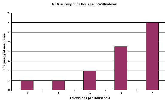
Cumulative frequencies (and in fact cumulative frequencies of percentages) are easy. They are simply the "add them up as you go across" totals for (f). N = 500
| Caution: Do not get muddled between actual values and the frequency of occurrence of that value. |
You will see that the chart below contains none of the actual values, only frequencies of occurrence.
| (f) |
24 |
32 |
46 |
156 |
184 |
33 |
25 |
| cumulative
(f) | 24 |
56 |
102 |
258 |
442 |
475 |
500 |
| cumulative (f) expressed as a % | 4.80 | 11.20 | 20.40 | 51.60 | 88.40 | 95.00 | 100.00 |
Note that the final value in the cumulative (f) row has to be the same as your total number of observations.
We now have enough information (in the correct format) to produce a special kind of graph called an Ogive(pronounced "o-jeeve") or the cumulative frequency curve. The cumulative aspect means that each successive percentage is added to the previous value until 100% is reached.
The term 'Ogive' is an architectural term for the shape of a Gothic arch and you will see below why this term is appropriate. This curve has very special properties that will tell us something about the distribution of our measured variable.
Always plot the measured variable (in this case the mid-value salary of each class) on the 'X' axis with the cumulative frequency value on the 'Y' axis...
You
should be able to see that there is a gentle curve to this graph and that the
top and bottom 'tails' are flatter than the central section. We can emphasise
this special shape by plotting the cumulative frequency expressed as a %. A further
advantage of this technique is that we can now 'calibrate' the chart to show the
25th, 50th and 75th percentiles. These percentiles
show the values at which first of all, a 1/4, then a 1/2, and finally, 3/4's of
the salaries fall. The Median position will be the same as the 50th percentile
and from this, we can calculate the median value (this is the graphical method).
In the chart below, this gives a median value of approximately £1360.
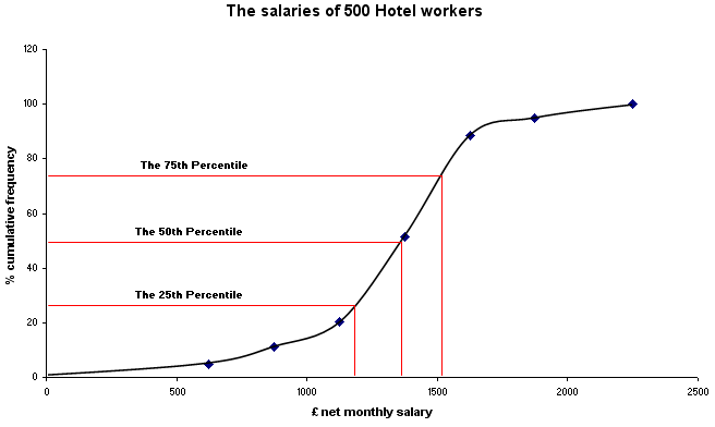
It is the steepness of the central section of the ogive that gives us an indication of the 'spread' or dispersion of the data. The steeper the gradient then the 'tighter' the results and the less dispersion there is.
As with the 'Box - and - whisker' plots (which we will introduce in Focus 4), other percentiles besides 25, 50 and 75 may be used but these are the conventional ones. Note also that if we stick to the inter quartile range (the range between the 25th and 75th quartiles), it tells us the values that sit at the edge of the mid- 50% of all our values . When we come to discuss normal distributions, we will develop a special term (Standard Deviation) for the boundaries to an area that encloses the mid 2/3rd's of our values.
Statistical Package for the Social Sciences (SPSS) is an Industry Standard software programme that is very powerful and more flexible that Excel. Data entry is similar but the use of functions and specific statistical tests is easier. The preference for graphics is a matter for the individual. You may wish to read the Introduction to SPSS now........... |
Open SPSS, enter data
Go to Variable View and type in the names for the 2 variables : Salary and Cfprcen
Type in your data in 'data view'
Go to 'Graphs', 'Scatter' , 'Simple' and transfer 'Salary' to the X axis and Cfprcen to the Y
Click 'OK' and the chart will appear.
If you want to insert a line to 'join up the dots', double click the chart to go into Chart Editor, Click 'Interpolation' and click 'straight'....(requirements vary slightly between SPSS v11 and v12).
To insert the 25th, 50th and 75th percentile line, place the cursor over the Y axis and right click the mouse. A menu will open and then click 'Y reference line'. Enter '25' in the position box and click 'apply'. Repeat the procedure for 50 and 75......
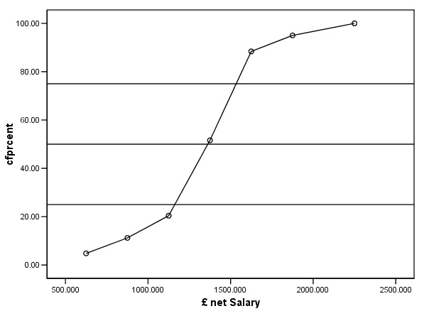
The gentle curve of the Ogive can be clearly seen.
Q. Go back to the table giving the salaries ( in the 7 groups) and the frequencies of occurrence. Prepare a histogram (in Excel). What conclusions can you draw from this chart?
You may also view this data already entered....open SPsmex00 Salaries
It is also possible to use individual Ogive shapes to compare distributions and in some respects this is visually easier than comparing 2 histograms..
 We looked at the salaries of 500 Hotel workers . Suppose we wish to compare those
figures with 500 transport workers. One of the easiest and quickest comparisons
to make would be the two Medians.
We looked at the salaries of 500 Hotel workers . Suppose we wish to compare those
figures with 500 transport workers. One of the easiest and quickest comparisons
to make would be the two Medians.
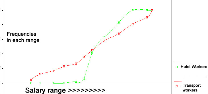
| Remember:The slope of an Ogive gives us an indication of the degree of dispersion. A gradually climbing curve indicates wide dispersion. A steeply climbing curve indicates a narrow dispersion. |
It is possible to calculate the median value in the same way as before but this time there will be a value for each Ogive and they can be compared directly..
In this next example we will complete the analysis process entirely using SPSS....
 Your agency has been commissioned to carry out a 'attitudes to meat' survey for
an influential food magazine. As a pilot study, it has been decided that you will
ask 30 customers at the meat counter in a supermarket for their opinions about
intensive farming and about hormone additives in cattle feed.
Your agency has been commissioned to carry out a 'attitudes to meat' survey for
an influential food magazine. As a pilot study, it has been decided that you will
ask 30 customers at the meat counter in a supermarket for their opinions about
intensive farming and about hormone additives in cattle feed.
Were they concerned about using such products?
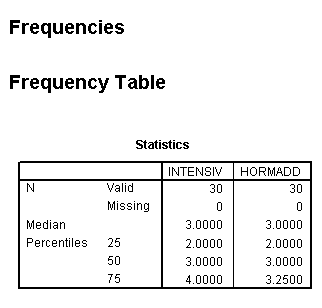
They could score 1 (no concerns whatsoever) through to 3 (no opinion either way) through to 5 (extremely concerned and would not sanction purchase). The Editor of the magazine wants to know what the median opinion score was and what the score values for the upper and lower quartiles were.
Q. In Focus 1, we discussed scales of measurement. This data is on the Ordinal scale of measurement? Can you now explain what this means? Why can there be no valid 'mean score'.
The results were entered into SPSS data view:
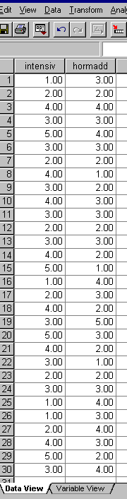
Now copy this dataset for yourself into SPSS
Name the two variables as 'intensiv' and 'hormadd'
Go to 'Analyse', 'Descriptive Statistics', 'Frequencies'.
Transfer both variables to the right hand box.
Click 'Statistics', tick 'quartiles', 'median' and 'Continue'
....back in the Frequencies window, click 'Charts', Type of Chart: tick 'Bar chart' and for Chart values tick 'frequencies'
Click 'OK'.
Your output should look like this....
Use 'Analyse', 'Descriptives', 'frequencies' and click on 'statistics',
Task:
See if you can now produce a cumulative % frequency table in SPSS for INTENSIV
, HORMADD.....
and the Bar Charts to support the data.
Your output should look like this..
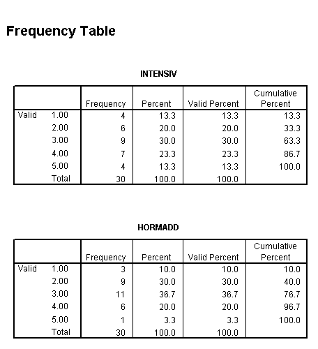
Task: Now produce the two bar charts.
Task: You have been asked by the Editor to write 250 words summarising your findings for the article.
Having
now investigated what is meant by 'average' and shown that the steepness of the
centre section of an Ogive gives an indication of dispersion; it would be helpful
to be able to quantify the degree of dispersion in some way. The most commonly
used measure of dispersion is the Standard Deviation,
but remember, in order to calculate this parameter, the data must be on
the Interval or Ratio scales
(see also Focus 1)
| Standard Deviation is "the mean of the differences between each individual value and the group mean" |
Note that these dispersion values are going to be both above and below (positive and negative) the mid value. If you were to simply add up all the positive and negative dispersion values in any data set, they will always add up to zero!
If we deliberately ignore the sign, we can sum the deviations to give us a mean deviation. This figure is of little use because it invariably approaches zero.
Why?
However, a better plan is to square all the individual deviation values because any negative number, when squared becomes positive!
A diagram should help....
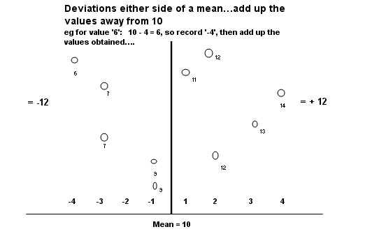
Value | Difference
from the mean | Squared
difference (ignoring the sign) |
12 | +2 | 4 |
6 | -4 | 16 |
11 | +1 | 1 |
7 | -3 | 9 |
14 | +4 | 16 |
13 | +3 | 9 |
7 | -3 | 9 |
12 | +2 | 4 |
9 | -1 | 1 |
9 | -1 | 1 |
100 | 0 | 70 |
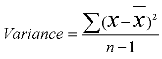
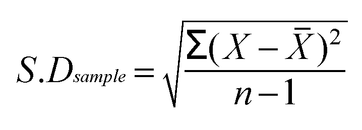
So the sum of the squared differences =70, divide by (n-1) will give the Variance =7.777 and taking the Square root of the Variance gives us the Standard deviation: = 2.79
(the reasons for using 'n-1' instead of just 'n' are quite advanced and need not concern us here.... simply remember to use n-1 always)
Checking with SPSS:
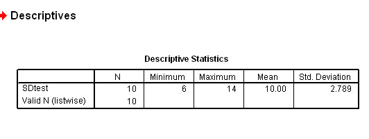
So 2.79 is a measure of the degree of spread that these 10 values have about the mean value of 10. The variance can never have any units because it is a squared number but the Standard deviation can have units where appropriate.
A second example:
 Here
are the weekly expenditures (£) on 'Pay-as-you-go'
mobile phones by 12 students
Here
are the weekly expenditures (£) on 'Pay-as-you-go'
mobile phones by 12 students
(to the nearest 10p).
| £ |
4.30 |
4.50 |
5.10 |
5.30 |
5.90 |
7.20 |
8.80 |
11.10 |
11.70 |
8.60 |
7.40 |
5.20 |
Remember that we are dealing with only a sample and not the whole population, so we want the sample mean. The letter 'u' can be used for the sample mean and the Greek letter 'mu' is used for the mean of the whole population.
Task: First calculate the mean weekly expenditure. It should come to £7.092
If we now calculate the differences (both positive and negative) from 7.09 for each of the above values we obtain the individual deviations . Then square those differences (no units applicable) to remove the negative values.
 We get:
| x
-x bar | -2.79 |
-2.59 |
-1.99 |
-1.79 |
-1.19 |
0.11 |
1.71 |
4.01 |
4.61 |
1.51 |
0.31 |
-1.89 |
| squared
| 7.78 |
6.71 |
3.96 |
3.20 |
1.42 |
0.01 |
2.92 |
16.08 |
21.25 |
2.28 |
0.10 |
3.57 |
Next:
The sum (sigma) of those squares is:69.28. Dividing by 12 would give us the mean deviation value (the variance) = 5.77.
As mentioned above, when dealing with samples it is wiser to divide by (n -1) and this would give us a variance of 6.30.
Remember, the variance is derived from squared numbers and so there can be no units (you cannot have squared money!) and so we take the square root of the variance to bring us back to a point where the original units are valid once again.
Hence: Standard Deviation: = 2.509 (£2.51)
This
would normally be stated fully as:
"One standard deviation represents
± £2.51 about the mean of £7.09"
We will discuss more fully what this means in the next section, meanwhile simply note that this gives a range ( for 1 s.d.) of £4.58 - 9.60 and that 8 of the 12 values....two thirds(66.7%) (shown in blue) fall into this range, that is, they are fairly well clustered near the mean..
| £ |
4.30 |
4.50 |
5.10 |
5.30 |
5.90 |
7.20 |
8.80 |
11.10 |
11.70 |
8.60 |
7.40 |
5.20 |
Let us carry out the same calculation using SPSS:
Open SPSS & enter the data tabulated above,
In Variable View; name variable as 'Spend'
Switch to Data view and enter the data as above
Click 'Analyse', 'Descriptive', 'Descriptives' again
Transfer 'Spend' to the right-hand box
Click 'OK'
Your output should look like this:
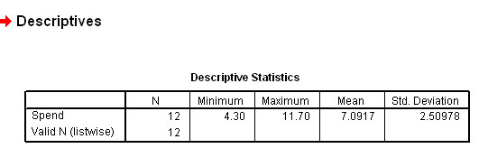
You can see that most of the results are clustered around the mean and this means that there is not a high degree of dispersion.
| If the S.D. is small, it indicates that the individual values are close to the mean. If the S.D. is large, then the individual values are dispersed at some greater distance from the mean. |
Ideally, we are looking for some measure that quantifies the 'amount of spread' that exists in a data set. Providing that the data is normally distributed; the standard deviation gives us just this measure.
 The marketing manager of Golden Marvel Comics Ltd
is concerned that many of their distributors are failing to get the magazines
to the shops quickly enough. The company state in all their contracts, that 24
hours is a maximum acceptable period. He asks you to carry out an investigation...
The marketing manager of Golden Marvel Comics Ltd
is concerned that many of their distributors are failing to get the magazines
to the shops quickly enough. The company state in all their contracts, that 24
hours is a maximum acceptable period. He asks you to carry out an investigation...
Tasks:
1) Consider how the investigation should be conducted. What questions are you going to ask?
2) Once we have some data from the distributors, we will need to compare the results with some sort of 'benchmark'. In other words "how will we know if the data from these suppliers is representative of the Industry as a whole?
3) One objective might be: "Are the results we have obtained unusual or are they what might be expected?"
So what is normal? In order to answer this question, we will eventually have to look at what is happening to competitor printing companies.
On with the investigation.....33 deliveries are monitored.....
The Time (hours) from collection to delivery
| 20.4 |
14.0 |
14.8 |
| 14.9 |
29.1 |
19.3 |
| 17.9 |
28.3 |
25.1 |
| 22.5 |
31.6 |
29.1 |
| 31.6 |
19.2 |
30.3 |
| 33.9 |
17.5 |
18.7 |
| 28.7 |
27.1 |
16.4 |
| 16.7 |
34.0 | 19.2 |
| 17.9 |
16.9 |
26.8 |
| 14.1 |
17.3 |
23.1 |
| 25.5 |
26.9 |
25.7 |
Next, note the Range... (14.0 - 34.0 hours)
Because
'time' is a continuous variable ( on the Ratio scale), we can now legitimately
calculate a mean value, so sum all values( ![]() )
and divide by n.
)
and divide by n.
![]() x
= 754.5
x
= 754.5
754.5 / 33 = 22.86 hrs. (22hrs 52mins)
So 'on average' it would appear that the crop is reaching the factory in the specified time but now look at the 'spread' of those delivery times. 15 of the 33 results are outside of the acceptable time limits set by the company.
Let
us look again at this idea of the values of the deviations. Each one has to be
the individual value minus the mean. This is expressed as "x minus x bar"
or ![]()
Just for illustration purposes, take the first and last values in the above set. We will calculate the deviation and then square it in each case....
| Value |
deviation
from the mean (22.86) | deviation (d) squared |
|
First:
20.4 | -2.46 |
6.05 |
| Last: 25.7 | +2.84 |
8.07 |
The variance is the sum of all these individual squared deviations divided by the number of values minus one.....
Note that by subtracting 'one' from the denominator, we are forcing the variance to be larger. It is better to overestimate the amount of variance rather than to underestimate it. Where n is small, it will make quite a difference but as n climbs to 100 or more it makes so little difference that it is safe to just use n rather than n-1.
In our delivery times example, sigma d squared: = 1238.03 .
Divide by 32; (n -1), to calculate the variance: = 38.69
The variance has no meaningful units because it is a squared number ( in this instance :hours squared!)
......and
so we have to take the square root of the number to get back to meaningful units:
= 6.22 hours and so
this is the Standard deviation of the sample.
Remember it is a sample... our results only relate to 33 deliveries whereas the distributor might be making 1000 deliveries a week and throughout the year. Later we will look at the issue of how much reliance we can place upon this standard deviation and how closely it reflects the true state of affairs for the whole of the population (in the above case: all of the deliveries ever made).
So the final formula for the S.D is:
In Focus 3, we will be discussing what is meant by a normal distribution but for now simply look at the chart below and consider the shape and consider the area enclosed under the graph.
The percentages shown in the yellow boxes indicate the percentage of the total area under the graph contained in that sector. The red numbers along the top indicate the number of standard deviations away from the mean. You can see therefore that one standard deviation either side of the mean will account for 68.26(68.3)% of the area under the graph. We can interchange the term 'cases' for 'area' once we realise that this is still an X and Y chart with classes on the X axis and 'frequency of occurrence' on the Y axis.
Similarly, 2 s.d's either side of the mean will account for 95.44(95.4)% of the area / cases under the graph.....
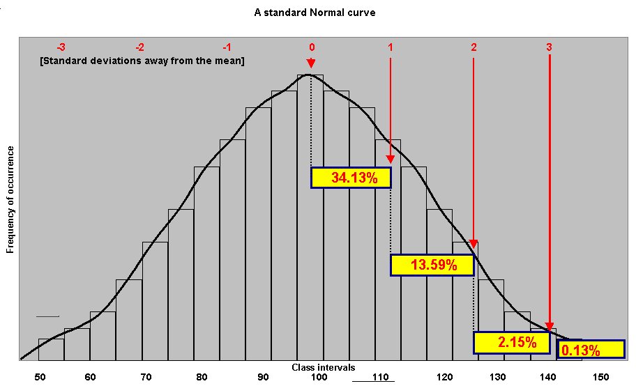
There is a very useful rule that is worth learning....The "68 - 95 - 97.7" rule
| In a normal distribution 68.3% of all cases will fall within ±1 S.D of the mean.... i.e 34.13% either side of the mean. In a normal distribution 95.4% of all cases will fall within ± 2 S.D of the mean.... i.e 47.72% either side of the mean. In a normal distribution 99.7% of all cases will fall within ± 3 S.D. of the mean.... i.e 49.87% either side of the mean. |
We can refine the table to give us the number of standard deviations at specific and convenient %'s. Convention dictates that we mainly use 90, 95 and 99%'s.
Standard deviations away from the mean:
| %
of cases (+ & -) covered | Number
of S.D's away from the mean (left and right) |
|
68.26% |
1.00
+ 1.00 |
| 90% |
1.65
+ 1.65 |
| 95% |
1.96 + 1.96 |
| 95.4% |
2.00
+ 2.00 |
| 99% |
2.58
+ 2.58 |
| 99.74% |
3.00
+ 3.00 |
| 99.9% |
3.32
+ 3.32 |
To gain a further insight into the mechanism that work within a normal distribution curve, you should go to Focus 3c where you will find an interactive (online connection needed) Normal distribution curve.
Back to the magazine
distribution problem...
Mean delivery time: 22.86 hrs
s.d: 6.22 hrs
If we randomly pick one result from our set of 33, there is a 68.26% probability that it will be one that falls in the range +/- one s.d either side of the mean, i.e. 22.86 ± 6.22 hours. That is between 16.64 and 29.08 hours. If our sample size was very large (approximating to the whole population), we should expect to find that 68.26% of all our values would also be within that range. Of course, this all supposes that the results obtained from our investigation are normally distributed.
Alternatively, we could say that there is a 95.4% chance that any individual result will be within 2 standard deviations of the mean. That is 22.86 ± 12.44 hours: i.e. 35.3 -10.42 hours.
Task: Check out the data set to see how many are already in the range 16.6 - 29.1 hours inclusive.
A): 23 (statistically, there should have been 22.53 values !)
Task: Calculate the boundaries that embrace 90% of our 33 cases
A): 12.63 - 33.09 hours
But is there a way of deciding how reliable our data set might be as a reflection of what is going on in the magazine publishing world!?
How confident are we that the mean that we have calculated would bear closer scrutiny ?
Is this a valid result or something 'out of the ordinary'? You may understand that if the mean value calculated is inaccurate (does not reflect the true state of affairs), then the s.d's become worthless.
It is merely convention that we start by using the 95% confidence interval. This means that we want to know what range of values (for the sample mean) we would get 19 times out of every 20 that we did the assessment. Of course this has to assume that nothing else about the scenario changes.
Here is a useful technique: the number of Standard Deviations (written as 's.d'. or 'theta') away from the mean can be used as a multiplier depending upon which Confidence level we wish to use...
Take the mean and then ± 1.96 multiplied by the Standard Error (which is the s.d. divided by the Square root of n)..... (33 in the above illustration)...
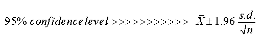
The Square root of 33 = 5.745
So: 22.86 ± 1.96* (6.22 ÷ 5.745),
i.e: 22.86 ± 2.12 hours.
We can now say, "if we carried out this assessment 20 times, we would expect the mean to fall in the range 20.74 - 24.98 hours on 19 out of 20 occasions. '95%' means '19 out of 20' times.
Naturally, we can use the other confidence levels such as 90% (in which case we would use 1.65 as the multiplier)..... 22.86 ± 1.65*(6.22 ÷ 5.745) =1.79 hours
" in 18 out of 20 occasions we would expect the mean to fall in the range 21.07 - 24.65 hours".
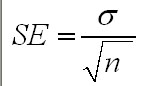
| The
basic expression for the Standard Error is: and will be discussed in more detail below and again in Focus 4a |
Task: Using the 99% confidence level (using 2.58 as the multiplier) calculate the Confidence limits and write out a statement of your findings as above. What do you notice about the limits (boundaries) as the Confidence level increases, do they become wider or narrower?
Q. Can you explain why this would occur?
The standard Deviation has shown us that there is quite a lot of variation in the delivery times for Golden Marvel Comics from printers to the shops but we still do not know how this compares with other manufactures in other locations around the country.
Later we will take a sample from a a second print works, carry out the same type of calculations and begin to make comparisons between the two. We will discover that comparing two means is one of the most important statistical techniques we ever have to use.
Yet another graphic technique that will prove useful at that time will be the 'Box and Whisker' plot! This is a quick and easy way to look at two (or more) sets of summary data to see how they (at least to begin with) compare with each other. This also is illustrated in Focus 2b and Focus 4
It is easy to forget that when we record means and standard deviations, we are always dealing with samples and never the total possible population of a product, item or living thing. However, we can estimate what the true mean might be but we use caution by defining exactly what level of confidence we are going to assign to our outcome. Here is the method, it involves using the Standard error figure.....
 ....
....
 The weekly wages of 441 coach drivers were recorded and the mean £ wage
for the group was found to be £312.00 gross. On further analysis the s.d.
was found to be £77.
The weekly wages of 441 coach drivers were recorded and the mean £ wage
for the group was found to be £312.00 gross. On further analysis the s.d.
was found to be £77.
The Standard Error will be: 77 ÷ sq root of 441
= 77÷
21 = 3.667
Again using our 95% confidence interval:
£312 ± (1.96* 3.667) = 312 ± 7.19
That
is: £312 ± £7.19
i.e. the true population mean should
be within the range: £304.81 - £319.19. So these two figures represent
the 95% confidence limits or boundaries. We would also expect that 95% of the
coach drivers in our sample would also receive wages within those confidence
limits.
 A wine bottling plant is supposed to deliver 750ml of wine to each bottle as it
passes through the filling tower. The Weights and Measures inspector found that
when he checked 170 bottles at random, that the mean 'fill' was 747ml and the
s.d was 6.5ml.
A wine bottling plant is supposed to deliver 750ml of wine to each bottle as it
passes through the filling tower. The Weights and Measures inspector found that
when he checked 170 bottles at random, that the mean 'fill' was 747ml and the
s.d was 6.5ml.
Task:
Calculate the S.E. and the Confidence
limits when the Confidence Interval is set at 99%.
Q.
The inspector would accept a maximum 10% of the bottles to be only filled to 748ml,
the remainder would have to be filled more than that. Does the machine have to
be re-calibrated or not?
 Now let us suppose that we wish to investigate the average earnings of the British
Population. It is quite unreasonable to suppose that we can ask them all! We decided
to ask 1000 people and work out a mean value from that. The figure arrived at
was £15,000. So this would be a start. The sample mean is likely to be close
to the population mean (a good approximation) but not exactly the same.
However, let us suppose that the exercise is carried out 5 more times.
Now let us suppose that we wish to investigate the average earnings of the British
Population. It is quite unreasonable to suppose that we can ask them all! We decided
to ask 1000 people and work out a mean value from that. The figure arrived at
was £15,000. So this would be a start. The sample mean is likely to be close
to the population mean (a good approximation) but not exactly the same.
However, let us suppose that the exercise is carried out 5 more times.
Now we have 6 means to consider:
| £15000 |
| £13000 |
| £17000 |
| £16000 |
| £14000 |
| £12000 |
.....eventually a sampling distribution of the means is built up. Ideally, a dataset of 30+ is considered necessary to approach an accurate estimate for the whole population.
.....This is then a frequency distribution of the mean values derived from a large number of samples.
.....etc etc
There are some important properties of this sampling distribution process that are worth remembering.
In general, if we take, from the population a set of samples (preferably more than 30) each of size (n) and find the mean of each, then two results arise:
1) The set of sample means, when plotted will always yield a Normal Distribution curve. This applies regardless of whether or not the original population from which the results were derived was Normally distributed.
2) The standard deviation of this set of sample means (referred to as the Standard Error [SE] of the means) earlier is always equal to:
S.E
= ![]() .....as
shown earlier.
.....as
shown earlier.
Taken together, these two outcomes make up the 'Central Limit Theorem' . Note that the larger the sample size, n, the large will be the square root of n and hence the smaller will our Standard error become.
| Essentially this means that
the more samples we take, the more accurate our approximation for the mean of
the whole population will become. |
Q. Is it better to take 6 samples of 1000 people or one sample of 6000 people?