
Focus 2]Professional (Visual) Presentation of Data |
Presentation of data and some tips about decimal pointsRanking of data'Picture scores'Bar charts, Histograms (plus a linked page)Pie charts'Stem and Leaf' plots, Scattergraphs, Calibration charts |
We have discussed the idea that the initial collection, organisation and early
presentation of collected data will make all the difference between a muddled
and incoherent project and a clear, well explained and deductive piece of work.
| Any tabulation of data must
be clear, unambiguous and all units must be displayed at all times. Take great care over the location and use of the decimal point. |
 Here are some lead impurity figures for Gold bars held in the Bank of England
(mg / Kg )
| Ambiguous
display | Clear
display |
| .051 |
0.05 |
| 0.035555555 |
0.04 |
| 0.034 |
0.03 |
| 6 |
0.06? |
| 4 |
0.04? |
| .05556 |
0.06 |
| .4 |
0.04 |
| .64 |
0.06 |
The obvious point to make here is that all the measurements were in milligrams per Kilogram of bar weight. There have also got to be decisions taken as to how many decimal places the records are to go to. If there is no consistency and care over the use and placement of the decimal point, the whole table becomes useless!
 Here is an exaggerated page entry of purchase invoices for Britmax
Motorcycles plc
Here is an exaggerated page entry of purchase invoices for Britmax
Motorcycles plc
| Supplier: |
£ |
p |
| J.B.C Ltd | 4000 | 9.7 |
| Ace D Co | 407 | 4.400 |
| 2 Max Ltd | 306 | |
| GXC Ltd | 777. | 7.7 |
| Cams and Co | 50 | 22 |
| DDW Ltd | 750 | . |
| AnVee plc | 192 | .25 |
| JBC Ltd | 420.5 | |
| 2 Max Ltd | 500 | 27.00 |
Even a single error such as moving the decimal point one place on an accounting page can create havoc. Electronic systems are just as sensitive to this type of error as manual systems so beware !!
So....
|
 Imagine
that the Market Research company you work for has
been commissioned to conduct a comparison survey of the home cover policies
offered by some leading insurance companies.:
Imagine
that the Market Research company you work for has
been commissioned to conduct a comparison survey of the home cover policies
offered by some leading insurance companies.:
| Do realise just how subjective (and therefore how difficult to quantify) the term 'quality' is. |
The assessment team might choose to examine 8 important variables (e.g. A:
no claims discounts, B: claims protection, C:
neighbourhood watch membership, D: 24hr plumber 'call
out' service, E: a 'new for old' policy, F:
age related discounts, G: automatic subsidence cover
and H:discounts for approved burglar alarms being
fitted.
Assuming that we give each variable 'equal weighting', our data set will begin to look like the table below.
Q. Are you going to treat this type of data as Ordinal or Interval?
The data is stored on a spreadsheet, the first line might appear as below....
| Company
name: 1. Proodince Insurance Ltd |
Total Score (max possible = 40) | ||||||||
| Variable: |
A |
B |
C |
D |
E |
F |
G |
H | |
| Score
(1 - 5)(avoid using zero), 1 = no consideration given 5 = generous consideration given | 3 |
3 |
4 |
2 |
5 |
4 |
1 |
3 |
25 |
Note:
this data is going to be highly subjective and open to bias because each individual
assessor
may have his or her opinions concerning the quality.
Task: Write a paragraph entitled: "There is a tension between the idea of "equal weighting" and "bias".
So each of the 40 companies are going to yield a table like the one above i.e.40 *8 = 320 pieces of data and 40 total scores. This would be highly cumbersome to set out and certainly difficult to read.
So we must condense it....
Let us place the 'total score' for each company into a class interval. The 7 categories /classes will each span 5 points and will indicate total scores of; 8-12, 13-17, 18-22, 23-27 etc etc. This will give us a total of 7 classes(see chart below).
Q. Why is there no 0 - 7 category?
Q. Could we use comparative percentages such as: 25 / 40 = 62.5%?
It
is possible to use ranges that
are unequal and this will be discussed later but for now,
we will have ranges
that are all the same and run from 5 to the theoretical maximum score of
40 (8 variables * max 5 score).
We may now consider adding our overarching subjective appraisal to these results such as: 8 - 12 = appalling, 13 - 17 = very poor, 18 - 23 = tolerable and up to 38 - 40 = superb. Note that the term 'average' and 'the norm' are avoided because they have specific statistical meanings which should not be used in this context. At least, not yet..
Once the final scores for all 40 companies have been collected, we can count up the number of companies that fall into each class interval and then translate that into a 'picture score'. The result will look like this...
| Class
Interval | Number
of Companies | 'Picture
Score' (Pictogram) |
| 8
- 12 | 3 | *** |
| 13
- 17 | 5 | ***** |
| 18
- 22 | 12 | ************ |
| 23
- 27 | 8 | ******** |
| 28
- 32 | 6 | ****** |
| 33
- 37 | 4 | **** |
| 38
- 40 | 2 | ** |
| Totals |
40 |
So we have 'distilled' our (8 *40 = 320) pieces of data down to 7. Notice also that the pattern of *'s looks like a conventional Bar Chart turned on its side. What it is indicating is the frequency of occurrence; a term we shall meet many times. That is, the number of occasions that a particular score has been achieved
Q. Have we 'lost' any valuable information by this method?
Q. Have we summarised the data too much and if so how could we remedy this? (Clue: '38' is the first number in the last class and as each class spans 5, 42 should be the last number).
Task. Give the class interval for 8 classes instead of 7
Q. Why is the final Class Interval different and how could we prevent this?
Q. Would you say that this was an acceptable way to judge an Insurance company?
We will be looking at ways to analyse this type of data in greater depth in Focus 5
Moving on from the 'Pictogram' , it is possible to indicate individual scores
along with a graphical component in another way. The 'stem and leaf plot' is simply
another device for reducing bulky datasets down to a manageable size and displaying
the results in an easily digestible fashion.
Here is a set of 30 ages (between 17 and 52) of women when taking their first driving test.....
19.
20. 23. 40. 28. 21.
30. 24. 45. 23. 50. 32.
17. 18. 20. 17. 51. 26.
36. 29. 37. 40. 17. 19.
18. 33. 31. 42. 33. 44.
It is difficult to see any pattern yet but if we string the 'tens' vertically and the units horizontally an interesting picture will emerge...
| 1 |
7 |
7 |
7 |
8 |
8 |
9 |
9 |
|
|
| 2 |
0 |
0 |
1 |
3 |
3 |
4 |
6 |
8 |
9 |
| 3 |
0 |
1 |
2 |
3 |
3 |
6 |
7 |
|
|
| 4 |
0 |
0 |
2 |
4 |
5 |
|
|
|
|
| 5 |
0 |
1 |
|
|
|
|
|
|
|
We have another 'picture score' but now with ratio figures(age at first driving test). Now let us rotate this table through 90 degrees....
|
9 | ||||
|
8 | ||||
|
6 |
7 | |||
| 9 |
4 |
6 | ||
| 8 |
3 |
3 |
5 |
|
| 8 |
3 |
3 |
4 | |
|
7 |
1 |
2 |
2 | |
| 7 |
0 |
1 |
0 |
1 |
| 7 |
0 |
0 |
0 |
0 |
| 1 |
2 |
3 |
4 | 5 |
| Teens |
20's |
30's |
40's |
50's |
This device has condensed our data into a pattern that our brain will readily absorb. We have placed each reading into a category and also given ourselves a chart showing the frequency of occurrence in each category.
A further modification is the 'back to back' stem plot that allows us to quickly compare 2 sets of data....
 A Life Policy Company has been reviewing its portfolio with regards to smokers
and has found this data from a research paper....
A Life Policy Company has been reviewing its portfolio with regards to smokers
and has found this data from a research paper....
The age (remember: on the ratio scale) at death of 88 people (42 female and 46 male) suffering from lung cancer:
| Male |
decade |
Female | ||||||||||||||||
| |
2 |
3 |
|
|
| |||||||||||||
| |
5 |
4 |
3 |
1 |
0 |
3 |
2 |
6 |
7 | |||||||||
| |
8 |
7 |
6 |
4 |
3 |
2 |
4 |
1 |
2 |
3 |
5 |
5 |
6 |
8 |
| |||
| 8 |
8 |
6 |
6 |
5 |
4 |
3 |
3 |
1 |
0 |
5 |
2 |
3 |
3 |
3 |
4 |
6 |
7 |
|
| |
9 |
9 |
7 |
7 |
6 |
5 |
3 |
3 |
1 |
6 |
3 |
4 |
5 |
6 |
6 |
8 |
9 |
9 |
| 9 |
6 |
5 |
5 |
4 |
2 |
1 |
1 |
0 |
7 |
1 |
1 |
3 |
3 |
4 |
6 |
7 |
| |
| |
8 |
7 |
5 |
4 |
2 |
2 |
0 |
8 |
2 |
3 |
4 |
6 |
7 |
| ||||
| |
|
|
|
|
|
|
9 |
0 |
3 |
3 |
4 |
| ||||||
We
can already see a pattern emerging between the longevity of the males and the
females. From here it would be easy to calculate the range, mean age at death
of both sexes and frequencies within each age band. You will also notice that
two distribution patterns are emerging, one for males and one for females. Male
deaths peak in their 50's whereas female deaths peak in their 60's.
Discrete variables (whole numbers only) (such as the number of people, cars, televisions etc) are displayed using Bar Charts, that is; there are gaps between the bars. Continuous variables such as age, height, temperature etc are displayed with no gaps and this is then a histogram. |
Q. Which do you think of the previous tables conveys the most information? Clue: all three charts provide 2-dimensional information but the last one has the advantage that it also provides 'left and right' information so in effect is plotting three variables rather than just two.
Q. If we now removed all the numerals from chart 3 but left the colour blocks, would the information imparted be the same? Obviously a legend for both the 'X' and 'Y' axis would still be required.
Q. What Policy recommendations would you make to the Life Insurance Company?
Back to the the Insurance companies...
As explained above, if the data collected
from the companies had been continuous e.g. £value , age or height,
then we would 'push' the bars together so that they were also continuous
and then we would call it a Histogram.
| You may wish to explore 'Histograms' now before continuing.... Go to: Focus 2b Constructing Histograms |
The fact that the categories below represent numbers of individual companies; we must ensure that we display them as discreet i.e. in Bar Chart format, similar to the one shown below...
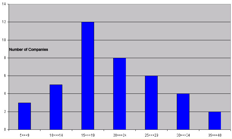
Note that the shape of the chart is exactly the same as the 'picture score' but simply rotated through 90 degrees.
 If we wanted to show proportions of the total of the Insurance Companies
that fell into each category, we would probably chose to use a Pie
Chart.
If we wanted to show proportions of the total of the Insurance Companies
that fell into each category, we would probably chose to use a Pie
Chart.
Pie charts should only be used to indicate proportions within the whole. %'s can be very useful and are readily understood by most people but use them with restraint.
Pie charts can only illustrate one variable at a time.
The chart below has been created using MS Excel.
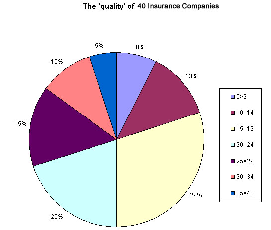
We still see 7 class
intervals, the largest of which reads 29% and is the group that scored between
15 and 19 points in our survey. There were 12 companies out of the 40 surveyed
that fell into this group.
| Caution: Excel pie charts cannot readily display points of a percentage. Excel has given the third class a score of 29% instead of 30%. This is because Class 1 should be 7.5% and class 2 should be 12.5%. Excel has rounded both up to whole numbers and so the next class has been rounded down by 1. This ensures that the three classes combined still show the correct total of 50%. |
We can start to make some deductions from our research. For instance, suppose we had previously agreed that a minimum of 20 points defines the border between 'acceptable, and 'not acceptable', we might say..."50% of the companies appear to exceed our minimum standards and 29% were borderline but the other 21% of them do not reach this minimum acceptable level of service ".
This is often the kind of statement and method of presentation seen in newspapers and magazines today. Is it acceptable?
Advantages | Disadvantages |
Quick
to produce | Lacks precision |
Usually
easy to comprehend | Open to bias display |
Give
a useful overview | Confusing when > 7 categories involved |
Can
indicate popularity | Can only deal with one variable at a time |
Can
display range of opinions and group size | Comparing Pie charts with one another is confusing |
| Ideal for frequency distributions |
It
is unwise to try to use pie charts for purposes other than highlighting proportions
of a single
variable within the sample set. It is equally unwise to assume
that the findings from a small sample set automatically reflect the wider picture.
40 companies might be sufficient to say that the findings are a reflection
of all the companies in Britain but you cannot be certain. Attitude surveys require
large numbers of participants if groupings are to be realistic and where derived
percentages are to be displayed.
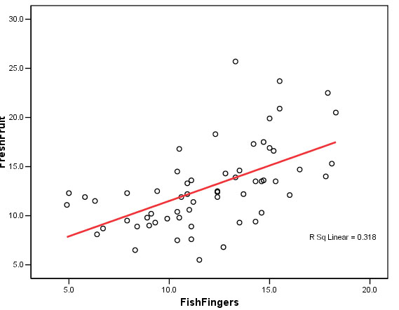 A scattergraph
(scattergram or scatterplot) is the most common way of representing the behaviour
of two variables that appear to have a relationship
with each other. We may wish to observe sales volume related to advertising budget
or lorry capacity and haulage costs or size of workforce with wages bill or population
density and the number of 'flu cases.
A scattergraph
(scattergram or scatterplot) is the most common way of representing the behaviour
of two variables that appear to have a relationship
with each other. We may wish to observe sales volume related to advertising budget
or lorry capacity and haulage costs or size of workforce with wages bill or population
density and the number of 'flu cases.
The points where the two measured values from one example intersect are plotted but not joined. Care must be taken when drawing such a chart that the scales used on the 'X' and 'Y' axis are incorporated and fully annotated.
It
is unacceptable to start inserting lines 'by eye' (no matter how tempting this
is) but the direction
and slope and general spatial arrangement of the points
can tell us a great deal about the
relationship before we do any real analysis.
| Always make it a habit to try and produce a graphic output of your data (if suitable) before embarking upon any inferential testing. |
Where the input ratio data is sufficiently accurate, a scattergraph may be used to calibrate one variable given the other.
 An Ice cream
manufacturer, Superlick Ltd, need to link their daily
ice cream production to daily temperatures because they have found in the past
that as the daily ambient temperatures rise, so does the sales of their ice cream!
After monitoring sales for some time, they finally produced the following summary.
An Ice cream
manufacturer, Superlick Ltd, need to link their daily
ice cream production to daily temperatures because they have found in the past
that as the daily ambient temperatures rise, so does the sales of their ice cream!
After monitoring sales for some time, they finally produced the following summary.
It is important to recognise that these two variables have different characteristics. 'Temperature' is an independent (often described as 'error free') variable because we cannot modify or alter the ambient air temperature on a summer's day! Thus it must be placed on the 'X' axis. 'Sales' is the dependent variable and must be placed on the 'Y' axis.
| Ambient
Temperature (deg C) | Daily
sales £ '000 |
| <
4 | 0 |
| 6 |
0.6 |
| 8 |
0.8 |
| 10 |
1.3 |
| 12 |
1.9 |
| 14 |
4 |
| 16 |
4.2 |
| 18 |
3.9 |
| 20 |
5 |
| 22 |
6.6 |
| 24 |
7.7 |
| 26 |
8 |
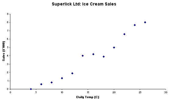
Q. From looking at the above chart, how would you describe the relationship between the sales of Ice Cream and daily temperatures?
Q. You are the Sales Manager for Superlick Ltd, how will you use this new data?
Q. Do you consider that this constitutes a relationship between the two variables? If so, why?
Q. Would it be acceptable to use this as a calibration chart?
Q. If one variable changes, what happens to the other? (Think carefully!) x>>>y? , y>>>x?
Note that we are not attempting to 'join up the dots' at this stage.... but this will come later.
 Here is a second example where we have plotted the typical price for a 3-bedroomed
house against the distance from the local (highly rated) Junior school.
Here is a second example where we have plotted the typical price for a 3-bedroomed
house against the distance from the local (highly rated) Junior school.
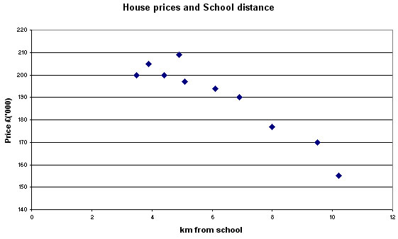
Q. Do you consider that the above chart is sufficient to state that there is or is not a relationship between the two variables? Describe what you can deduce from this chart.
Q. How do we know that there are not many other factors (called co-factors or confounding factors) that are influencing the house prices?
(See also: Correlation in Focus 7 and Regression in Focus 8)
 Last year,
Floids Bank plc launched their new on-line banking
service with a heavy promotional campaign co-ordinated by their sales and marketing
team. Here are the results (measured as 'web-hits') for the first 9 months.....
Last year,
Floids Bank plc launched their new on-line banking
service with a heavy promotional campaign co-ordinated by their sales and marketing
team. Here are the results (measured as 'web-hits') for the first 9 months.....
|
Web 'Hits' |
Promotional expenditure
(£) | |
| April |
60,000 | 40,000 |
| May |
33,000 | 30,000 |
| June |
37,000 | 30,000 |
| July |
36,000 | 25,000 |
| August |
39,000 | 25,000 |
| September |
42,500 | 35,000 |
| October |
48,500 |
35,000 |
| November |
37,000 | 27,000 |
| December |
47,000 | 20,000 |
Task: Plot the above data and make your deductions in the form of a short report to the Board of Floids Bank plc. Note that in this instance you should treat '£ promo' as the independent variable.
![]()