
[Focus 2 b]Constructing
simple Histograms |
| Remember that the horizontal axis on a Histogram must represent a continuous variable scale such as time etc. If the variable is discreet (e.g. number of cars, people, boxes etc) then we must use a Bar chart ( with categories) instead. |
Remember also that another important feature that we can exploit with these charts is to transform all our 'frequency of occurrence' groups into percentages. Obviously the final 'area under the graph' must add up to 100.
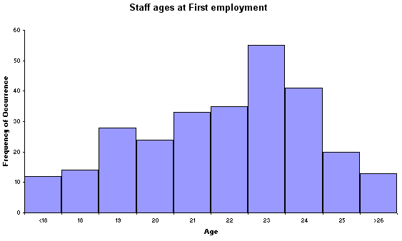
 Here is a data set relating to the age (at first employment) of 275 graphic designers
working in the London office of a large agency in 2005. When working with this
set also consider the following.....
Here is a data set relating to the age (at first employment) of 275 graphic designers
working in the London office of a large agency in 2005. When working with this
set also consider the following..... Q. Could we compare this data set with say, a set from another firm or city?
Q. How best could we compare this data set with one generated from 1994 data?
Now here is the raw data set:
| Age
@ first employment | frequency
of occurrence |
| <18 |
12 |
| 18 |
14 |
| 19 |
28 |
| 20 |
24 |
| 21 |
33 |
| 22 |
35 |
| 23 |
55 |
| 24 |
41 |
| 25 |
20 |
| >26 |
13 |
'Age' is a continuous variable, so we use a histogram rather than a bar chart....
Task: Now create your own Histogram (in EXCEL) for the data set below relating to another agency. Follow the instructions given.....
Sample size(n): 200.
| Age |
Freq of occurrence |
| <20 |
10 |
| 21 |
19 |
| 22 |
23 |
| 23 |
39 |
| 24 |
42 |
| 25 |
38 |
| >26 |
29 |
Open Excel, in column A, type in the frequency of occurrence data shown above.
Click on the Chart icon. The Chart wizard 1- 4 opens.
Select 'Column' and the top left-hand sub-type option.
Press and Hold to preview the chart.
Click 'Next'. The radio button for 'Series' should be ON.
Click 'Next'. Type in the chart title ' Staff Ages at First Employment'
For Category X (X axis), type 'Age' and for 'Y', type 'Frequency of Occurrence'. The titles will automatically appear on your preview chart.
Click open the 'Legends' tab and de-select 'Show Legend'. Click 'next'
Chart Wizard step 4....Chart Location....Click the 'as new sheet' radio button. Click 'Finish'
To change the bar chart into a histogram......Using the mouse, place the cursor over any one of the bars and then right click. In the menu that appears, left click 'Format data Series' Click 'Options' and reduce gap width to zero. Click 'ok'
Select the 'X axis' with a right mouse click and clear the formatting. The numbers 1 - 7 will disappear.
Make sure the Drawing toolbar is open.
Insert a Text Box and enter the figures '<20 to >26'. Adjust the font sizes and positions to suit the histogram.
Save.
It should look like this!
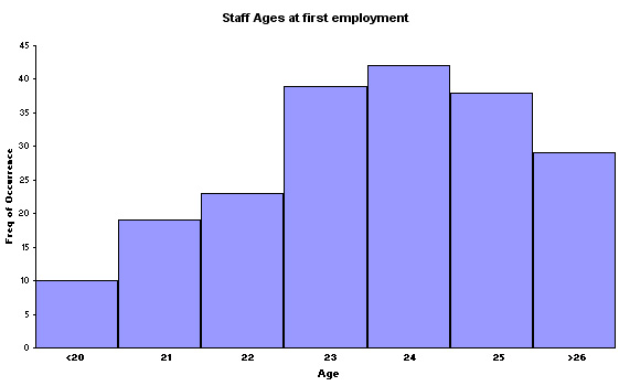
Q. How does the shape of this Histogram differ from the first one illustrated above?.
Q. Can you discern any other differences and if so, how would you start to quantify those differences?
Q. Calculate the median age of first employment (24 years and how many months?)
 In the example about the quality of service from Insurance Companies (Focus
2), remember there were 40 companies and they were each scored on 8 different
attributes (variables). The frequency table would look like this...
In the example about the quality of service from Insurance Companies (Focus
2), remember there were 40 companies and they were each scored on 8 different
attributes (variables). The frequency table would look like this...
| Class Interval (i.e. final score) | Number
of Companies* | %
Frequency | Cumulative % Frequency |
| 5-9 |
3 |
7.5 |
7.5 |
| 10-14 |
5 |
12.5 |
20
i.e. (7.5+12.5) |
|
15-19 |
12 |
30 |
50
i.e. (20+30) |
|
20-24 |
8 |
20 |
70 i.e. (50+20) etc. |
|
25-29 |
6 |
15 |
85 |
| 30-34 |
4 |
10 |
95 |
| 35-40 |
2 |
5 |
100 |
| Total |
40 |
100 |
* This means the actual number of companies that gained a final score that fell within the given class interval.
Q. Does this data require a Bar chart or a Histogram? Hint: these are quite clearly 'scores' and are therefore discreet and not continuous......
Task: Construct the correct chart using Excel using both % Frequency & Cumulative % Frequency on the 'Y' axis.
Q. By comparing both charts, can you see the graphic relationship between the two?
We have commented that Histograms should always be used where frequencies of occurrence of continuous data is involved. Such data is often 'grouped' but they may not always have the same boundaries, that is the classes may be of different widths. It is therefore necessary to adjust the height of each group in order that the areas remain in the correct proportions to each other.
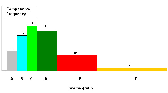
 Here is a chart showing the family incomes of 500 families broken down into 6
classes but note that they are not all the same 'width'. In order to illustrate
this fact in the histogram, we have to make adjustments using a multiplier for
width and a divider for height. The necessary adjustments to width and height
are therefore shown. Income groups are displayed on the X axis and frequency of
occurrence on the Y axis. The areas of each box must remain in the same proportions
as the original frequency data (f).
Here is a chart showing the family incomes of 500 families broken down into 6
classes but note that they are not all the same 'width'. In order to illustrate
this fact in the histogram, we have to make adjustments using a multiplier for
width and a divider for height. The necessary adjustments to width and height
are therefore shown. Income groups are displayed on the X axis and frequency of
occurrence on the Y axis. The areas of each box must remain in the same proportions
as the original frequency data (f).
We are taking units of £5000 as the standard unit:
| Income
Group | Gross
Income (£K) | Number
of families (f) | Relation
to standard column width | Multiplier | Drawn
(f) | Height
divider |
| A |
10 - 15 |
40 |
Standard |
1 |
40 |
1 |
|
B |
15 - 20 |
70 |
Standard |
1 |
70 |
1 |
|
C |
20 - 25 |
90 |
Standard |
1 |
90 |
1 |
|
D |
25 - 35 |
160 |
Twice as wide |
2 |
80 |
2 |
|
E |
35 - 55 |
120 |
Four times as wide |
4 |
30 |
4 |
|
F |
55 - 105 |
20 |
Ten times as wide |
10 |
2 |
10 |
The Final Chart looks like this:
Histograms and Bar Charts are an excellent way are illustrating the size, shape and 'skewness' of a distribution. They also allow us to make some comparisons about the relative frequencies of particular results. However, they don't give a clear measure of dispersion and they are quite difficult to compare with other histograms, especially if the data sets are of different sizes. The solution may be to produce Box Plots, more accurately referred to as 'Box and Whisker' plots.
The 'whiskas' represent the full range of values recorded. The thick bar in the box represents the median value (the 50th percentile) and the box itself represents the 25th to the 75% percentile....the middle 50% of all the values recorded.
 Here is a simple box and whisker plot monitoring the timekeeping of two employees
who are habitually late for work each morning. The Y axis is measured in whole
minutes...
Here is a simple box and whisker plot monitoring the timekeeping of two employees
who are habitually late for work each morning. The Y axis is measured in whole
minutes...
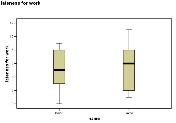
Here is part of the 'Explore' output from SPSS for this data:
You can interrogate any data set in SPSS.... From the 'drop down' menu, select 'explore' and 'descriptives'.....
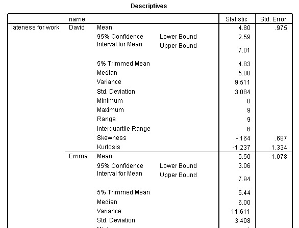
Some deductions:
The maximum and
minimum values are displayed as well as the range.You can see that the median
values are different but because this was ratio data, we have also gathered information
about the mean and the confidence intervals for those means and the standard deviation.
We
can see that Emma's performance is slightly worse than David's.
A second example:
 Here is a Box Plot looking at the 'spread' of results from four (hypothetical)
groups of students (78 in total) taking the same Finals exam paper. Notice especially
that the group sizes were all different: 25, 25, 18 & 10. Box plots are quite
suitable for such situations because they show the median and percentile positions
as well as the upper and lower limits spanned by the data, the 'size' of the group
will not affect this ability....
Here is a Box Plot looking at the 'spread' of results from four (hypothetical)
groups of students (78 in total) taking the same Finals exam paper. Notice especially
that the group sizes were all different: 25, 25, 18 & 10. Box plots are quite
suitable for such situations because they show the median and percentile positions
as well as the upper and lower limits spanned by the data, the 'size' of the group
will not affect this ability....
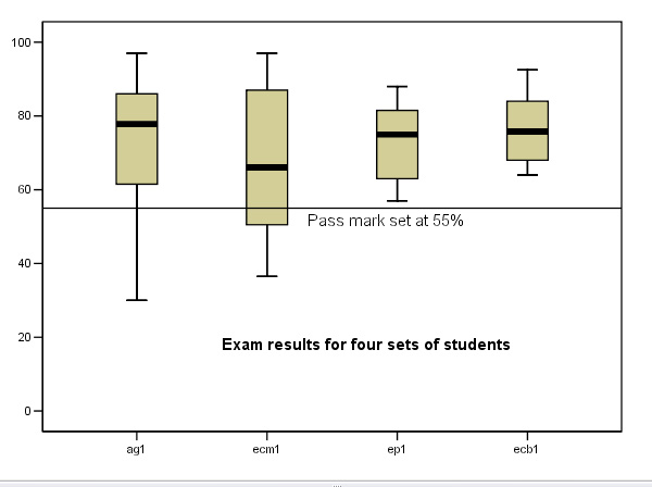
(The 55% pass mark line is also shown)
To repeat: each box has 3 lines, a top, middle and bottom. The top line represents the 75th Quartile (Q3), the bolder mid-line is the median value (50%)(Q2) and the lower line is the 25th Quartile (Q1). The upper and lower 'whiskers' indicate the full range of the data presented. So the gold box represents the middle 50% of all the values in the data set and the two whiskers represent the other 50%. Do not confuse the thick bar (the 50% median value) with the mean for each set.
| Caution! Boxplots cannot illustrate mean values. |
We now have the ability to compare 2 or more sets of data. This requirement will feature even more frequently in the Focus pages yet to be dealt with.
It is important that you learn to 'extract' as much observational information from charts and graphs as possible.
Task: Before reading the green text box below, try to write down at least 6 observations on the boxplot above......

Your observations should include:
|
Caution: There are a few situations (e.g. where the data is 'skewed') or where there are values that are well outside of the general range where SPSS Box Plots indicate other features. In these cases 'outliers' and 'extreme values' are identified by the software. Most statistical techniques require that extreme values are omitted from analysis because they will disproportionately affect the outcome.
Use this dataset to create your own boxplot
Use:SPsmex03
Exam Results
In
SPSS>>>> Go to 'Graphs', 'Box Plots', 'Simple'
Select ' Summary of separate variables', click 'Define'
Transfer all the sets you wish to have in the chart, click 'OK'
Note: the boxplots will appear in the same order as they are in the database.
Task: Interrogate SPSS as described earlier
Note that we can also interrogate SPSS by another route to give basic descriptive information.....
Drop down the 'Analyse' menu and select 'Descriptive Statistics' and then 'Descriptives'
In the window that opens, transfer all 4 variables to the 'variables(s)' box and click 'OK'....
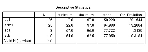
Using the "rule of thumb", the group ag1 shows a wide dispersion, ecm1 shows less whilst the last two groups, ep1 and ecb1 show a narrow dispersion.
![]()