[Focus 14]"Reducing the dimensions"Factor Analysis theory....Principal Components Analysis (PCA) |
Before we start....
Focus pages 14,15,16 and 17 are going to explore a number of ideas that all have one thing in common...they are not attempting to arrive at a particular mathematical answer but are attempting to find patterns that might be hidden away in a mass of data. These 'detective' methods can be long and complex, with many optional paths along the way, any of which might lead to new insights into the story hidden in the data.
The 'Keywords and Phrases' chart below is best printed off and used as a reference within each Focus.....
| Focus 14 . Principal Components Analysis | Focus 15. Cluster Analysis (HCA) | Focus 16. Discriminant Analysis |
| Dimension
reduction Data compression | Dendrograms | Predictive models using parametric data |
| No groups assumed in advance | No groups assumed in advance | Groups are assumed in advance |
| 'Clouds of data' | Types of 'Linkage' | 'New' variable constructed to give a 'score'; the discriminant function |
| Principal components and Variance | Monothetic and Polythetic (number of characteristics in the analysis) | Independent variables as 'predictors' |
| Eigen values and the KMO co-efficients | The Jaccard matrix | The 'Decision rule' |
| The rotated approach | The Clarke matrix | Wilks' Lambda |
| The Kaiser correction | Fusion charts | Stepwise analysis |
| Plotting Component 1 against Component 2 | Cluster membership | The Discriminant function and Discriminant 'score' |
| Factor 'scores' for each case | Predicting group membership of a new case | |
| Variables left in or out of the analysis | ||
| % of cases correctly classified |
Focus 14
| First
and foremost: Note that Ordinal data is sometimes acceptable because PCA is not an inferential procedure. |
We
have already stated that one of the objectives of inferential statistics is to
be able to gain
information about a population...... given samples to work
with. However, if our datasets are very large and involve say 4,5,6 or more variables,
in order to uncover trends, relationships, similarities or differences etc, etc;
it is necessary that the information is made more manageable in some way.
Imagine
that we had a dataset with 11 variables, there might be (depending on the scales
of
measurement involved); 11 means, 11 variances and 55 covariances!!
Inevitably, if we are going to devise ways to reduce (or condense) our dataset by relying on a reduction in variables / dimensions, we must be aware that there is a risk that some detail within that data is going to get lost. Imagine we had 8 variables to deal with. We want toextract the maximum amount of information (in the form of variance) from each variable and 'blend' it into a new component. That new component is a distillation of the variabilty expressed in each the variables in the correct proportions.
The purpose in actually employing many variables is that they might yield a greater depth of understanding about the subjects under investigation. Be aware that at some point a 'law of diminishing returns' will begin to apply.
Consider:
If we just take the weight of a person it will yield a certain amount of information
but if we
have the weight, height, neck size, shoe size etc, we have a much
better 'picture' of that person. If we
add eye colour, age,sex, name and
address and even their data of birth, then we would have a mass of information
and an even clearer picture of the person involved. It is our desire to 'contain'
and delineate all that information into a neat package that the next series of
procedures will explore.
The problem is compounded if we have data to deal with from many subjects. Dealing with data from 10 people is simpler than from 100 and that is simpler than data from say 10,000!
Extracting any deeply 'hidden' pattern information and reducing the mass of data
at the same time needs
some difficult concepts to be explained. The main
questions to ask will be "having worked hard to gather all this information;
is there any pattern or structure to it anyway"? Also, "if I condense
all that information into a neat package, how much detail will I loose?"
Principal Component Analysis (PCA) theory:
Before beginning with PCA, the term 'Factor Analysis' is a confusing one; firstly, it applies to a specific technique whereby a mathematical model is used to produce a smaller number of linear combinations from the original dataset. Secondly, the term is used in a generalised sense to mean any 'data reduction' technique (of which there are many) and this includes PCA. Some authors even take issue with the use of the term 'Principal Components' and say that the correct term should be 'Principal Factors'.
The two techniques compliment each other but there are subtle differences..
1) PCA asks: "Can I simplify the structure of the data in such a wayas to capturethe majority of the variance in just 2 or 3 components?...
2) Factor analysis builds on this idea by working on the sub-sets of each variable.The intention is to look for groupings in the variables. The 'factor scores' that we will discuss later are the result and the signature of the new psychological construct we have created.
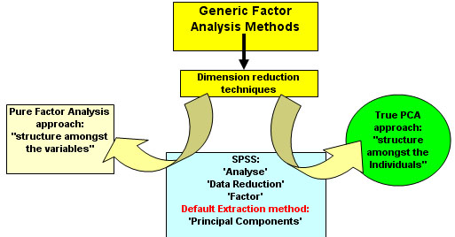
So where is PCA within the framework of Factor Analysis methods?The relationship between factor analysis and PCA is a confusing one and in fact, PCA is just one (of many) factor analysis methods that exist. Pure PCA is only concerned with dimension reduction; looking for 'structure in the clouds of data'. If we want to go in a different direction and look for structure within the variables; then that would be Factor Analysis proper. SPSS does not help the situation because the methodology for PCA is contained within the following navigation: 'Analyse', 'Data Reduction', 'Factor Analysis', and then PCA is given as the default extraction method. The diagram below should explain the relationship:
|
Multi-dimensional thinking....
We
began in Focus 13 by considering just 3 variables
but the task now is to devise a procedure that
can accommodate many
variables in the analysis.
We
are going to have to try to think about a situation where there are lots of dimensions.
This is very
hard for us to do but it can be achieved mathematically.
So what things can we actually do with PCA?1. Dimension reduction....'distilling' a high percentage of the information buried within maybe 8 or 9 variables down into just 2 or 3 'new' variables that we call 'components' or 'factors'. Mathematically, we produce new 'functions' or 'equations' and so each case within the dataset will gain a new positionable 'score'. Units do not apply. 2. "Searching for structure"....By exploring (and then plotting) the output, the 'score' is generated by utilising one, two or three of these new 'components'. We may find that the resulting 'scores' are not simply distributed as a random mass but that there is some structure revealed; 'clouds' of points emerge on the plot. Such 'clouds' will suggest that there are groupings present and this is very useful 'new' information. This is something that could not be readily seen or substantiated simply by looking at a large dataset. 3. If 'groupings' are detected; we would try to explain and identify the characteristics that create the 'signature' for each group. We might wish to go even further and (if the data is suitable) carry out t-tests to compare the means generated within the new component variables. |
It is useful, before we begin, to place PCA analysis within a framework of the other types of data classification and reduction that we are going to be introduced to:
| The primary intention: | Groups delineated in advance (a priori) |
Groups not assumed or delineated in advance |
| To
achieve 'dimension reduction'...looking for patterns within large datasets |
PRINCIPAL COMPONENTS ANALYSIS [This TOPIC] | |
|
To assign many / all individuals to groups where practicable |
| CLUSTER ANALYSIS [Focus 15] |
| To assign a 'new' individual to an existing group |
DISCRIMINANT ANALYSIS [Focus 16] |
|
This all needs some careful and often repeated explanation.....
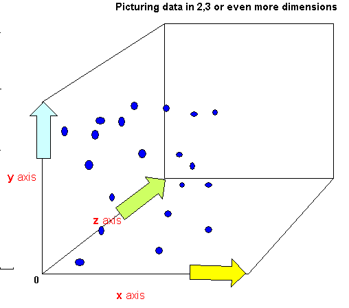
 Let us imagine that we have 20 Golf balls. We are going to suspend them in an
empty shop in a random fashion. Each will have a specific location in space dictated
by three distance measures, all working from zero
(the bottom left point at the front of the shop). We
Let us imagine that we have 20 Golf balls. We are going to suspend them in an
empty shop in a random fashion. Each will have a specific location in space dictated
by three distance measures, all working from zero
(the bottom left point at the front of the shop). We
want a way of characterising
the spatial pattern displayed by these balls.
x
represents the distance (variable 1) along the shop front, y represents the height
from the ground
and z represents the distance into the shop for each
ball.
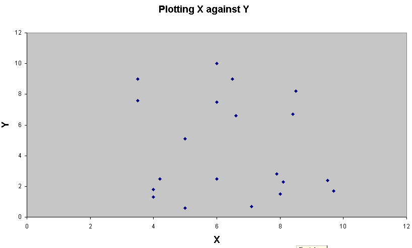
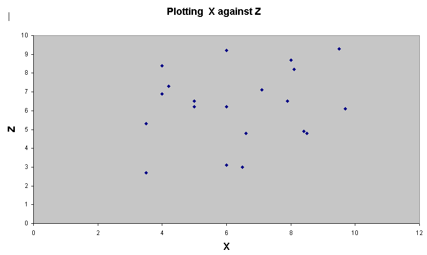
If we had wanted to graphically represent just one variable in space; it would be best represented along a straight line. As that single variable changes its values so the representative point will simply move backwards and forwards along the line. Similarly, for two variables, we use two lines at right angles (i.e. Orthogonal display) and now we can move the point backwards and forwards and now also, up and down. Three variables use three lines, all still at right angles to each other....the point can now move backwards and forwards, up and down but also inwards and outwards!
(Golf Ball orthogonal distances in metres from the origin)
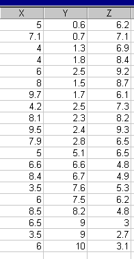
The
axis, XY might be likened to the shop window with the points marked on the window
pane. Z would be represented by the floor so XZ is the 'bird's eye view of the
points. YZ represents the inside left-hand
wall of the shop.
Now
imagine that we shine 3 strong lights onto the balls (at
right angles) in order to cast shadows on
the three surfaces discussed. We
can quickly generate 3 plots, XY, XZ and YZ, the three resulting images would
appear as shown below..
[Shop Window]....2 'clouds' appear.....one above the other, the lower one being more distinct...
[Shop
Floor]....no apparent differentiation into 'clouds'
[Inside Wall]...Two 'clouds', top left and bottom right...
|
The
positions of the points shows more variability in X and Y than in Z.
The
third plot seems to be conveying new information about the distribution that is
not readily
apparent in the first two plots.
The values in Z begin to 'characterise' the data more clearly.
Q. Does it help if we plot all three pairings together in a 3D chart?....
We can continue by comparing the relationships between the values in any 2 of the 3 dimensions. Using SPSS, we can, for instance, quickly calculate the three Pearson correlation's (rp) that the above charts yield:
| XY: 0.196 |
| XZ: - 0.148 |
|
YZ: 0.817 |
Note
the strong correlation between values for y and z (0.817), this is quite different
from the relationships exhibited in the other two correlation's. We are made aware
that values in y and z have a strong influence over each other and more so than
values in x do on either of them. In fact both the correlations involving x are
weak ones. With just three variables in play, we can do this analysis readily
but what if there are 6 or 8 variables
that have been measured on the Interval scale?.... Which ones carry the most influence
in terms of key characterisation?
What components principally define the information contained in the dataset?
The first algorithm must now embrace a body of information that will characterise the data but will have reduced it to new principal component(s). There may only be one principal component but ideally there will be 2 or even 3 discovered in the analysis. Usually, we would hope to extract the bulk of the variance in two or three in order to observe any 'structure in the clouds'.
Although a hard concept to grasp; the components 'replace' the original variables X, Y and Z in such a way as to account for most of the variance present and hence maximise the characterisation of the data. We are thus 'reducing the dimensions' from 'n' to just two or three. Once achieved; these 2 / 3 components can be plotted...but they are no longer X,Y and Z.
So a component is effectively a new 'variable' constructed from 'bits' of all (or most) of the originals. Think
of a component as a distillation from all the variables in the set.
Remember, a component cannot have any units. |
If
we could now generate just two components; the principal component and the secondary
component, we could plot them against each other on a 2D
plot and see if any grouping / clustering (clouds) of individual locations
appear from the 2 new dimensions created and represented by the 2 newly created
'components'. So a newly derived component would be allocated
an axis. It is therefore desirable to limit the usable number of
components generated to 2 or no more than 3.
So mathematically, how do we actually shift from 'variables' to 'components'?
The idea that we want to construct 'a new set a variables ' may still seem a difficult one.
Problem: Lots of variables to deal with....all having an effect but not all to the same extent.....
[This example also illustrates the difficulty in separating pure PCA from Factor analysis]
 Let us imagine you have been asked to carry out a survey for a consumer magazine.
You are to investigate 8 different modes of transport (in relation to a proposed journey from Swanage Pier to London). The magazine is to produce an article on which mode of transport turns out to be the most acceptable in environmental terms...
| Mode
of Transport |
| CARS |
| TRAINS |
| MOTOR
BOAT |
| COACH |
| PADDLE
STEAMER |
| YACHT |
| MOTORBIKE |
| BICYCLE |
There are a number of imponderables that could affect the final answer but we limit ourselves to say, just 5 and to simplify the task; we make sure that they are all normally distributed and measurable at least on the Interval scale. Even so, if we had no data reduction system to use, we would still be faced with a mass of information to interpret!!.
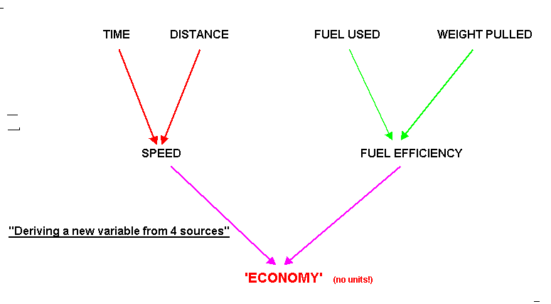
Here is 'Dimension Reduction' at work:The first variable that can be measured is Distance covered (miles), the second is Time taken (hrs). We can plot these two as y and x values respectively. The slope of the resulting plot would indicate the speed and the steeper the slope; the greater the speed. Thus, by combining these two variables, a new one called 'Speed'(m.p.h) has been produced. Speed is simply a product of distance and time and both will have an equal effect upon the final value for 'Speed'. So far, we have created a derived variable. In the same way, we might also examine the Fuel Used (litres) and the Weight Pulled (kg) for each machine. This would produce another plot indicating; 'Fuel Efficiency' (l/kg), another derived variable. Finally, if we plotted speed against fuel efficiency, we could produce yet another new variable that we could call 'Economy Rating'. Notice how we have managed to 'condense' a large amount of data / information into one single component made up from 4 original sources. Notice also that this new component is devoid of units. This is exactly the point....it has been constructed from a blend of many variables. What we do not yet know is whether or not those 4 original variables contribute equal 'weightings / loadings' to the final 'Economy rating'. Summary Chart:
This is the fundamental question "are the four original variables exerting equal influence on the 'economy' outcomes or is one variable more influential than the others"? Are some variables almost irrelevant to the outcome altogether? Now 'Economy' must be considered as a component (i.e. component 1) and not as a variable.
|
Moving Towards Factor Analysis:
Having constructed a new component we need to quantify it so that it can be categorised or placed in an appropriate grouping (if groups are deemed to be present).
We see below an imaginary equation with the weightings for each variable displayed:
Economy 'component 1' equates to: (0.4*distance) + (0.35*time) + (0.25*fuel consumption) - (0.5*weight).
So
now a 'score' for component 1 can be derived for each and every vehicle type used.In
order to generate sufficient data, it would be necessary to replicate the experiment
a number if times.
information can be compared and plotted.
The
figures would relate to moving one individual along the whole of the journey:
| Distance (mls) | Time (hrs) | Fuel (l) | Weight (kg/1000)/ per person moved | Code on X axis on chart below |
Mode of Transport |
'Component
1' | |||
| 130 |
3.5 |
18 |
1.2 | 2 | CARS | 36.9 | 38.3 | 34.7 |
37.1 |
| 121 |
4.1 |
120 |
| 4 | TRAINS | 42.4 | 44.8 | 45.1 |
43.2 |
| 177 |
10.6 |
|
| 7 | MOTOR BOAT | 96.8 | 88.7 | 90.9 |
91.2 |
| 131 |
|
|
| 3 | COACH | 42.4 | 39.0 | 44.2 |
39.1 |
| etc | 1 | PADDLE STEAMER | 22.0 | 24.6 | 21.6 |
22.5 | |||
| etc | 8 | YACHT | 96.5 | 97.8 | 98.3 |
99.9 | |||
| etc |
|
|
| 5 | MOTORBIKE | 85.0 | 84.0 | 84.5 |
83.3 |
| 137 |
14.1 |
0 |
0.08 | 6 | BICYCLE | 90.8 | 92.4 | 88.4 |
89.7 |
The row colours reflect the results obtained when the scores are plotted. We are using the logic of PCA here to see if 'groups' emerge from the individual pieces of data.....
We have created a model that allows us to distill data from all the modes of transport that we are interested in, in a fair and comparable fashion. There may be other factors that should be considered such as wind speeds etc but certainly a pattern has emerged. The least efficient method seems to be the paddle steamer and the most effective is the yacht. (Illustrative only!)
| We will see later that often 2 or more components might be 'extracted. When this happens, we have to decide if they are sufficiently important (how much variance do they account for?) before deciding to leave them in or drop them from the analysis. |
So how does PCA actually generate the desired function?
We
have now discussed both multidimensional problems and the transition of 'variables'
to 'components'. Remember that a 'component' is a linear weighted combination
of the original
multiple set of variables. You may
also wish to consider a component as an advanced form of a 'derived variable'.
At the end of the PCA data manipulation process there need not automatically be any reduction in the number of variables still 'in play'. It is basically a data transformation process, actually an orthogonal* transformation procedure, that yields a new set of component values that are correlated with the original values but are independent of each other. Another way to think of this is as a form of 'data compression' because we can store the information derived in a compressed form and later reconstruct the data with the minimum amount of distortion.
*A note about the components and orthogonal transformations:'Orthogonal' refers to the spatial referencing that is used to interpret the components and is derived from the very ancient map-making technique of representing a 3-dimensional object in just 2 dimensions. However, in the context of PCA, it refers to the fact that the 3 axes are always kept at right angles to one another. This is a key element in the spatial simplification of the data that we are seeking. If this rule was broken, the relative spatial separations would become meaningless. Note also that orthogonal variables cannot be correlated. |
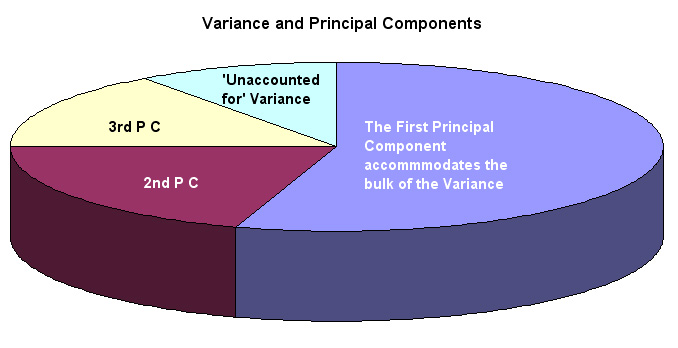
| 1. We have achieved our main goal....'dimension reduction'; a distillation of the mass of raw data 2. The first (principal) component should account for most of the Variance present, often 40 - 60% 3. The 'loadings' indicate the size of the contribution made by each original variable to each component. |
If the original dataset is suitable for this type of analysis, at least 90% of all the original variance should still be accounted for within the first two or three components.
What
we hope to finish with is a neat empirical summary of all our data that we can
represent in 2D or
3D!
The
correlation's between the original variables generate what is referred to as the
component
loadings.
The variables contributing the highest component loading will thus be identified
within the Principal Component
set. It is a 'scoring system' in that sense. Each individual can be 'scored',
located in the spaces defined by these new components. We need to save these 'scores',
plot them on a scattergraph and look for patterns. Often relationships are found
that simply would not be seen within the original dataset.
In PCA we are not actually testing anything (hence no null hypothesis) but simply trying to identify and quantify the sources of variability. Note also that all the usual rules about sample size and sampling methods must still be adhered to.
In practical terms, it is only the first two or three principal components that are going to yield useful information but in theory the maximum number of components will always be the total number of variables under scrutiny. If only one Component is extracted, the analysis stops, although we will see in the final example (cross-country runners) that we can alter the Eigen value thresholds to ensure that a second Component is extracted.
Eigen values
An Eigen
value is a non-unit based measure or index of the total variance that is accounted
for by a
given variable. The maximum sum of all the Eigen values will be
the same as the number of
components present. In our example below, this
means 6. By dividing the Eigen value for each component by the maximum possible,
a % value is created.
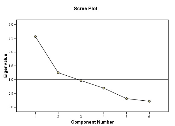
Eigen values may also be displayed graphically using the Scree plot, so called because of the characteristic shape usually displayed. The point at which the slope changes dramatically (often called the 'knee' ) will indicate where the 'cut off' point is between components that will contribute to the solution and those that will be discarded.
When using SPSS, the output may finally offer one, two or three components to contribute depending upon the Eigen values generated. Remember that it is the Eigen value that determines which of the original variables stay in the analytical process and which do not. Ideally, we would wish to find two or three components in the high region of the scree plot which would imply that each is contributing large 'chunks' of variance.
The Kaiser criterion is a convention that states that any variable with an Eigen value of less than one should be excluded and SPSS follows this rule , although you can alter the setting in SPSS if you wish.
We will also see that (in SPSS) the proportion of all the variance accommodated for (by each component) can be expressed as a percentage.
Note that many texts (including SPSS) use the term 'factors' instead of 'components'. 'Components' is possibly less confusing.
Working through an example should help to clarify all this !
[Note that we will not attempt to carry out this analysis without using SPSS].
 33 students (studying 6 subjects) have filled in application forms to join a civil
service recruitment course. They managers are interested in learning more about
their psychological attributes / dimensions in order that the best advice may
be given to them and a suitable selection of recruits may be made. All students
have taken the same block course of study.
33 students (studying 6 subjects) have filled in application forms to join a civil
service recruitment course. They managers are interested in learning more about
their psychological attributes / dimensions in order that the best advice may
be given to them and a suitable selection of recruits may be made. All students
have taken the same block course of study.
| We
must not have any preconceived hypotheses to prove or disprove. PCA always begins on the premise that no pre-existing groupings are known to be present. |
Here are their recent mock exam scores:
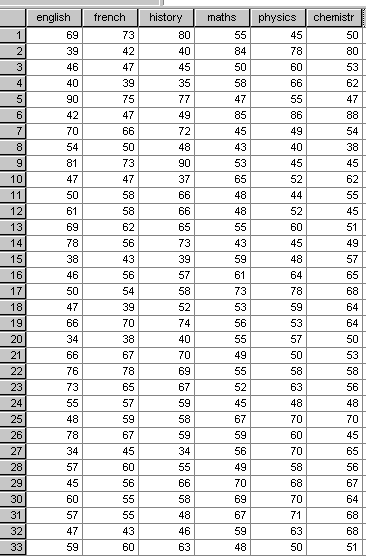
STAGE 1:The first task is to view the data as a set of boxplots to reveal any anomalies. In this case there are some outliers (which will be accommodated in the analysis) but there are no extreme values (often wrongly entered data) that need to be corrected...... We can proceed.
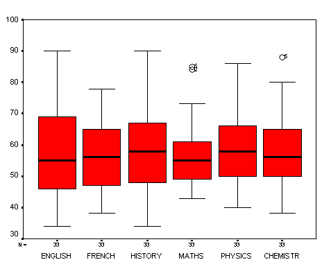
Already we can make some interesting observations, for example the mean scores achieved in each subject vary by less than 2% overall. The greatest variability (spread) seems to in 'History' and 'English' whilst 'Maths' shows the least variability (see s.d's below). We might also note that there seems to be generally more variability exhibited in the humanities subjects than in the sciences. However, all this is very speculative and it would be difficult to make any definitive statements about what this output is telling us about the students overall.
STAGE 2: The PCA analysis using SPSS:
This data set is available as: SPsmAex 15 Mock Exams
Open SPSS in the usual way and enter all 6 variables in 'Variable view' and then enter the data as usual in 'Data view'
Open 'Graphs, Boxplot, 'Simple' and tick 'summaries of separate variables', click 'define'.
Transfer all 6 variables to the 'Boxes represent' box. Click 'OK' to produce your summary boxplot.
Now open 'Analyse', 'Data reduction' and 'Factor'.
Again, transfer all 6 variables to the variables box......
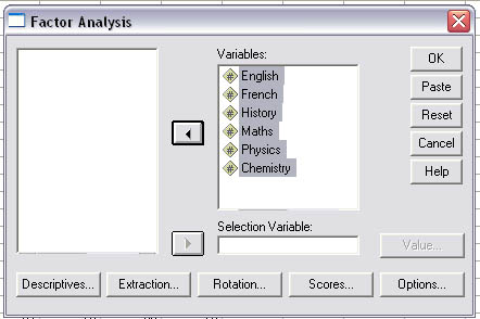
Now open 'descriptives': tick KMO, 'Co-efficients', 'Univariate descriptives', 'Reproduced correlations' and 'Initial solution'. (5 ticks in all) Click 'Continue'
Open 'Extraction', Make sure that the extraction method chosen is 'Principal Components'
Click
on 'Scree plot', 'Eigen values over 1' and 'Correlation matrix' and in the Display
section, make sure that
the 'Unrotated factor solution' is ticked.
Click 'Continue'
Click
on the 'Options' section, click 'Exclude cases pairwise'
and type in a value of 0.3 to 'Suppress values
less than' (this will make
the output slightly easier to follow! Click 'Continue'
| #
You have a choice here, strictly speaking for a PCA analysis
no rotation solutions should be employed. It is a less confusing and more
appropriate path for pure PCA. However, if you wish to try to maximise the association between components and the variables then continue with a rotated solution. This means that the pattern of 'loadings' is presented in a way that makes it easier to interpret. The specific rotational technique most commonly used is the 'Varimax' approach.... If you wish to go down this Factor Analysis route: Open 'Rotation' and tick 'Varimax' , 'Rotated solution' and 'loading plots' ... Click 'Continue'.
|
Open
'scores' and tick 'save as variables'. (These will 'appear' in your original data
set as 'fac 1' and
'fac 2' and are the 'latent variables' for use at the
end of the analysis).
Click 'continue' and 'OK'
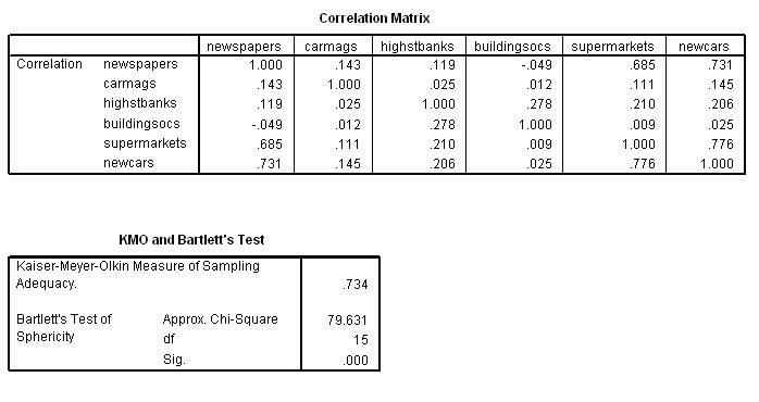
The first two (of the nine!) outputs are 1) the Descriptive Statistics and 2) the Correlation Matrix, sometimes referred to as the R-matrix.
STAGE 3: Understanding the Outputs
The
Correlation matrix shows us the degree of correlation that exists between each
variable and each
of the other 5 variables present and forms the foundation
of the PCA analysis that follows.
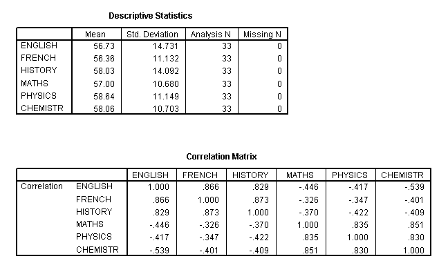
Note
that the Correlation matrix is a mirror image of itself arranged along the top
left to bottom right
line. So the correlation of say French with English
is the same as that of English with French.
We
may already notice that there does appear to be 2 clusters of high correlations
appearing.....
Within the three humanities, we see correlations of: .866,
.829 and .873 and these subjects all have weaker (and negative) correlations
with the three sciences.
Conversely, the three sciences show correlations of .835, .851 and .830 with each other and again weak negative correlations with the humanities. The strongest correlation recorded is between History and French (.873) whilst the weakest is between Maths and French (-.326). We could best illustrate this with an overlay scatterplot, so let us extract a correlation chart for just these two extreme pairs of variables. We will fit a 'line of best fit' also. Remember again....we are exploring the data rather than testing it....
Go to graphs, Scatterplot, Overlays and transfer the pairs of variables you wish to overlay...
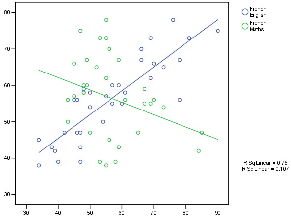
It would have been interesting to test a subject such as 'Music' which has strong elements of both science and the arts associated with it to see which subjects it gave good correlations with.
The exam correlations appear to be polarising.....
Q. Are they tapping two distinct types of mental ability?
Q. Can the rest of the analysis add to our understanding of the exam results?
Next we must look at the third SPSS output which will confirm the KMO measure. This is a test that determines how suitable our samples are for this type of analysis in the first place. A score of 0 to 1 is possible and the critical value is somewhat arbitrary but should be > 0.6.
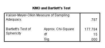
We
have achieved a KMO value of 0.787 and so we may
continue to the next check....
The Bartlett's Test of Sphericity should yield
a p<0.05 for the data to be considered suitable for this type of investigation.
It does and so we can continue..
The next output is called the Communalities and in simplistic terms, indicates the % of the variance present that has been 'extracted' by the PCA analysis. Although given as a decimal, it may readily be considered as a %.
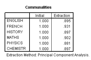
So for example, it has been possible to include 89.5% of the variance present in the ENGLISH marks within the PCA analysis. These high percentages add credence to the rest of the output. If you add all 6 extraction values and divided by 6 = .9005 i.e. 90.05%
The
5th table tells us more about the components that have been extracted. We see
the Eigen values (total
must sum to 6)(each one must exceed a value of 1 to continue to be included) and
the % of the variance accommodated by each component both before and after (axis)
rotation about the fixed
origin....
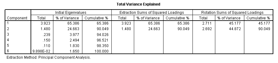
[9.898E-02
is the SPSS notation for:0.09898]
Bearing in mind the Eigen factor values, only two components have values greater than 1 and can go forward. If only one component is extracted, we cannot plot it on a chart but with 2; a 2D plot can be produced and with three; SPSS will yield a 3D plot .
Note in particular that between them, the two extracted components accommodate 90.049% of all the variance present in the dataset. We are also given two further breakdowns of this %, firstly between the two accepted components and again (in block 3) when the axes have been rotated (to maximise the divergence). In both cases, the cumulative % will remain the same. The confirmation and indication of the number of components that can go forward is also indicated by the scree plot which we have already explained. They will only be the ones above the Eigen line set at a value of one...
STAGE 4: Understanding the Scree Plot:
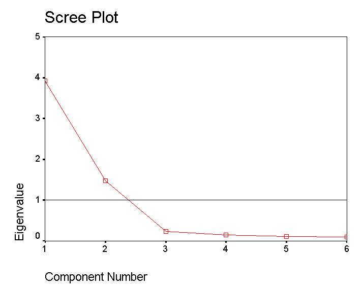
This plot confirms that only the first and second components qualify to go forward. Note that the 'knee' is below the critical Eigen value of 1. Remember that factor analysis is all about exploring your data and the use to which you put it is always a matter of judgment. In this instance it would not be worth exploring components 3, 4 etc because their influence is so small (9.051%of the total variance noted).
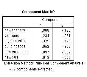
The
next output to view is the Component Matrix
which shows us the respective loadings of each of
the
items onto the two components extracted. In one sense, this means "how much
affinity has say 'History' to each of the extracted 'components'?
The
previous chart showed us that 65.386 % of the variance has been contributed by
component 1 and a further 24.663% has been contributed by component 2.
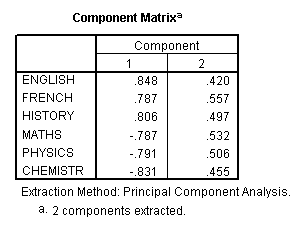 These figures represent the correlation coefficients for each original variable
as derived components 1 & 2 and these figures are therefore the component
'loadings'. The higher the 'loading', the more that
that component accounts for the total variance of the score obtained by that variable.
Taking a value >0.4 to indicate a strong loading
, you can see that 3 of the 6 subjects have positively loaded to much the same
extent onto the first component. The three science subjects have also loaded negatively
to much the same degree on component 1. All 6 subjects have loaded evenly on the
second (and less weighty) component. This is where rotation of the solution might
help to clarify things.....
These figures represent the correlation coefficients for each original variable
as derived components 1 & 2 and these figures are therefore the component
'loadings'. The higher the 'loading', the more that
that component accounts for the total variance of the score obtained by that variable.
Taking a value >0.4 to indicate a strong loading
, you can see that 3 of the 6 subjects have positively loaded to much the same
extent onto the first component. The three science subjects have also loaded negatively
to much the same degree on component 1. All 6 subjects have loaded evenly on the
second (and less weighty) component. This is where rotation of the solution might
help to clarify things.....
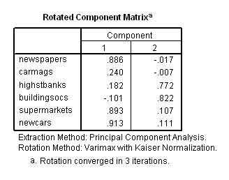
# The Factor Analysis approach and a rotated solution....The rotated Component Matrix information is shown below . Now we have a more 'even situation' in that 45.177% of the variance is accommodated by component 1 and 44.872% by component 2.
|
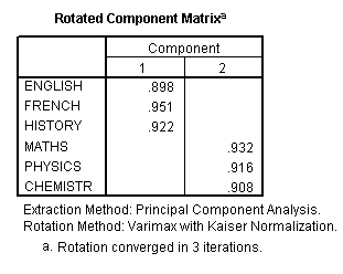 In this instance Factor Analysis exemplifies the value of using axis rotation
in this type of analysis. You will see that the three Humanities subjects have
adhered (loaded) heavily onto Component 1 whereas the three Sciences have adhered
closely to Component 2. This type of loading pattern (where a clear pattern exists)
is called 'simple structure'.
In this instance Factor Analysis exemplifies the value of using axis rotation
in this type of analysis. You will see that the three Humanities subjects have
adhered (loaded) heavily onto Component 1 whereas the three Sciences have adhered
closely to Component 2. This type of loading pattern (where a clear pattern exists)
is called 'simple structure'.
Let
us return to the data set and see what happens when we plot the results of the
analysis that has produced these two new 'components'. You should have the Component
loading chart as part of your output. If not; check back to SPSS........and.......
Open
'Rotation' and tick 'Varimax' , 'Rotated solution' and 'Loading plots' ... Click
'OK'.
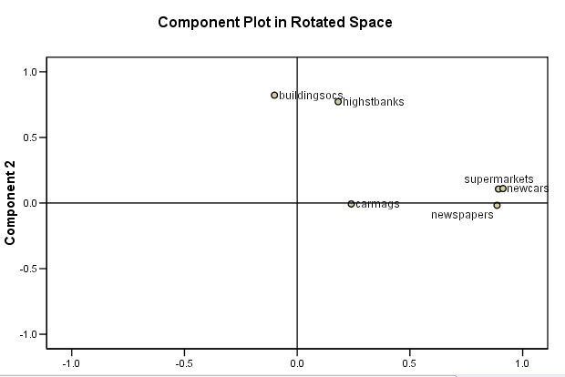
This chart helps us to visualise the relationship between the new factors and the original variables....
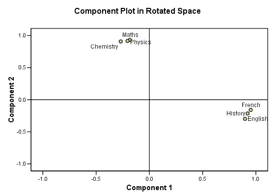
Perhaps
you can now see that two small 'clouds' of points have emerged.
Our
student applicants do seem to be polarising into one or other of just two
groups.
We
stated that this output is relatively 'clean' but this is not always the case.
Often the loadings might
be weak and / or they may load on more than two
components. In those cases, any resulting 'clouds' are too intermingled to give
us a clear picture of any underlying relationships. Or perhaps there simply is
no underlying structure to find. Sometimes a large number of items load onto one
component and sometimes only one will load onto a given component. Note that in
SPSS; we usually reduce the loading level (i.e. allowing some slight suppression
) to 0.3. This means that only loadings above 0.3 will be displayed. There is
also the option of deleting a non-loading item altogether and rerunning the analysis.
STAGE 5: We need to back-check how well our 2-component model accounted for the covariance among the 6 subjects, ideally we would want to see only very small residuals left over....
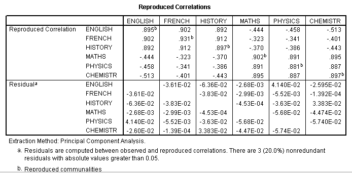
Each
reproduced correlation is the sum of the products of their respective loadings
on the 2
components accepted for analysis. Let us take English and French
(0.902).
Remember
the unrotated Component matrix....
(0.848 x 0.787) + (0.420 x 0.557) = 0.902..correct!!
Let
us check another pair: Physics and French (-0.341)..
(-0.791 x 0.787) + ( 0.506 x 0.557) = -.341...
correct!!
The
residuals simply compare the results from the original correlations (Output
2) with the new set of reproduced correlations that were generated by our
new components. E.g. French / English was 0.866 and
is now 0.902; a difference of -0.036.
Note that SPSS has presented this figure as -3.61E-02,
the '02' again indicating the number of decimal places in front of the figure.
The important point here is that all the residuals are very small and that indicates that our two-component model did suit the data very well.
Presenting your findings1. Describe your project, the methods employed and the reasons for carrying out the work. 2. Present your dataset in a clear and defined way so that the reader can follow your procedures throughout. 3. Explain (if) why PCA was utilised in this work and how you assessed the suitability of the data for this type of investigation. Explain your boxplots and the KMO value. 4. Follow the logical procedure outlined above. 5. If you do alter the number of components that you extract (rejecting the Kaiser criterion to alter the threshold Eigen value), you must refer to the scree plot and explain your thinking. 6. Give your conclusions and suggestions for further research. |
We can conclude:
PCA
yielded two components with an Eigen factor of more than
one. These two components
accounted for 90.049% of the total variance recorded.
The scree chart verified the validity of retaining
just two components for
further investigation.
Switching to factor analysis..............the Varimax rotation revealed the presence of a simple structure.
There
appears to be 2 'signatures' present here and this agrees with our original inspection
of the correlation matrix. These correlations could be accounted for by suggesting
that there are two independent psychological dimensions of ability at work here.
Two physiological profiles. We could
use this new information to assist in
the selection of students for the recruitment course.
The power of PCA has been demonstrated in that it has the power to 'see' structure in data in fewer dimensions than in the original n variables.
Q. Are these conclusions consistent with the boxplot we produced at the beginning?
Here is another PCA analysis; this time, using biometric data...
 Imagine that we are studying a 35-man cross-country team.
6 biometric parameters are to be measured on each man. We therefore have 210 'pieces' of data to deal with. We need to try to reduce this large amount down to a manageable quantity but without loosing any of the inherent information that we have gathered about these men. Remember, we are not setting out to prove or disprove any hypothesis here. What we may discover is whether or not there are any signs of 'natural groupings' within the team
We will look at 6 variables that are easy to measure. A ratio of 5:1 (that is 5 samples for every variable investigated) is a minimum for this type of analysis.
Note that we can use mixed units providing we tick 'correlation matrix' when we come to it in the SPSS routine.
1) Height (cms)
2) Weight (kg)
3) Length of leg (cms)
4) Waist circumference(cms)
5) Chest circumference (cms)
6) Head circumference (cms)
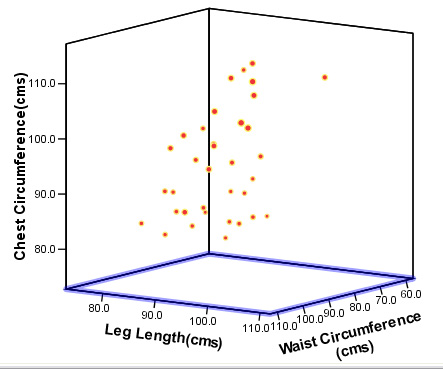
Here is part of the data set:
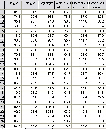
Available as: SPsmAex 13 HCA athletes
Again, the first task is to produce boxplots of all the measured variables to ensure that we have no 'outliers' to deal with. Remember, outliers would be marked with an asterisk or a circle and would indicate the case number if the data demanded it.
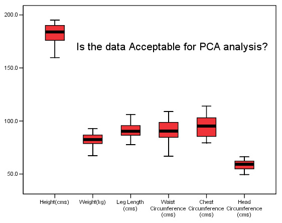
The analysis will indicate which characteristics vary the most between individuals and so far it would appear to be 'Waist circumference' 'Chest Circumference' and 'Height'. The variable 'Head Circumference' is showing the least variation. Remember that the maximum variation may turn out to be a characteristic that is derived from the biometrics, such as the relationship between height and weight. SPSS will explore all possible combinations of factors and show them in the correlation matrix.
At the end of this type of analysis (post rotation) the 'signature' with the most variation may look something like the box below, the overall 'blend' of information may be referred to as the 'latent variable'. An individual coefficient is linked to each true variable (a situation sometimes referred to a 'simple structure').
We might discover that there were 3 components generated but as we have said, there may be as few as one, the principal component. E.g....
| 'The
latent variable score' = (0.8 x weight) - (0.25 x height) - (0.1 x leg length)
|
Q. The KMO value is .814. What does this indicate?
Q. Look at the standard deviations, what can you say about the degree of variation exhibited by individual variables from this table?
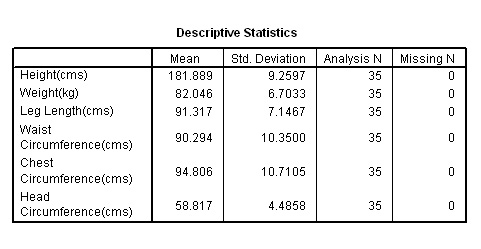
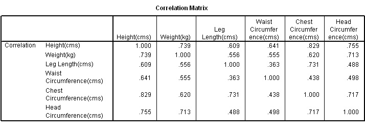
Q. Which two factors exhibit the greatest correlation and which two exhibit the least?
Q. Why have all the correlation tests have returned similar values.
Q. What provisional conclusions might we draw from this?
The next table tells us about the component(s) themselves that have been extracted...
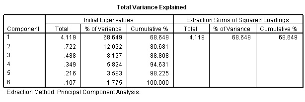
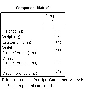
Note that only one component satisfies the Kaiser criterion (i.e. an Eigen factor greater than one).
Q. What % of the total variance is covered by this one component? Should we, at this point consider extracting a second component?
Next we have the scree plot which shows us graphically the Eigen values that were listed in the table above...
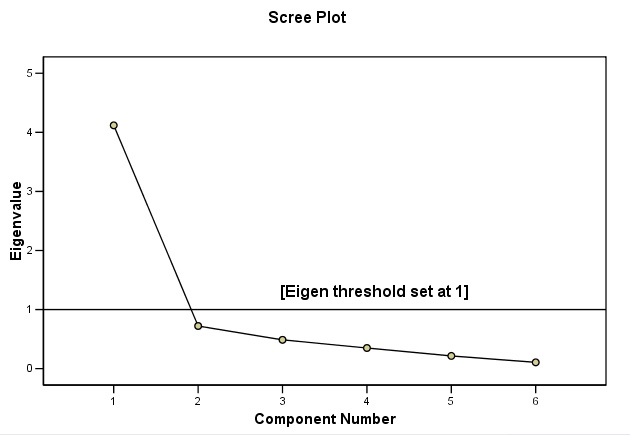
Note that components 2 - 6 have Eigen values less than one and so only Component 1 is retained. So when we try to look for 'structure' in this dataset, we will only be able to utilise one dimension and cannot produce a two-dimensional chart
Q. What conclusions can be drawn?
Lowering the Eigen Value Threshold ?
Q. After studying the scree plot, should we ignore the Kaiser criterion and lower the Eigen value? What would be the purpose?
Task: Go back through the same analysis but reduce the Eigen value to 0.7. What happens?
Here are the two component matrices with a) Eigen value 1 and b) Eigen value 0.7
 |
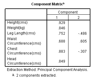 |
Q.
Would you say that all 6 variables have loaded uniformly onto the one component?
Which variable
has the most and the least influence here?
Task: Now go back and incorporate a rotation of the matrix.
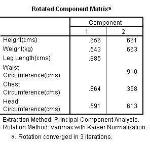 |
Rotating the Components (Factor Analysis) You will see that it is 'Leg length' and 'Chest' that have adhered (loaded) heavily onto Component 1 whereas the 'Waist Circumference' has have adhered closely to Component 2. This type of loading is quite common but not particularly clear. As stated earlier,often the loadings might be weak and / or they may load on two or more components. Any resulting 'clouds' are too intermingled to give us a clear picture of any underlying structure. Or perhaps there simply is no underlying structure to find. Sometimes a large number of items load onto one component and sometimes only one will load onto a given component. Note that we can reduce the loading level (of suppression) from 0.4 to 0.3 if we wish but this will possibly mask the resulting conclusions. There is also the option of removing a non-loading item altogether and rerunning the analysis. |
Because we do now have 2 extracted components, we can once again produce a Component Loadings chart which may show us something of the relationship between the new latent variables and the original variables....
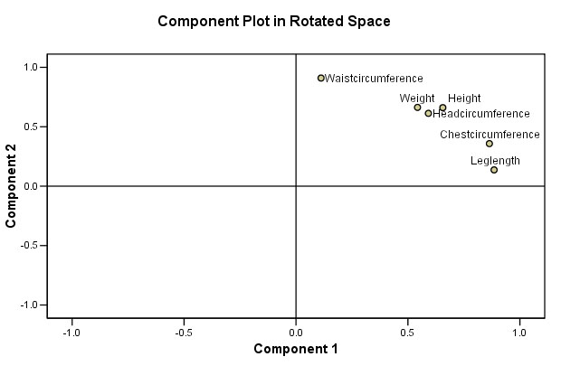
| Recall that it was 'Leg
Length' and 'Chest Circumference' that loaded heavily on to Component 1. Recall that it was 'Waist Circumference' that loaded heavily onto Component 2 |
Having extracted 2 latent variables, we can now use the 'scores' obtained. These 'scores' have no units and are, in a way the 'signature' for that particular person. It should now be obvious that this last part of the analysis is impossible if only one component is extracted.
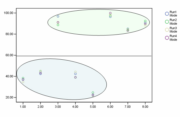
We have begun to 'characterise' each individual subject in the set by plotting their component 'scores' (discussed earlier).The factor scores plotted against each other (individuals have been numbered) are shown below.......
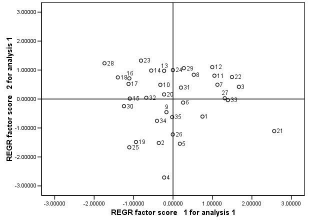
Q. What do you conclude when two sets of factor scores are plotted against each other, is it fair to say that individuals close to each other are therefore similar?
Q. Check the chart above and then go back to the original data set and comment on the biometrics for runners 16 & 17 and 20 & 21
Q. Has our analysis succeeded in uncovering any hidden 'structure' here and would you say there are any 'natural groupings' present?
It is interesting to consider that had we been given some simple nominal data for the set of runners (e.g.. hair colour, skin colour etc, we would have been able to place the runners in clear groupings with no recourse to mathematics. However, this is why PCA is so useful because it allows us to search for hidden groupings which we would otherwise never know existed.
Making
inferences from this type of data can be risky.... PCA is best used to 'point
the way' towards
other more conventional 'hypothesis-based' tests. Consider
this restriction and then......
Q. Comment upon the validity (or otherwise) of the following statements:
1. " By recording the height of any runner in the team, we can make reasonably accurate (to within 5 %) make predictions about his weight and head circumference".
2. "The survey suggests that all the runners belong to the same grouping".
3. Lowering the Eigen limit to 0.7 revealed more information about the runners.
4. From the original data: comment on the final chart shown below.....
Using PCA to explore the results of a simple questionnaire...
 'What Automobile' magazine want to carry out a survey
for its readers but first, the Editor decided to run a pilot study amongst their
own staff. 45 drivers (2 did not own their own car) were asked to fill
in a simple questionnaire. The Editor wanted to find out their opinions and to
discover what (and if) there was an influence between the following considerations
and the purchasing a new car.
'What Automobile' magazine want to carry out a survey
for its readers but first, the Editor decided to run a pilot study amongst their
own staff. 45 drivers (2 did not own their own car) were asked to fill
in a simple questionnaire. The Editor wanted to find out their opinions and to
discover what (and if) there was an influence between the following considerations
and the purchasing a new car.
The
scale used was: 1= Excellent, 2 = V.Good, 3 = Reasonably good, 4 =Average, 5 =
Poor,
6 = Very poor, 0 = Don't know
The questions were: