[Focus 15]Cluster Analysis or HCA (Hierarchical Cluster Analysis) |
The 'Keywords and Phrases' chart below is best printed off and used as a reference within each TOPIC.....
| Focus 14 . Principal Components Analysis | Focus 15. Cluster Analysis (HCA) | Focus 16. Discriminant Analysis |
| Dimension
reduction Data compression | Dendrograms | Predictive models using parametric data |
| No groups assumed in advance | No groups assumed in advance | Groups are assumed in advance |
| 'Clouds of data' | Types of 'Linkage' | 'New' variable constructed to give a 'score'; the discriminant function |
| Principal components and Variance | Monothetic and Polythetic (number of characteristics in the analysis) | Independent variables as 'predictors' |
| Eigen values and the KMO co-efficients | The Jaccard matrix | The 'Decision rule' |
| The rotated approach | The Clarke matrix | Wilks' Lambda |
| The Kaiser correction | Fusion charts | Stepwise analysis |
| Plotting Component 1 against Component 2 | Cluster membership | The Discriminant function and Discriminant 'score' |
| Factor 'scores' for each case | Predicting group membership of a new case | |
| Variables left in or out of the analysis | ||
| % of cases correctly classified |
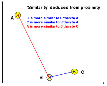
| We will try to assign all the subjects / individuals / objects in a given set to a particular group or 'cluster' if (and only if) clustering can be shown to exist. It is vital that you realise that these techniques are not designed to produce a 'right answer'; they are a way of exploring the character of your data and a way of discovering hidden information. How you interpret what you find will be down to your own judgment and experience. |
These are all non-hypothesis techniques. Clustering is achieved on the basis of
a defined or measured 'distance' or 'similarity' between individuals / objects.
Those objects with a high degree of 'similarity' will be placed in the same 'cluster'.
Those items that appear 'distant' or dissimilar from the first group will be placed
in another cluster. Eventually all individuals / objects will be allocated to
a cluster. The effect is to produce a hierarchy of clusters and these can
be represented by a dendrogram ( some texts refer
to cladograms). The idea of a 'family tree' will
be familiar to you and the logic here is exactly the same.
You may like to consider this procedure to be 'organisational' and based upon characteristics rather than being numerical.
We do not however, ( for the purposes of Cluster analysis) assume that 'groups'
exist a priori.
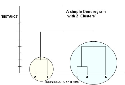
The most closely related or similar individuals here would be 1 and 3. Then 2 and 4. Next would be the link between 5 and 1,3. The two supposed clusters have been circled and they only 'join up' at the sixth distant level.
We are not testing anything but simply looking for apparent relationships between objects. Quantitative data can be used but so can qualitative data as long as it can either be given a 'score' or a 'presence / absence' score. In the biological sciences a combination of both types of data have been used to produce 'evolutionary trees' for plants and animals.
There are a great number of clustering techniques ranging from the very basic ones (which we will cover) to complex mathematical methods.It must be emphasised that we will only be taking an elementary look at this topic.
In simple cases (just 2 or 3 variables / characteristics involved), it might even be possible to identify clusters in such an obvious way that complex procedures are not needed. The method adopted is to 'build up' the most similar attributes displayed (by the objects) into larger and larger classes. The next most similar is then joined on and then the next most similar etc,etc. As stated, we are using a hierarchical clustering technique in this instance. Furthermore, we are adopting the agglomorative approach because we wish to build up sets of entities into successively wider partitions, like the branches of a tree. In theory, we could start with a single entity / example and build up to an all encompassing set.
Going from large to small would constitute the divisive approach . Both concepts are valid
It
is the nature of our thought processes to want to place objects into categories.
It is the way that our brains' sift, sort and store large amounts of information
so that 'memory' allows efficient retrieval of stored information. Even the idea
of naming objects and using symbols (letters) at all, is
a classification
system because it allows us to distinguish one object from another e.g. dog, cat,
pencil, brick, horse, mouse, table etc. Each of these combinations of written
symbols conveys a specific meaning to the reader.
Aristotle (384 - 322 b.c) built up his own system of classifying animals which began with a simple (but very sensible) distinction; those with red blood (roughly all vertebrates) and those lacking red blood (roughly all invertebrates).
 |
Perhaps the earliest extensive example of cluster analysis come from the work of the Swedish botanist Karl Linnaeus (1707 - 1778). He was an argumentative, uncultured and 'scruffy' man but his ideas about the hierarchy of characteristics that might show variation but were, in some capacity; common to all living things, took root amongst the scientific 'establishment'. By the time he was 28, he had begun the massive task of describing and classifying flowering plants based upon the shape, colour, size and position of the stamens, pistils and petals. His Systema Naturae was first published in 1735. By 1755, some 7700 flowering plants had been thus classified according to the visible attributes that they had in common. |
 Born in the same year; his main detractor was the French naturalist, mathematician
and vegetarian; Georges-Louis Leclerc, the Compte de Buffon
(1707-1788). Buffon believed that life was constantly in a state of change
and that nothing was static and that the rigid Linnaean system was "vile,
inferior and fallacious"
Born in the same year; his main detractor was the French naturalist, mathematician
and vegetarian; Georges-Louis Leclerc, the Compte de Buffon
(1707-1788). Buffon believed that life was constantly in a state of change
and that nothing was static and that the rigid Linnaean system was "vile,
inferior and fallacious"
Linneaus also extended his methods to cover animals and human diseases. As specific characteristics became less similar between specimens, so the position within the hierarchy became higher (more remote). Conversely, as the characteristics (between two specimens) became more similar, so their position within the hierarchy goes further down the scale to species, subspecies and even to variety / breed.
In
other words, we move from the general (few similarities / many differences) to
the specific
(many similarities / few differences).
E.g. A "living thing"....
So today, if a hitherto unknown plant is found in the Amazon jungle; a close examination by an experienced botanist will be able to determine firstly the Phylum and then the Class etc etc until.....
1. Is this a new species, variety etc.?
2. Has this plant been classified before?
3. If it is a new species, he can determine where it 'fits' in the hierarchy of plants using our existing taxonomy.
This concept of 'natural groups' can be equally applied to inanimate objects (non-numerical / qualitative information) as well as to living things and more recently, to numerical / quantitative information as well. We can consider classifying hotels, clocks, steam engines, Building Societies, computers or sailing boats in this way, that is; to enumerate as many similarities (or similarities / differences) as possible. It is important that any groups so constructed have a predefined and valid reason to be categorised in the way that you have chosen. We can define what attributes a group might have but we cannot assume in advance that any individuals in the dataset are actually going to fit into that group in advance of the test.
We may wish to consider similarities based on scaled but metric or non-metric data. The process basically relies upon the idea that the distance between points plotted on a scattergraph gives a good indication of the similarity between the entities:
"The
closer together two points are; the more similar they are"
"The further
apart two points are: the more dissimilar they are"
Distances measured in this way are often referred to as 'Pythagorean' (because each distance measures the hypotenuse of a right angled triangle) or if you are working in SPSS, their term for the same method is 'Squared Euclidean'. The other main option is the 'Manhattan method' which involves moving only in the horizontal and vertical planes to measure the distance. It is equivalent to using the 'other' two sides of a right-angled triangle. The three coloured arrows in the chart below all trace out the 'Squared Euclidean' track.
A problem arises however when we encounter a Cluster of points. It is possible to measure the distance between each point and every other point but three expedient and practical methods have been devised. The term that refers to the method of measuring those two points in this context is: 'Linkage'....
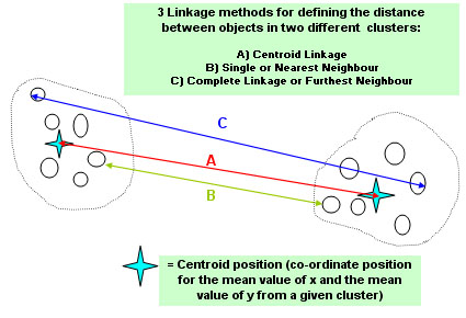
SPSS will offer you
all three linkage methods to choose from.
The chart shows that we can compare spatial numerical values for the points in the various clusters by looking at A)...centroid linkage B) the two that are closest to each other (nearest neighbours)or C) complete linkage (furthest neighbour). There is no right or wrong linkage method to use and it is sometimes best to try all three in the hope that one will give a clearer picture than the other two. With small data sets it is possible to construct a 'distance matrix'....
| POINT |
1 |
2 |
3 |
4 |
| 1 | CenNNFN | |||
| 1 | ||||
| 1 | ||||
| 2 | Cen | CenNNFN | ||
| 2 | NN | |||
| 2 | FN | |||
| 3 | Cen | Cen | CenNNFN | |
| 3 | NN | NN | ||
| 3 | FN | FN | ||
| 4 | Cen | Cen | Cen | |
| 4 | NN | NN | NN | |
| 4 | FN | FN | FN |
Etc Etc...
The choice of variables is also important and all must be given equal 'weighting' so as not to introduce a bias in terms of the positions of the entities on the scattergraph.
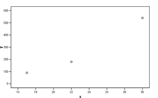
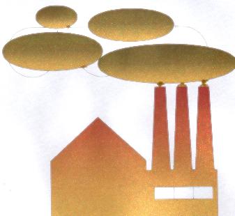 Imagine we had some data on the Interval scale; "the internal diameter of
factory chimneys from 15cm to 35cm" and another similar variable was "the
height of those chimneys, from 80cms to 8m" The former will have little effect
on the 'distances' between individuals. The outcome will basically be a reflection
of their height. We can compensate for this by using standardised
variables.You will recall individual
standardised measurements (Focus
3)as more commonly known as Z-scores and :
Imagine we had some data on the Interval scale; "the internal diameter of
factory chimneys from 15cm to 35cm" and another similar variable was "the
height of those chimneys, from 80cms to 8m" The former will have little effect
on the 'distances' between individuals. The outcome will basically be a reflection
of their height. We can compensate for this by using standardised
variables.You will recall individual
standardised measurements (Focus
3)as more commonly known as Z-scores and :
| Z-score
= measurement
- mean for that set of measurements .............. standard deviation of that set of measurements |
E.g 17 - 23 = - 6 and - 6 ÷ 5 = -1.2 etc...
Chimney | Diameter
(cm) | Mean | Std
Dev | Z-score | Height
(m) | Mean
| Std
Dev | Z-score |
1 | 17 | 23 | 5 | -1.2 | .9 | 2.7 | .8 | -2.75 |
2 | 22 | -0.2 | 1.8 | -1.13 | ||||
3 | 30 | 1.4 | 5.4 | 3.38 | ||||
| Range | 2.6 | 6.13 | ||||||
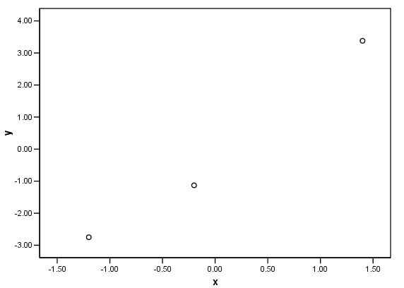
Now, all three chimneys are being compared on an even basis and it is these values that we would prefer to plot on the scattergraph. Look at the two charts and note how the scales seem out of proportion to each other on the first but are far more balanced on the second....
 .
.
Cluster analysis has been variously referred to as 'clumping', 'typology construction', 'pattern recognition', 'numerical taxonomy' and 'classification reduction'. All these titles suggest that the ultimate aim is to classify previously unclassified objects by reference to their inherent characteristics. This differs from the ideas used in Discriminant analysis where 'natural grouping' are assumed to exist in the first place. This will all be discussed later in Focus 16.
| The primary intention: | Groups delineated in advance (a priori) |
Groups not assumed or delineated in advance |
| To
achieve 'dimension reduction' |
PRINCIPAL COMPONENTS ANALYSIS [Focus 14] | |
| To assign many / all individuals to groups where practicable |
| CLUSTER ANALYSIS [This Focus ] |
| To assign a 'new' individual to an existing group |
DISCRIMINANT ANALYSIS [Focus 16] |
|
So Cluster Analysis exploits our ability to distinguish the similar from the dissimilar. The greater the number of clear comparisons that we can make the more precise our classification will become.
If only one characteristic is used (e.g. Presence or absence of a backbone) the classification is called monothetic and when many characteristics are investigated, the classification is known as polythetic.
Every object in the universe is capable of being classified simply by association with at least one other object whether it is a newly discovered solar system, a new electron particle, a motor car, types of footwear, a new pension scheme or a wild flower.
We
can divide the cluster analysis techniques neatly into sub-types, the choice depends
on the quality of data being examined. For example, if the data is non-metric,
we are limited to using a simple comparative matrix.
However, if the data is metric we can be more precise and use similarity / differences
'distances apart' (linkage) and compare them as index numbers. These index numbers
might better be described as metric coefficients. When tabulated, they will give
a coefficient for every possible pair of values in the dataset.
[See also
Focus 7].
The index numbers can finally be used to 'join up' closely related values in an
hierarchical fashion until all cases are accounted for. This process is called
fusion. So fusion is achieved by employing one of
the three linkage options. In a similar fashion,
when dealing with qualitative data, we have to
decide which two individuals have the most characteristics in common and we lay
them together.
In both scenarios, the next stage is to construct a matrix....
Surveys and questionnaires often ask for opinions and attitudes and this type of non-numerical, subjective information can be used (if there is sufficient data) to place individuals into groupings by using manual numerical codings (see also Focus 8). From there, it may be possible to either compare how the groupings change over time or to assess which groupings represent a majority / minority view. At the introductory level, we will look at situations where the choices are bi-directional only: present /absent, yes / no, on /off etc....
We will look at just two methods of measure here, the Jaccard and the Clarke matrices but do note that these are just two of many. They have been selected because they are appropriate for the types of data we are discussing and they are simple to illustrate.
We do not use the computer here.
This is one of the simpler matrices because it only looks for similarities. You may like to think of these matrices as modified frequency (of similarities occurring) charts. Let us start with an example that involves simple 'presence or absence' data.....
Here are 6 children and 4 attributes that any of them might have. Which children might be most closely related? Next, we produce a very simple 'tick chart'...... '#' means 'present', a blank space obviously means 'not present'. All attributes being measured are given equal status or 'weighting'.....
Child | Red
Hair | Colour
Blind | Green
Eyes | Pigeon-toed |
1 | # | # | ||
2 | # | |||
3 | # | # | ||
4 | ||||
5 | # | # | ||
6 | # |
By adding up all the '#'s we can produce a Jaccard 'similarities matrix' and this next stage is displayed as a summary chart. Each value in the table below is called a 'similarity coefficient'. Remember, we are logging the similarities only.....
Child | 1 | 2 | 3 | 4 | 5 | 6 |
1 | ||||||
2 | 0 | |||||
3 | 1 | 0 | ||||
4 | 0 | 0 | 0 | |||
5 | 2 | 0 | 1 | 0 | ||
6 | 1 | 0 | 0 | 0 | 1 |
The strongest link seems to be between child 1 and child 5 where they have two attributes in common and this is the only location where that happens in the matrix..
A slightly more involved example....
 The 'Bloom-it-all' garden centres have 5 new varieties
of Rose on sale this year. They want to be able to show the customers the relationship
between these varieties in a simple but dynamic way.
The 'Bloom-it-all' garden centres have 5 new varieties
of Rose on sale this year. They want to be able to show the customers the relationship
between these varieties in a simple but dynamic way.
Using 5 'easy- to- see' attributes (e.g. pink petals, long stamens, spade-like petals, serrated edge, short bracts etc.) we again record each one on the presence of that particular attribute.
| Rose |
Attribute #1 | Attribute #2 | Attribute #3 | Attribute #4 | Attribute #5 |
| A | # |
|
# |
# |
|
| B | # |
# |
|
|
|
| C | |
|
# |
|
# |
| D | |
# |
|
# |
|
| E | # |
|
# |
# |
# |
Look across the rows at Roses A and B, they only share 1 attribute in common but if we look at Rose A and Rose E, we see that they share 3 attributes in common and are would therefore be considered more similar to each other than A and B were.
Roses C and E share 2 attributes in common and could therefore be less closely related to each other than A and E were but more closely related to each other than A and B were.
| Rose |
A |
B |
C |
D |
E |
| A |
| ||||
| B |
1 |
| |||
| C |
1 |
0 |
| ||
| D |
1 |
1 |
2 |
| |
| E |
3 |
1 |
2 |
1 |
|
With so few (5) attributes in the examination, the differentiation of any similarities is going to be quite crude.
So let us imagine that we expand the investigation by using 10 visible attributes of the 5 Rose varieties.
| Rose |
A |
B |
C |
D |
E |
| A |
| ||||
| B |
2 |
| |||
| C |
5 |
3 |
| ||
| D |
1 |
6 |
5 |
| |
| E |
7 |
4 |
2 |
8 |
|
Now some clearer differentiation has begun to emerge. Rose A has 7 attributes in common with Rose E and Rose C has 5 attributes in common with Rose D etc. etc. We could surmise that D and E were closely related (8 similarities) whilst A and D are not closely related because they only share 1 attribute....at least as far as the attributes being examined are concerned.
The amount of comparisons and general information is becoming cluttered so we need to display it graphically as an inverted linkage tree or what is more commonly called a dendrogram. The allusion to trees is an appropriate one as the proximity of two objects represents their relative positions on the 'branches'. The nearer that two objects are to the 'ends' of the branches; the more closely they are related to each other. We can now appreciate both the fusions and divisions that exist at each level of the appraisal. Partitioning can be visualised in both the horizontal and the vertical axes.
The
type of dendrogram most familiar to you will be the 'family tree'. People that
are closely
related (e.g. father / son) will be linked with only one vertical
step between them. Brothers and sisters
will appear on the same level. Son
and grand-father would be separated by two levels etc etc.
In
the chart below, the horizontal red bars represent the 'level' at which two objects
are related in
terms of the number of attributes (similarities) they have
in common. In later examples, we will see that these levels can be better described
as 'fusion coefficients' and do not need to be whole numbers. They are on a continuous
scale and the gaps between them are a measure of the closeness of the relationships....
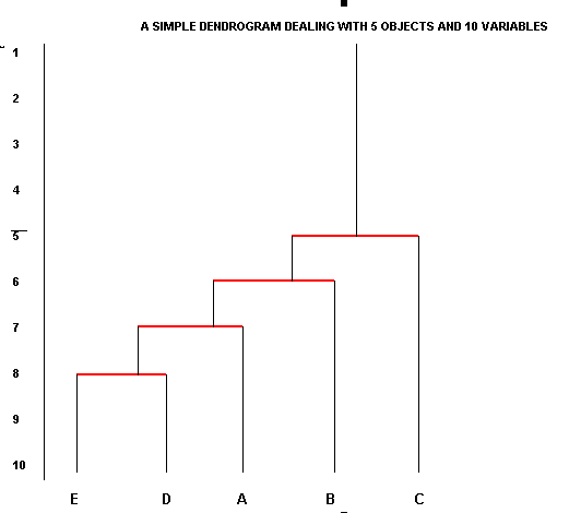
Always start with the highest number of similarities (the largest fusion coefficient)(E:D = 8, lowest red line) and continue in descending order and we stop when all the objects / entities have been incorporated.
There is one important drawback with this type of display. Objects that are somewhat dissimilar can become linked through intermediates. This process is known as 'chaining'. Look again at the similarities between Roses C and E; they should link at the '2' level but priority is given to the fact that Rose C connects to D at the '5' level.
Note
also that after the first coefficient has been dealt with, the second may or may
not involve one
of the objects already placed. If it does, you should join
the new (third) object to that branch. If it transpires that the second highest
coefficient is between two hitherto unplaced objects; then a new 'branch' must
be started. The two branches will eventually 'connect' at a lower similarity level.
The Jaccard Matrix is particularly useful when there are large, qualitative datasets to deal with.
 6 airports are being compared in terms of the facilities they offer, 8 facilities
such as "can handle Jumbo Jets" or " can handle freight aircraft
" or "operate night flights"etc etc.
6 airports are being compared in terms of the facilities they offer, 8 facilities
such as "can handle Jumbo Jets" or " can handle freight aircraft
" or "operate night flights"etc etc.
| Airport
/ Facility > |
A |
B |
C |
D |
E |
F |
G |
H |
| Manchester |
# | # | # | # | ||||
| Southampton | # | # |
# |
# |
# |
# | ||
| Heathrow |
# |
# |
# |
# |
# |
# | ||
| Gatwick |
# | # |
# |
# |
# | |||
| Luton |
# | # | # | |||||
| Stanstead |
# |
# |
# |
# | # | # |
Task: Create a Jaccard dendrogram (on paper) from this information. Tip: think carefully about facility D and F before you begin.
Q. Which two airports appear to be most dissimilar to each other.
The
logic of this type of matrix is similar to the Jaccard matrix except that we now
assess
similarities and differences together.
The Jaccard method is considered preferable because it does
not drag non-essential
(and more imprecise) data along with it. Furthermore, the Jaccard Matrix is
usually reserved for the larger datasets which should always improve the accuracy
of any analysis.
| We should
also repeat the distinction between the idea of 'distance between' two objects
and the use of a matrix for analysis..... With non-parametric data, we have to use the matrix purely on a presence / absence or yes / no basis because we have no measurable distances to work with. The presence / absence attributes are displayed on a tick chart and then we sum those +ve and / or -ve matches. With parametric data we would 'switch up' to the more satisfactory and precise procedure of using metric coefficients. |
Caution!! When we refer to 'differences' we do not mean that one object displays an attribute and the other does not. It really means 'negative matches', that is, both objects share the fact that a particular attribute is absent.... from both of them.
Look again across the
earlier tick chart....
| Rose |
Attribute #1 | Attribute #2 | Attribute #3 | Attribute #4 | Attribute #5 |
| A | # |
|
# |
# |
|
| B | # |
# |
|
|
|
| C | |
|
# |
|
# |
| D | |
# |
|
# |
|
| E | # |
|
# |
# |
# |
We stated earlier that Roses A and B shared just 1 attribute in common (Attribute 1) but in fact they share 2 because they neither of them exhibit Attribute 5 i.e. a full negative match. So this extra information could now be incorporated into a Clarke 'Similarities and Differences' matrix.
Roses C and E have 3 attributes in common , 2 positive matches and 1 negative match. On the Clarke matrix, such a situation would score 3 whereas on the Jaccard matrix this would score 2.
Staying with Rose production, here is a tick chart covering 10 possible attributes
but this time the Nurserymen have improved their capacity to delineate
the attributes one from another by adding scales
to two of them and choices to 7 of them and numerical data to one of them.
Task:
Study the chart below carefully and determine the scale of measurement (N.O.I.R)
on each of the following:
Attribute |
[N.O.I.R] |
Measurement |
| 1. Stem shade | Scaled 1 - 10 | |
| 2. Size of flower | L or S (large or small) | |
| 3. Petal shade | Scaled 1 - 10 | |
| 4. Shape of petals | 5 choices | |
| 5. Shape of bracts | 5 choices | |
| 6. Perfume | P or A (present or absent) | |
| 7. Shape of stamens | 3 choices | |
| 8. Shape of leaf | 5 choices | |
| 9. Colour of leaf | 5 choices | |
| 10. Number of petals | 4, 5, or 6 |
This gives us 22,250,000 possible permutations and should be more than sufficient to expose the relationships between the 6 Roses under scrutiny !
Note that we are not measuring 'distances' between any pairs of values, only in the number of times a match appears between any pair.
Here is the resulting tick chart:
| Attribute >>> | 1 |
2 |
3 |
4 |
5 |
6 |
7 |
8 |
9 |
10 |
| Rose A | 4 |
L |
4 |
2 |
4 |
P |
2 |
3 |
2 |
4 |
| Rose B | 3 |
S |
6 |
4 |
4 |
P |
2 |
5 |
1 |
4 |
| Rose C | 5 |
S |
3 |
3 |
3 |
A |
3 |
4 |
3 |
4 |
| Rose D | 6 |
L |
7 |
4 |
3 |
A |
3 |
5 |
2 |
6 |
| Rose E | 4 |
L |
8 |
2 |
2 |
P |
1 |
3 |
4 |
5 |
| Rose F | 3 |
S |
2 |
1 |
4 |
A |
1 |
5 |
3 |
6 |
Q. Here is the Jaccard Matrix for this data, why is the Jaccard Matrix most appropriate in this instance?
|
| Rose A | Rose B | Rose C | Rose D | Rose E | Rose F |
| Rose A | | |||||
| Rose B | 4 |
| ||||
| Rose C | 1 |
2 |
| |||
| Rose D | 2 |
2 |
3 |
| ||
| Rose E | 5 |
1 |
0 |
1 |
| |
| Rose F | 0 |
4 |
3 |
3 |
1 |
|
Task: Produce an appropriate dendrogram from this data.
Q. Can you see an example of 'chaining' (clue: look at level 4)?
Q. How many 'natural groups' would you say exist here?
Q. On what premise would you separate them?
We
will only illustrate one technique here but be aware
that there are other clustering algorithms:
the two-step cluster analysis
is appropriate where very large data files are present and the K-means cluster
analysis is used specifically where continuous data
is present.
Note that SPSS offers a wide range of distance measures, similarity index numbers and clustering algorithms.
SPSS recognises the procedure we wish to use under the name: Hierarchical Cluster Analysis (HCA).The procedure is limited to smaller data files (hundreds of objects to be clustered), but has the following unique features: *Ability
to cluster cases or variables.
Essentially, this procedure is an exploratory tool designed to reveal natural groupings (or clusters) within a data set that would otherwise not be apparent. |
 Let us return to the case of the Cross-country runners introduced in Focus
14.
Let us return to the case of the Cross-country runners introduced in Focus
14.
We are going to explore this idea of 'similarities between the individuals'.
It may or may not be possible to place each team member in a group or cluster.
We will compare the biometrics of the athletes to see how closely they match each
other. We wish to discover whether 'natural groupings' exist or not and if they
do; to be able then to allocate each and every person to his correct group. Groupings
may be present but they do not readily show themselves simply by looking at the
dataset and we do not assume any grouping before commencement.
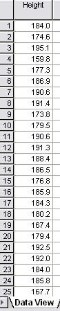
Here is part of the dataset again.... (SPsmAex 13 HCA Athletes)
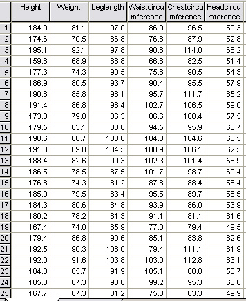
n = 35
It
would be impossible to pick out any relationships, either close or distant by
simply looking at this
data.
Using HCA, SPSS will run through (n - 1) computational stages until all the cases have been linked to each other. The computer will carry out every possible 'distance measure' for all variables and for all possible pairs of individuals and will then link each case to the next nearest case based upon the array of metric coefficients generated.
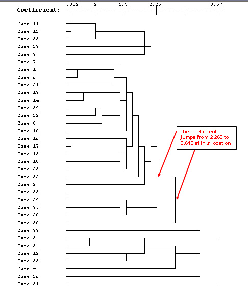
The lower the co-efficient figure; the closer the relationship between the 2 individuals of the pair. In the chart below, cases 11 and 12 link at the closest level and generates a co-efficient of .359. Case 1 only links to case 21 at the end of the computation and generates a high co-efficient of 3.673.
Use: SPsmAex13 HCA athletes for this exercise
Or: Open SPSS, 'Variable View', Type in the names of all your variables as usual
Switch to 'Data View'. Open 'Data' from the drop down menu, pick 'Select cases' and ' Select all cases', Click 'Continue', Click 'OK'
To run the HCA...Go to 'Analyse', 'Classify', 'Hierarchical Cluster'
Select
all your biometric variables and transfer then to the 'variables' box
Make sure the 'Cases' button is on, and tick the 'Statistics' and 'Plots' boxes
Click 'Plots', tick 'Dendrogram', select 'None' in the Icicle box, Click
'Continue'
Click 'Method', Select 'Nearest Neighbour', make sure the 'Interval' button is on
Select 'Squared Euclidean', and under 'Transform values' select 'Z Scores'
Click 'Continue' and then 'OK'.
The Agglomeration schedule and a Dendrogram will now be generated.
Task:Study the dendrogram carefully....how many 'natural groupings' do you think are present. If you think there any, try and insert the dividing line(s).
( The full Agglomeration schedule is shown and consisted of 34 stages because there were 35 athletes)
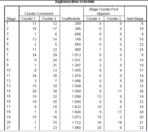
The Agglomeration schedule shows the order in which a total of 34 links have been made; closest links first. The schedule also suggests that only two natural clusters exist, columns 5 & 6 indicate at what stage each linkage was allocated to one or other of the two clusters. A 'cluster' has to be a minimum of 3 individuals.
So
the agglomeration schedule shows that cases 11 and 12 have the least distance
between them and are therefore linked together first (at level 1). Then 16 is
linked to 17 at just above level 1.
1 to 6 at approximately level 2 and so
on until all cases have been accounted for. The final column in the schedule indicates
when the pairing next features in the lists. So for 11 / 12 it is at the 6th stage
(Level 5) when 11 pairs with 22.
The fusion coefficients (Column 4 above) indicate the 'closeness' (or conversely: distance apart) of pairs of individuals. They are represented by the 'tie-lines' on the dendrogram below. The coefficients also indicate the 'closeness' of individuals to their nearest neighbour in ascending order.
... Looking more critically at 'natural groupings'...If
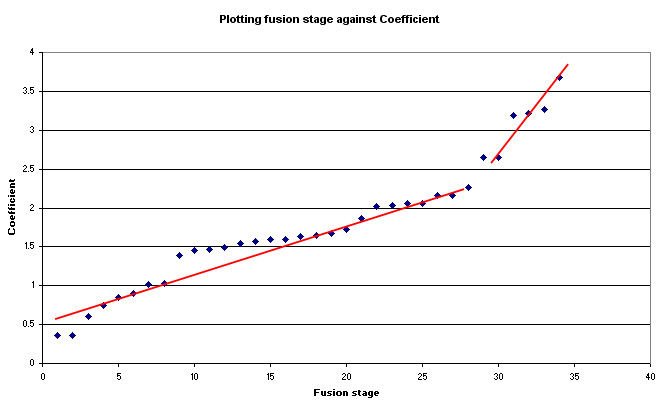
we produce a scatterplot of the fusion order (on the X axis) against the coefficient
values (Y axis), we can search for apparent 'breaks' in the pattern of regularity.
Any 'breaks' suggest that there are more than one 'natural groupings' present
because the 'distance' between changes has increased. This idea should become
clearer in the Dendrogram itself because the location of the break has been highlighted
with two red arrows
Note how the coefficient 'jumps' after Stage 8 (1.031 to 1.387) but the slope does not change very much. However, the slope does change after stage 28 (2.266 to 2.649). This is after case 20 has been entered. Both before and after this point, the coefficients climb steadily. This larger 'jump' appears in the dendrogram and is shown below.
Q. Can you see now that the most likely 'natural break' is between case 30 and case 20? Are there any other points in the dendrogram where a natural break might be considered to exist?. Look again at the fusion chart to see if any more interpretations could be placed on this output..
|
So the Dendrogram is the graphic representation of this whole process of aligning similarities according to their closeness to other cases....
You will appreciate that as we go from left to right across the list, the similarities are becoming more distant until finally we appear to have 2 groups emerging. The first group consists of 26 men and the second group has 9 members. We have, in effect produced a kind of 'segregation' based on the closeness of each man's biometrics to the other men in the set.
Finally, let us return to the idea that simply measuring the height (or weight) of any man might allow us to make inferences about which 'group' that individual should be placed in...
 |
The mean height for the whole group is 183.3 cms but for the first group it is 186.2cms and for the second group it is 176.6cms...that is 5.2% shorter. Such a difference seems marginal and would not be easy to discern in a group of 35 but justifies the placement of the men into two groups if we take the decision that a 5% difference is worthy of note.. |
It should
now be clear that the height of each man can
corroborate the order of linkage exhibited and
this does facilitate our ability
to place the runners in their correct grouping. Remember, this level of analysis
will not be possible with nominal and ordinal data.
Q. Can you demonstrate that 'weight' and 'head circumference' might show the same importance?.
Task: Comment upon the grouping structure that has emerged.
Task: Comment particularly on the biometrics of Runners 3, 11 and 8 and then on 5, 13 and 2.
| Note:
When designing any questionnaire, it is imperative that the questions are selected
and carefully worded to gain the maximum amount of information from the respondent |
 The screenshot below is part of the data captured from a pilot study.....'lifestyle'
survey conducted on 40 people at random. The idea behind a pilot study
is to find those questions which might allow us to differentiate between groups
of people in a quick and effective way. We must assume that no groupings exist
before commencement of the survey. What we are seeking to discover here
is whether or not certain questions might allow us to discover any 'natural groupings'
before embarking on a bigger survey project.
The screenshot below is part of the data captured from a pilot study.....'lifestyle'
survey conducted on 40 people at random. The idea behind a pilot study
is to find those questions which might allow us to differentiate between groups
of people in a quick and effective way. We must assume that no groupings exist
before commencement of the survey. What we are seeking to discover here
is whether or not certain questions might allow us to discover any 'natural groupings'
before embarking on a bigger survey project.
8 of the questions in the survey only required a simple "yes" or "no" response (nominal data level). Are any of these questions useful 'indicators' of grouping or not?...
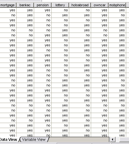
We are going to have to deal with 320 pieces of 'yes / no' information.
Q. Is it possible to discern any 'natural groupings' just by looking at the results sheet ?
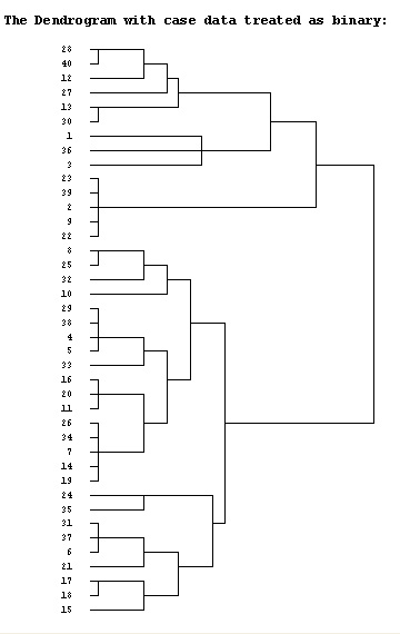
We could simply code 'yes = 1' and 'no = 0' but this would not differentiate between questions. We could simply score positive similarities in the classic Jaccard manner. This would produce a 40 x 40 matrix and again, would be difficult to interpret. The solution is therefore to try a number of possible SPSS dendrogram types to see if any patterns and / or clustering emerges. Firstly we will treat the case data simply as binary information. The resulting dendrogram looks like this:
Now we will see if the emerging patterns are any more clear if we treat the data as being on the interval scale. The dataset is available as: SPex66 HCA plus
To run the HCA...Go to 'Analyse', 'Classify', 'Hierarchical Cluster'
Select
all 8 variables and transfer then to the 'variables' box
Make sure the 'Cases' button is on, and tick the 'Statistics' and 'Plots' boxes
Click 'Plots', tick 'Dendrogram', select 'None' in the Icicle box, Click
'Continue'
Click 'Method', Select 'Between-Groups Linkage', make sure the 'Interval' button is on
Compare this output with the binary output version above. You should notice that the levels of fusion differ but the allocation of cases to the respective clusters has remained the same.
Remember, these are only two of a number of dendrogram outputs that we could have generated (try centroid fusion and nearest neighbour). The intention is to explore a number of options until something appears in the output that might most clearly suggest a pattern where differentiation can be observed.
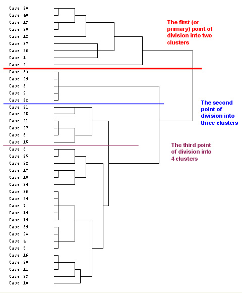
Starting at the right-hand side of the chart, the last linkage to be made joins two groupings, one of 9 members and the other of 31. However, it is possible to sub-divide a little further but remember that the first division will indicate the greatest disparity between the clusters and as we sub-divide further; the dissimilarities will lessen. For this reason, especially with small datasets, it is unwise to contrive more than 4 clusters....
Once you have studied the second dendrogram, carry out the run a second time but this time:
Click 'Statistics' and under 'Cluster membership', select 'Range of solutions' and type '2' for minimum number of clusters and '4' for maximum.
Now run the procedure and study the cluster membership chart output as shown below. The red, blue and brown lines in the dendrogram have been inserted according to the Cluster membership indicated by the output.....
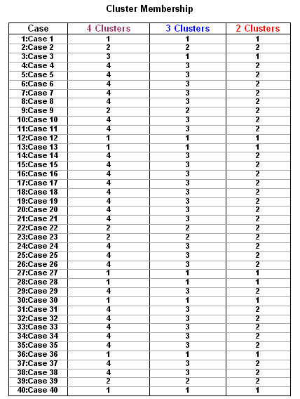
Now return to the dendrogram above and separate the cases into their appropriate grouping (use the 3-cluster output option for this). Use the blue and red lines as dividers and ignore the brown line.
Task: Produce your own consistency chart like this for Groups 2 and 3. Agreement to the level of 85% can be considered as virtually unanimous and would justify the inclusion of that question in any further study.......
Group
1: | Q1 | Q2 | Q3 | Q4 | Q5 | Q6 | Q7 | Q8 |
Case
1 | Ø | Ø | Ø | Ø | Ø | Ø | ||
3 | Ø | Ø | Ø | Ø | ||||
12 | Ø | Ø | Ø | Ø | Ø | Ø | ||
13
| Ø | Ø | Ø | Ø | Ø | Ø | Ø | Ø |
27 | Ø | Ø | Ø | Ø | Ø | Ø | ||
28 | Ø | Ø | Ø | Ø | Ø | Ø | Ø | |
30 | Ø | Ø | Ø | Ø | Ø | Ø | Ø | Ø |
36 | Ø | Ø | Ø | Ø | Ø | Ø | ||
40 | Ø | Ø | Ø | Ø | Ø | Ø | Ø | |
Maximum
Agreements | 9 | 8 | 9 | 5 | 7 | 6 | 9 | 5 |
So questions 1, 2, 3, and 7 seem to define the parameters of this group very well. You should find that the same questions define the parameters of Groups 2 and 3.
The first practical division into clusters is between those subjects (cases) that do not have a bank account or a car and those that have both (Q3 &7).
The second division of clustering separates those that don't have a mortgage.
We might clarify these findings by using a cross-referencing chart where all coloured squares have reached 85% unanimity and from this you should realise that we have managed to construct three fairly distinct 'clustering profiles' from our original data......
| Cluster
group | Q1 |
Q2 |
Q3 |
Q4 |
Q5 |
Q6 |
Q7 |
Q8 |
| 1
9 members | Non-salaried | No mortgage | No bank a/c | Mixed
(5:4)(56%) | Mixed
(7:2)(78%) | Mixed
(3:6)(33%) | No car | Mixed
(5:4)(56%) |
| 2
5 members | Non-salaried | No mortgage | Have bank a/c | No pension | Buy lottery tickets | Have holidays abroad | Own car | No mobile phone |
| 3 26 members | Mixed (17:9)(65%) | Mortgage | Have bank a/c | Mixed (16:10)(62%) | Mixed (8:18)(31%) | Mixed
(17:9)(65%) | Own car | Mobile phone |
So the 3 most useful 'separational' questions have been:
A colour-coded summary chart derived from the 5 most 'separational' questions is helpful:
| Group 1 | |||||
| Group 2 | |||||
| Group 3 |
Where we have found a mixed result (some "yes" responses and some "no") the interpretation is less clear. This might suggest that any future questionnaire design should replace the questions concerning 'pensions', 'lottery tickets' and 'holidays abroad' because the responses were mixed. Of course, this particular exploration of the data is only one of many and other explorations might contradict these conclusions and suggest that those questions discarded here still had merit in some other way!
![]()
Go back to 'quick view' Contents page
Go on to Focus 16
Go back to Focus 14