
[Focus 16]Discriminant
Analysis.... |
The 'Keywords and Phrases' chart below is best printed off and used as a reference within each Focus.....
| Focus 14 . Principal Components Analysis | Focus 15. Cluster Analysis (HCA) | Focus 16. Discriminant Analysis |
| Dimension
reduction Data compression | Dendrograms | Predictive models using parametric data |
| No groups assumed in advance | No groups assumed in advance | Groups are assumed in advance |
| 'Clouds of data' | Types of 'Linkage' | 'New' variable constructed to give a 'score'; the discriminant function |
| Principal components and Variance | Monothetic and Polythetic (number of characteristics in the analysis) | Independent variables as 'predictors' |
| Eigen values and the KMO co-efficients | The Jaccard matrix | The 'Decision rule' |
| The rotated approach | The Clarke matrix | Wilks' Lambda |
| The Kaiser correction | Fusion charts | Stepwise analysis |
| Plotting Component 1 against Component 2 | Cluster membership | The Discriminant function and Discriminant 'score' |
| Factor 'scores' for each case | Predicting group membership of a new case | |
| Variables left in or out of the analysis | ||
| % of cases correctly classified |
Focus
16
When we studied regression, it was noted that a particularly important facility was the ability to estimate a value for the dependent variable (y' on the Y axis) from given values for the independent variable(x on the X axis). This could be achieved using the derived formula for the 'line of best fit' or less precisely, from the line on the chart itself. Of course, it was imperative that both variables were parametric or normally distributed.
However, the situation arises where we require a prediction / decision; not in clear quantitative terms but in terms of a qualitative judgment but still based upon sound and logical principles.
In practical terms, this might take the form of a question; "we know we have categories... but which category do we place a particular object / person into"? What are the parameters? In simplistic terms "which group does this person appear to belong to?"
An
essential prerequisite for Discriminant analysis is that the parameters of the groups are defined prior to analysis. |
There are also a number of other preconditions that have to be met before this type of investigation can go ahead..
| * The data is multivariate normal (that is to say, the sampling distribution of any combination of predictors is normally distributed. *Some minor skewness is acceptable provided the dataset is not small. *Any and all 'outliers' must be identified and removed from the analysis *Homogeneity (similarity of) of variance-covariance matrices is assumed. *No
variable must be an exact linear function of any of the others...this is a condition
known as 'multi-colinearity'
|
Discriminant analysis is a technique for combining a selected number of independent variables into a single 'new variable' upon which each case in the study earns a unique and overall 'score'. This new variable is known as the discriminant function. The analysis is so constructed as to maximise the differentiation between the discriminant functions achieved by each individual.
When we discussed Cluster Analysis (Focus 15), we confined ourselves to working with qualitative distinctions based upon the characteristics being recorded.
But...
| *What if the displayed characteristics (of the object) are less clear? *What if this creates some indecision as to which group a particular object belongs? *What if an object could conceivably belong to more than one group? |
Some terms
of reference to allow us to discriminate between the a priori groups and
a method of allocating new cases to the most appropriate
group (whilst minimising risk of making a mistake) are required. Again,
it must be emphasised that only parametric and normally distributed data is
presented for analysis.
Because the categories ( groups) are defined a priori, the task is to find the 'best /clearest /strongest' functions / components (in canonical order) that best discriminate (i.e. maximise the distinctions) between these pre-existing groups. We have done this before, you may remember that in PCA (Focus 14 ) we used the idea of 'rotating' the solution to gain maximum differentiation and then in HCA (Focus 15) we used different SPSS routes to produce different dendrograms to highlight differentials.
 The NSPCC decided to carry out a large national
survey concerning 'children at risk' population in Britain. They might
gather a wide variety of information / data concerning spatial distribution, absolute
numbers, size of family, sex, height and weight of children, times of year when
'most at risk etc. etc.
The NSPCC decided to carry out a large national
survey concerning 'children at risk' population in Britain. They might
gather a wide variety of information / data concerning spatial distribution, absolute
numbers, size of family, sex, height and weight of children, times of year when
'most at risk etc. etc.
The crucial question however, will always be: "can we pin point which children (or rather which groups of children) are most at risk"? You can already appreciate that the premise that there are two groups of children: those at risk and those that are not, has already been accepted in advance.
How
should they be most clearly defined or delineated so that:
"we can
take any new case that arrives and quickly place that child in the correct grouping
so that appropriate help can be offered quickly and efficiently, if required.
The initial step might perhaps be based on the social workers professional judgement, i.e. 'those at risk' and 'those not at risk'. At this stage, as many possible variables can be listed for inclusion in the analysis as is required. It may also be necessary to consider devising more than just two groups. It may be that we need to establish in advance the true mathematical nature of the difference between the groups. Using mathematics, it will be possible to maximise that differentiation.
There
is no point in carrying out a Discriminant function analysis if the groups don't
really exist but are simply wishful thinking or an artificial contrivance!! |
After collecting all the numerical data, we want to place all the children that were identified by the social workers into one or other of the two categories. Such information could then be valuable in developing policies to help safeguard the more vulnerable children in our population.
The
core of the analysis technique is to 'combine' those independent variables statistically
selected (by the SPSS procedure) into one new single variable called the
Discriminant function.
Each case in the dataset earns a 'score'. These scores will be set in such a way as to discriminate to the maximum extent the differences present within the groups of cases measured. We hope to find that there is the equivalent to a significant difference between the groups.
As the analysis progresses, a test statistic that SPSS will generate called Wilks' lambda will test the suitability of each independent variable for inclusion as part of the ongoing analysis and will assess the degree of discrimination that has been achieved.
Remember this chart:
| What is the primary intention? | Groups already delineated (a priori) |
Groups not yet assigned or delineated |
|
To
achieve 'dimension reduction' |
PRINCIPAL COMPONENT ANALYSIS [Focus 14] | |
To
assign many / all individuals to groups where practicable |
CLUSTER ANALYSIS [Focus 15] | |
| To assign a new individual to an existing group |
DISCRIMINANT ANALYSIS [This TOPIC] |
|
If we are only considering two potential groups, it may be helpful to imagine two overlapping normal distributions, one for the 'not at risk' children and one for the 'at risk' children. Both curves would have their own mean and the task of the discriminant analysis procedure is to generate scores that place each case (and later, any new ones) in one or other of the two groups in such a way as to maximise the distance between those two means. We wish to separate these two distributions as much as possible.....
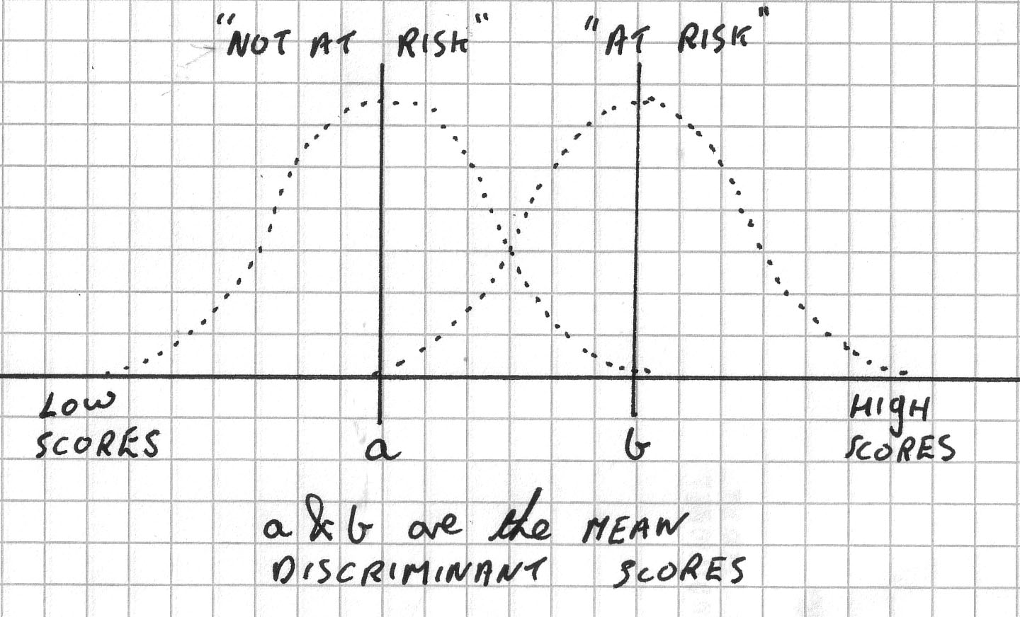
Within the procedure there are also techniques to help to discern those variables that make the greatest contribution to the process of separation and eventually, grouping prediction.
We can use a stepwise procedure whereby each individual independent variable (often seen written as the Predictors) is inserted or removed from the analysis in turn. This enables the choice of which variables that should go forward into the final steps of the analysis to be made.
The Wilks' lambda statistic is generated and the changes in it's value (when a variable is left in or taken out) is recorded. The significance of this change is measured using an F-test. Only variables with an F-value greater than the critical value are allowed to proceed. SPSS will do all this for you.
So SPSS goes through a lengthy process of inserting & deleting & reinserting all the independent variables one at a time. Actually they are all removed first and then allowed to re-enter one at a time if the F-value is appropriate, if it is not, the variable is left out for the remainder of the analysis.
At the end of the analysis SPSS will make use of a decision rule that will allow us to define mathematically which group any future case that is presented (measured in the same way) is most likely to belong to.
We will also generate a '% score' that tells us how accurate we have been with our allocations of cases into their respective groups. There is little point in allocating a case to a particular group if we are not satisfied that there is a reasonable chance of getting it right!!
Remember
also that it is perfectly legitimate to 'explore' these datasets...we have moved
away now from the idea that "only one course of action or procedure will
be right" or that there "is only one solution to a problem".
A practical worked example:
 Metromart plc operate a chain of suburban 'convenience' stores. Shelf
space is at a premium and so cost / effective use of every square meter is vital.
To achieve this, they must improve their distribution logistics. They own 300
stores nationwide and have 4 regional distribution centres. The logistics centre
is in the Midlands.
Metromart plc operate a chain of suburban 'convenience' stores. Shelf
space is at a premium and so cost / effective use of every square meter is vital.
To achieve this, they must improve their distribution logistics. They own 300
stores nationwide and have 4 regional distribution centres. The logistics centre
is in the Midlands.
Most national retailers today are able to 'fine tune' the 'mix' of products going to any of their stores. The product mix must accurately reflect local demand in order to maximise sales. Stock regimes are therefore based on regionality and seasonality of demand, customer profiles, size of store, catchment and geographical location, consumer trends etc.
Initially, Metromart want to be able to identify which products act as 'signatures' for stores in different locations. Eventually they hope to be able to identify which stores need which 'mix' of products and this would help their distribution efficiency considerably.
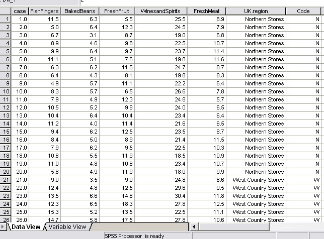
So a pilot investigation was devised and began with monitoring in three regions of the UK...Northern Stores, West Country Stores and Home County Stores.
After much consideration, 5 sales products were selected by the management team and the volume of sales measured in "£ thousands per quarter". This data must be metric. Then, 20 stores were selected at random from each of the three regions. You should understand that the 'Groups' are already known in that they are the 3 areas of the UK and we know in which area each store is located. Thus 'Location'(Region) is the 'Grouping variable' here and only 3 groups are to be accepted in the analysis..
Discriminant analysis is going to eventually tell us how many stores conform to the 'signature' of their regional group and how many might more readily belong to one or other of the other two groups.
We may find for example that all the stores sampled in the North conform to just one 'mix' or we may discover one or two of them seem to more closely conform to the 'West Country mix'. Whatever the outcome, the exercise will help Metromart to make their product distribution more targeted for each store and thereby improve efficiency.
The sales figures for the following "tell tale" products were considered the best to use as indicators:
1. Fish Fingers
2. Baked Beans
3. Fresh Fruit
4. Canned Beers
5.
Fresh Meat
The SPSS process.....
We must first check the data for extreme values and remove them from the data set and instruct SPSS to create means in their place. Any outliers present, we will leave in place...
60
stores were assessed in total.
The Y axis units are "£ thousands
per month"
and in each case the sample size is 20 stores.....
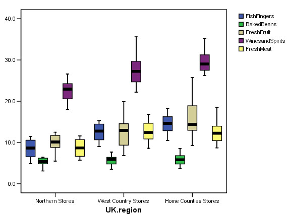
Essentially this will be satisfactory for analysis, there are no outliers and no extreme values.
Remember that each 'box' represents the results from 20 stores in each region. If all the stores were from the same group, we would expect to see little variation between the groups. Look at the (beige) boxplots for 'fresh fruit' for example; they look very different for each region. This may of course be due to sociological factors such as attitudes to fresh foods / fast foods etc. It may also reflect differing proportions of housekeeping spent on fresh fruit in the 3 regions. In other words, it may also reflect the socio-economic character of the region in which the stores are located.
So the purpose of this particular Discriminant analysis will be to confirm and explore the groupings and then to predict the proportion of stores in each region that appear to belong to their 'home' group. It is very likely that the stepwise analysis that SPSS will perform will delete one or more of the factors measured as failing to be significant and we will be left only with those variables that have contributed the maximum effect to the variability. In practice, SPSS does things the other way round....all factors are discounted and then 'let back in' one by one.
The dataset is: SPsmAex 16 Supermkt sales
Open SPSS and enter all the variables as described above. Switch to Data view and enter your data.....
For the Boxplots: Open 'Descriptive statistics', 'Explore'. Transfer 'UK Region' to the Factor box, 'Case' to the label cases box and all 5 Dependent variables (predictors) to the 'Dependent list' box. Click 'OK'. This will generate individual boxplots for each variable.
Alternatively, for a more succinct output, go to 'Graphs', 'Boxplots','Clustered'.... tick 'summary of separate variables'. Define: category axis: 'UK Region' and place all other predictors (other than 'cases') into 'Boxes represent'. Click 'OK'. This will actually generate the boxplot shown above.
------------------------------------------------------------------------------------------------------------------------------
For the Discriminant Analysis: Open 'Analyse', 'Classify' and 'Discriminant'. Transfer 'UK Region' to the grouping variable box (This is the Nominal and Dependent variable throughout) and define the range as 1 - 3 (i.e. Northern Stores, West Country Stores, Home Counties Stores).
Transfer all the other variables (other than cases) to the 'Independents' box.
Click "use stepwise method" and ...
Click 'Statistics' and tick 'means'; 'Within-group correlations', and also tick 'Unstandardised Function coefficients', click 'Continue'.
Click 'Method', 'Wilks' Lambda' and 'Display summary of steps'. Click 'continue'
Click 'Classify' and tick 'Summary table', and 'continue'
Click
'Save' and tick 'Discriminant Scores' (we need these
for the final chart...instructions are further down the page)
and click 'Predicted
Group Membership'
Click 'Continue' and 'OK' !!
Be aware that the SPSS output for this analysis is extensive and will consist of at least 15 tables! Only the essential elements are presented here......
First let us digest the basic descriptive statistics that have been illustrated in the earlier boxplot. The mean represents the mean £sales('000) figures for 20 selected stores over a three month trading period....
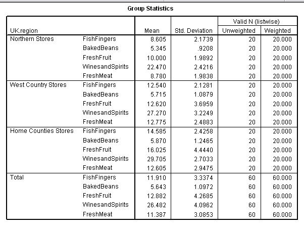
The Home Counties stores are the largest 'earners' on all but 'Fresh meat' where the West Country Stores are ahead by the smallest of margins. The Northern stores seem to be generally under-performing when compared to the other two groups.
The next table to examine (the within-groups matrices) looks at all the possible correlations between each variable and the other 4 for all three regions.
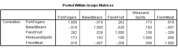
Remember that the matrix is a mirror image of itself aligned along the top right to bottom left axis.
Let us examine the various correlations. The values contributed by all 60 stores are taken into account at this stage. All correlations are quite weak, the strongest being between 'Fish fingers' and 'Fresh Fruit' (r = +.262) and the strongest negative correlation is between 'Fresh meat' and 'Fresh Fruit' (r = -.209).
A scattergraph illustrates the point....
Open 'Graphs', 'Scattergraph', 'Simple' and transfer the two variables 'Fresh Fruit' & 'Fish Fingers'.
Double
click the chart to open 'chart object'.
Click 'Options' (SPSS 11) or double
click any of the points (SPSS 12) and 'Fit Line' and 'Linear'
Click 'OK'.
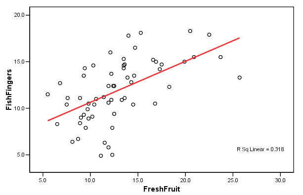
Each circle represents one store. So far, we are not yet trying to distinguish between groups but simply examining all the possible relationships (and the strengths thereof) that exist between any pair of predictors. What this tells us is that there is a weak but positive correlation between the sales of fresh fruit and the amount of sales of fish fingers shown by these 60 stores.
The strongest negative correlation seems surprising....the more fresh meat a store sells; the less fruit is sold.
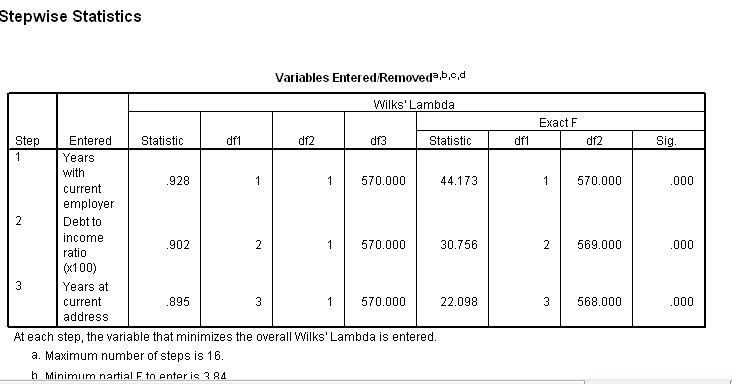
Output 6 indicates which variables have been entered into the analysis and by default, which have been dropped because they failed to comply with the Wilks' lambda criteria. Only one variable can enter or leave at each step. The summary below shows that only three of the five variables qualify for further analysis...
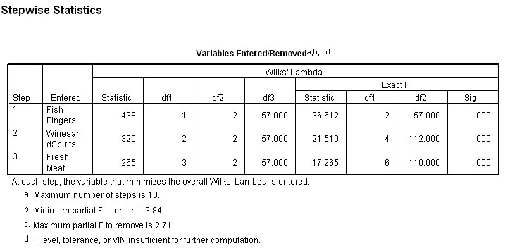
Note the minimum level for F required for entry is 3.84 in the first place and the maximum value prior to removal is 2.71....
The analysis is now explained in greater detail:
In Step 1( table below), you will notice that the variable with the highest 'F to enter' value is the one permitted to enter the continuing analysis. So initially 'Fish Fingers' enters because it achieved a value of 36.612.
In the next step Wines and Spirits yielded a value of 10.319 and is allowed to enter.
In the next step Fresh Meat yielded a value 5.662 and is allowed to enter.
In the next step No Variable yielded a value of 3.84 or more and so no more variables are allowed to enter.
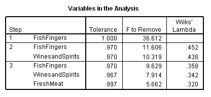
Notice how the 'F to remove' value changes as each new variable is allowed to enter. This is because it would then be necessary for any variable that yielded a revised F-value below 2.71 to be removed again! The 'variables not in the analysis' chart is the complimentary data to the earlier 'variables in the analysis' chart above. Here it is showing this process in detail....
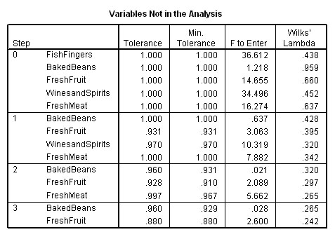
So Baked Beans and Fresh Fruit are out! After this third 'run' SPSS stops the analysis as there are no more variables that can enter.
Notice also that 'Fish fingers' is the first variable to gain entry into the analysis because it achieved the highest F value. If we study the Step 0 column you will see that it is the three variables with the highest F values that are eventually allowed to enter but only one at a time and in descending order.
Let us try to summarise what has happened so far with SPSS having run the analysis:
| Initial
position | No
variables IN |
| After
first run | .1
variable IN; 4 variables still OUT |
|
After
second run | 2
variables IN; 3 variables still OUT |
|
After
third (and final) run |
3 variables IN; 2 variables still OUT |
|
STOP |
From the 3 variables selected and the data held within them, SPSS has distilled 2 discriminant functions; Dis 1 and Dis 2. The first of these (Dis 1) accounting for 97.5% of the total variance recorded in the dataset and with P<0.005 and the second discriminant function accounting for the remaining 2.5 % of the total variance but with no significance attached to it (P> 0.1).
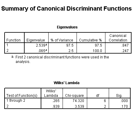
Wilks' Lambda output confirms this and shows the first Dis_function to be significant but not the second. However, we still need to retain Dis 2 in order to look at a two dimensional scatterplot.
It is at this stage in the process that some discrimination between the 3 grouping variables will properly appear; especially when we produce a scatterplot...... Dis 1 (on the X axis) displays a range of approximately 7.5 but the range displayed by Dis 2 is only about 4.2. This illustrates well how Dis 1 is separating results into the groups whereas Dis 2 is less able to do so.
Open 'Graphs', 'Scatter', 'Simple' and transfer 'Dis 1_1' to the X axis box and 'Dis 1_2' to the Y axis box
Transfer 'UK Region' to the 'label cases' box. Double right click the mouse to open the Chart Editor feature.
Click on any dot on the chart to open the 'Properties Window' and select the 'variables' tab
Place
cursor over 'UK Region', double right click and (holding down mouse button), transfer
'UK Region' to 'Group by' box
Click 'Apply' and close.
Double right click exactly on the Y axis (it will be highlighted). Open the 'Properties Window' option from the drop down menu. Select the 'Scale' tab.
'De-click' the Auto Minimum and Maximum boxes and replace with (in this instance), the figures: - 4 and 4. (This should help to clarify any 'clouds' in the patterning). Click 'Apply'.
Click the Red 'X' in the top right hand corner of the tool bar to close Chart Editor window and return to chart only.
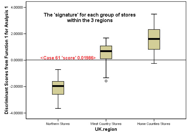
You should now find you have the chart shown below, the legend indicates that the stores from all three regions have been differentiated.
| SPSS
tip: To get the output shown below automatically as
one of the generated outputs: In the main Discriminant window, click on 'classify', Under 'plots', tick 'Combined groups'. This will automatically plot the two Dis_functions against each other. This plot will also give the centroid location for each group. It is a matter of choice which form of presentation you find the clearest |
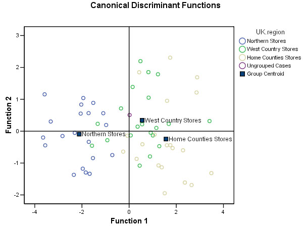
You
should be able to discern the 3 'cloud' groupings with Northern stores on the
left, West Country stores in the centre and Home Counties stores predominantly
on the right. The chart also suggests that the Northern stores are the most homogenous
group and the Home Counties stores the most heterogeneous (disparate) group.
A
further conclusion drawn from the position of the centroids might be that the
Northern stores are less similar to the other two regions and that the West Country
stores and the Home counties stores are more similar to each other than either
is to the north Country stores.
Ignore Store 61 (the new store' has been aligned as a 'West Country store' type
and appears (uncoloured) in the centre of the chart. This will all be explained
under 'Predicting Group membership' further down this Focus.
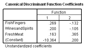
Calculating the Discriminant Scores manually:(for checking purposes only!)Each of the points in the above chart represents an individual store and is therefore a 'store signature' but how were they arrived at? You may remember that we ticked for 'Unstandardised Function coefficients' in the initial analysis. The Discriminant score for each individual case is made up using a Constant and the specific Discriminant Function Coefficients, as follows: Dis
score(case 1,
2.... 60 etc ) = Constant (A) + a * value for Fish Fingers + b * value
for Wines and Spirits + c * value for fresh meat The SPSS output is shown below:
Store
xx: D1 = -10.364 + (0.269*fish
finger sales) + (0.200* wine sales) + (0.163*meat sales) Let us check these figures out by using case 10 where the discriminant scores generated by SPSS were: (1) -1.5334 and (2) - 0.8452 So; D(1) = -10.364(const) + .269*8.3 + .2*26.6 + .163*7.8 = -10.364 + 2.2327 + 5.320 + 1.2714 = -1.5399
and D(2) = 0.200(const) + (-.132*8.3) + (-.105*26.6) + (.365*7.8) = 0.200 + (-1.0956) + (-2.793) + 2.847 = - 0.8416 Results are accurate to 2 dp It is a short step now to saying that; providing we have the sales figures for 'Fish Fingers', 'Wines&Spirits' & 'Fresh Meat'; we can insert those figures in the 2 formulae above and we will obtain two discriminant 'scores' that can be then plotted on the basic scattergraph. In some cases this may mean that the 'new store' falls neatly within one cloud and can be safely catagorised as belonging to that group (that is what SPSS would do). Unfortunately, it may also be that the co-ordinates place the store in 'no man's land' and so further work must be done. Nevertheless, SPSS will always place a new case in the most likely group based upon the mathematics shown above.
|
More about the Discriminant Functions...
The next SPSS output examines the 'makeup' of the two discriminant functions that have been generated.
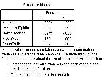
Note immediately that SPSS states that Baked Beans and Fresh Fruit have not been used in the analysis (marked as 'a').
We can now see that Dis 1 is contributed to positively by Fish Fingers, Wines and Spirits and Fresh Meat.
Dis 2 is contributed to positively by Fresh Meat and negatively by the other two.
Go back to the data set in SPSS and click 'save', then tick 'Discriminant scores', Click 'OK'
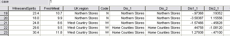
Look at the original dataset and you will see that the 'scores' for each store for both 'Dis1_ 1' and 'Dis2_ 2' have been calculated. We have already shown that 'Dis1_1' will account for 97.5% of all the variance displayed.
You must understand that discriminant 'scores' represent the unique 'signature' value for each store.
Here is a section from that output; notice how the general range of the Northern Stores differs from the West Country stores...
.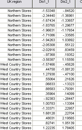
But also look closely at West Country Stores 1 and 10 ! You will see that they more closely resemble the 'scores' recorded for the Northern stores.
Q. What do you think this might foretell?
Prior to the analysis we might have supposed that the signature 'scores' for these 60 stores (within the three locations) would be evenly distributed. However, the classification of "how many stores are in their most likely groupings" shows a different story. SPSS now makes use of the discriminant scores and the decision rule to slot each store into the group that it most resembles...
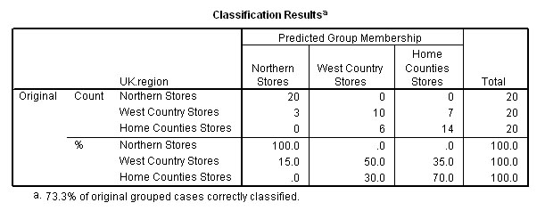
All 20 of the Northern stores were 'true to type'. The West Country Stores were the most difficult group to characterise and stores 1 & 10 are more like the Northern Stores and are part of the '3' shown above. Only 50% of West country Stores are in fact 'true to type'.
The 'predominant store type' for the north region constitutes 100% of that sample.
The 'predominant store type' for the west country region constitutes 50% of that sample.
The 'predominant store type' for the home counties constitutes 70% of that sample.
We have seen that there are 3 stores in the West country group that have been predicted as aligning themselves more closely to the stores in the northern region based upon the discriminant scores achieved. The remaining 7 stores in that sample align more closely with those currently trading in the home counties.
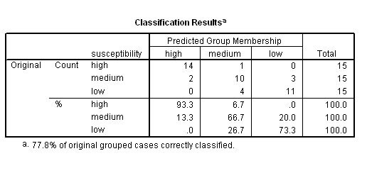
20 + 10 + 14 = 44 stores (out of 60) have been correctly classified (because we already knew which region they were in) by Discriminant analysis and 44 / 60 = 73.3 % as indicated.
In other words, the output indicates that our overall success rate for being able to correctly predict the profile / 'signature' of the membership of any given store based upon the 3 sets of sales figures for 'Fish Fingers', 'Wines and Spirits' and 'Fresh Meat' alone is 73.3%.
So this percentage indicates the probability of accurately predicting the correct group membership for a new individual.
Q. How might the management improve on this level of predictability?
Illustrating that we have "maximised the divergence between the groups"
We have already stated that the Eigen values output for 'Discriminant function 1' accounts for 97.5% of the total variance present and so we will limit ourselves to exploring the information that just this one function can tell us.
If you have not already done it, go back to the data set in SPSS and click 'save', then tick 'Discriminant scores', Click 'OK'
The Discriminant scores (Dis1_1) should now be displayed in the SPSS dataset.
E.g Store 19:(North region and predicted to be in the North region by the Discriminant analysis output)...
Q. How would you interpret the situation regarding stores 21 and 22?
'Dis1_1' and Dis 2_2 have no units and must only be regarded as the 'score' values for that particular store, they characterise that store numerically. Of course each store will render it's own figure, so in this sense we have produced a 'new' variable and each case will have a value with respect to that new variable. We could perhaps more fully describe this variable as the 'Store stock-mix signature'.
The 'scores' produced are a distillation of the data collected from the variables allowed to go through the analysis.. Each is an index that characterises that particular store. If we then return those stores to their typological group and run a boxplot on the three groups using Dis1_1 as the dependent variable, we would hope to see that the analysis has managed to maximise the differences between the three groups...
The analysis has now maximised the variation present so as to make the greatest distinction between the three groups and this is what we had hoped for.
Because we have chosen to only work with the first discriminant function, we can only use a boxplot to illustrate the data. If we use 2 (or 3) discriminant functions, we can generate 2D ( 3D) scattergraph(s). We saw earlier that a 2D scattergraph did in fact, yield distinct 'clouds' of points.
Another capability of Discriminant analysis follows on from here and relates to 'Case 61' alluded to in the above chart.....
Predicting Group membership
Imagine that a new Metromart store has been opened ('Store 61' in the SPSS dataset) and the logistics team want to know which 'product mix' should go to that store. Perhaps 6 months trading figures will be sufficient to allow this type of analysis to be used.
It is important to understand this feature of discriminant analysis because it allows us to place new cases into the most appropriate existing grouping once the new data is entered. It is also a good way to test the validity of the procedure by only submitting figures for the eligible variables elected for inclusion in the analysis.
Suppose that we wish to predict which grouping a new store is most likely to belong to, we can enter the values for the three eligible variables by re-running the discriminant analysis.
In addition though, this time...click 'save' and 'predicted group membership',
SPSS will utilise the values generated in the 'decision rule' to estimate which group the new store is most likely to belong to.
SPSS will then insert it in the chart as shown in our added case (61) below.
Dis1_1 works out to be 0.01986 for this store and this line is marked on the Boxplot above. SPSS would place this value in the West Country region(and it does!!)....
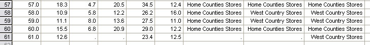
This final SPSS output will give the location that best 'fits' the econometrics of each store. Look at cases 58 and 59 above, although physically in the Home Counties, their 'signature' is more closely aligned with those in the West Country region. Store 60 is in the correct place already!
So the Metromart experiment has established that it would be possible to predict most suitable 'product mix' typified by one of three regions simply by knowing the sales figures for the three products extracted from the analysis. The accuracy of such predictions has been stated as 73.3%.
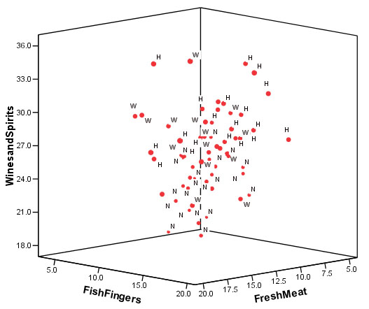
As an extra facility, using SPSS, we could also plot the three selected original variables against each other on a 3D orthogonal plot. This exercise highlights the 3 'groupings' present but it is perhaps not as clear as the 2D Discriminant Functions plot illustrated earlier but it does re-emphasise the point that you must always be prepared to 'explore' your data to look for any hidden information.
[,'N' 'W' and 'H' refer to the three regions.]
The 'N' points have low values on the Y axis (the bottom of the chart therefore), the 'W' seem to predominate in the centre of the 'cloud' and the 'H' points seem to predominate in the top right of the chart. You will also see confirmed that it is the 'W' stores which are the least consistent whilst the 'N' stores are the most consistent in their spatial positioning.
This situation is improved upon (as already suggested), post analysis, by using the generated discriminant functions and the decision rule(based on Wilke's lambda output) instead of the original variables, to replot each store either on a 2D or 3D plot to highlight and maximise the divergence between the 3 groups.
Q. Suggest more ways in which the accuracy of the predictions might be improved.
Example 2
 This is a large hypothetical data file modified from an SPSS file example.
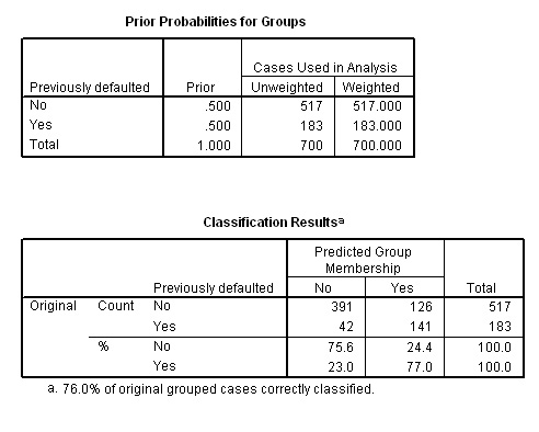
It concerns a bank's efforts to reduce the rate of loan defaults. The file contains financial and demographic information on 850 past and prospective customers. The first 700 cases are customers who were previously given loans. 517 of these paid back their loans on time and with no problems arising, 183 unfortunately however, did default on the repayments.
The last 150 cases are prospective customers that the bank wishes to classify as good or bad credit risks. So you will appreciate at once that the 3 groupings have already been identified before the analysis begins.
If you are a loans officer at a bank, you want to be able to identify characteristics that are indicative of people who are most likely to default on loans, and you want to use those characteristics to identify good and bad credit risks in the future. Nine characteristics such as 'years at current address', 'age', 'debt to income ratio' and 'household income' are all initially offered for analysis.
"Have they defaulted on a loan before?" is the most important consideration and this becomes our grouping variable.
Let us clarify what we hope to achieve with this analysis:
Grouping
variable | Analysis
procedure | ||
| TEST 1 | 700 existing customers | Has the client ever defaulted on a loan in the past? Yes / No | 8 variables initially entered to produce a Discriminant function. Run the test....... |
| TEST 2 | 150 'new' customers | Is the client likely to default on a new loan? Yes / No | Discriminant function generates individual discriminant scores and these are used to predict (allocate cases to) their correct grouping |
Open: SPex 67 bank loans
Run
1:
Drop down 'Data' menu and choose 'Select
cases'. Click on 'based on time or cases'. Click 'Range' and enter '1 to 700'.
Click
'OK' . This ensures that only the existing customers, cases 1 - 700, are used
in the first analysis.
Select
'Analyse', 'Classify' and 'Discriminant'
Transfer 'default' to the Grouping
variable box and enter 0:1 as the range.
Transfer the other 8 variables to
the 'Independents' box. Click
"use stepwise method" but don't Click
'OK'...
Instead, click 'Statistics' and tick 'means'; 'Within-group correlations', and also tick 'Unstandardised Function coefficients', click 'Continue'.
Click 'Method', leave at the default settings (Wilkes Lambda) this time
Click 'Classify' and tick 'Summary table', and 'continue'
Click 'Save' and tick 'Discriminant Scores' and click 'Predicted Group Membership'
Click 'Continue' and 'OK'
The 'screen grab' below shows the bottom part of the saved dataset. Notice that each case has been allocated (based upon the data logged) to a "likely to default": (Dis_1) is a 'Yes / No' category and a Discriminant 'score' has also been generated for each case. At this stage it would appear that the cases allocated as 'No' are receiving a low + or a minus values for their scores whereas those cases receiving a 'yes' allocation are positive values.

The next step is to identify the structure of the discriminant function for future use. Firstly, we need to identify which variables were allowed to carry forward in the analysis...

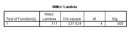
Note that all three F-ratios are highly significant......
Four of the 8 variables satisfied the Wilks' Lambda test statistic and are shown in (4) above. The single Discriminant Factor is also shown to be highly significant....
Now we have all the necessary values needed to construct the Discriminant function. It can be applied to any case using the 4 coefficients and the Constant...
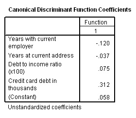
D score = .058 + (-.120* Years with current employer) + (-.037*Years at current address) + (.075* Debt to I ratio) + (.312*CC debt). Let
us verify this using case 661 below : D score = .058 + (-.120*2) + (-.037*3) + (.075*7.10) + (.312*.18) = .058 + (-.24) + (-.111) + (0.5325) + (0.05616) =0.29566 (correct to 3 dp)
The formula is correct!! |
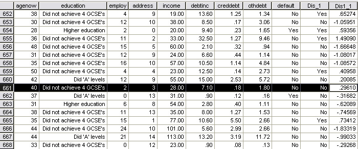
But how accurate have the allocations been? Look at case 662 above; this client is shown to have defaulted on a loan but the predicted category says 'NO'.
The outputs below show us that of the original 517 cases that didn't default, 391 were predicted correctly and 126 were not. This gives us a 75.6% accuracy.
Of the original 183 cases that were known to have defaulted, 141 were predicted accurately and 42 were not. This gives a 77% accuracy.
Overall then, (532 ÷ 700 = 0.76) we have achieved a 76% level of accuracy.
Task: now run the whole analysis again but this time select 'all cases' (drop down 'Data' again to add in all cases). Now the 150 new clients will be included in the analysis and will be allocated to a group and given an individual Discriminant score.
Task 2: It is possible to find the critical value for the discriminant score where the result shifts from 'No' to 'Yes'.
In SPSS, go to the 'Data' drop down menu, select 'Sort cases'
Sort by 'Dis1_1' and in Ascending order. Click 'OK'
Scroll down to 'cases 529/530'

From
this point, the bank would be able to issue a notice (similar to the hypothetical
one shown
below) to all staff involved in verifying loan arrangements.
They would now only need a hand
calculator to make a
decision with a 76% chance of making the correct one...

Notice
how the first two (negative ) coefficients will help the client's case as the
variable value increases but the reverse is the case with the remaining two variables.
As those values increase, they will impair the clients chances of getting a loan.
The coefficient for Credit Card debt (.312) is shown to be the most important
factor in the structure of this particular discriminant function.
Finally, we can now use a boxplot to show how the two groups have been separated to best effect. We cannot produce a Discriminant Function scatter plot inn this instance because only one Dicriminant function was generated.
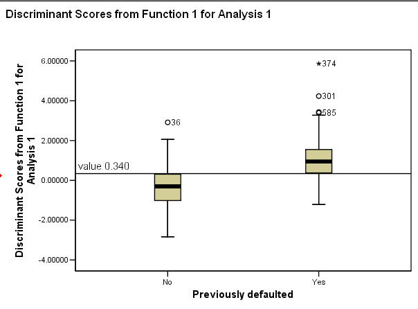
Notice the position of the threshold between the two groups
Task: Check back on the dataset and comment on the situation regarding cases 585 & 301. Clue: Within SPSS, these cases would be termed as 'outliers' meaning that they were more than 1.5 boxlengths above or below the box. Case 374 is classed as an extreme case and is more than 3 box lengths above the box.
Q. Would you consider 76% accuracy sufficient for this type of exercise or would you wish to see other factors used to judge suitability for a loan? Clue: we have not considered the size of any proposed loan or the purpose of any proposed loan.
Example 3
 A market research company has conducted some research into the susceptibility
of male viewers to television advertising.
A market research company has conducted some research into the susceptibility
of male viewers to television advertising.
They have started from the premise that there are three type of people: those who are virtually impervious to TV ads (low sus), those who are aware and take note of them (medium sus) and finally, those people who are very susceptible to TV ads (high sus). It is important to know how to define these groups in order that future marketing campaigns are more focussed.
Can we more readily identify these people by measuring a number of variables such as IQ, weight, salary etc.?
Again, we will be attempting to 'sort out' all the people in our sample and we will try to discriminate between them so that they can be placed in their correct groups. Remember; for discriminant analysis, we must know in advance that groups do actually exist. If there is any doubt on this point then PCA must be used first.
45 men were took part in the investigation and firstly they were asked to consider which group they thought they should be placed in!.
5 parametric variables were selected:
1. Age (between 20 and 65)
2. Weight
3. I.Q
4. Years at current address
5. Annual income
Task: Consider for yourself which (if any) of these parameters might give an indication of susceptibility.
You can access the dataset: SPex 82 TV adverts
The grouping variable in this case is 'Susceptibility'.
Once again, we must first explore the data looking for anomalies.
Use 'Graphs', 'Clustered', Summaries of separate variables', define category axis as 'susceptibility', click 'OK'.
The output indicates that there are no anomalies to contend with....
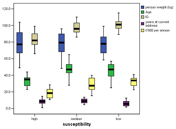
There seems to be some clear variation showing up. Look particularly at 'IQ' and 'Age'. The are no outliers so we can continue with the analysis..
Open
'Analyse', 'Classify' and 'Discriminant'. Transfer 'Susceptibility' to the grouping
variable box and define the range
as 1 - 3 (i.e. High, Medium, Low). Transfer
all the other variables (other than cases) to the 'Independents' box. Click "use
stepwise method".
Click 'Statistics' and also tick 'means'; 'Unstandardised coefficients', ' Within-group correlations', click 'Continue'
Click 'Method', 'Wilks' Lambda' and 'Display summary of steps' , click 'Continue'
Click 'Classify' and tick 'Summary table'
Click 'Continue'
Click 'Save' 'Predicted Group membership' and 'Discriminant scores', 'continue' and then 'OK'
Go first to the very last output to check what % of cases were accurately identified. If it is 75% or more, then the analysis is worthwhile and should be studied further, if it is less than 75% then you must consider whether or not the results are sufficiently reliable to be used in this way and perhaps other analysis procedures should be explored.
Selected Outputs:
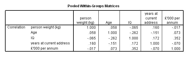
We can see that there are no strong correlations, the strongest being between 'IQ' and 'Income' but even this correlation is quite weak (r =.352).
Because we used a stepwise method, the next table indicates which variables were discarded from the analysis and in which order they went. Finally only two were discarded and they were 'weight' and 'income'. Study this chart carefully, you will see that the first 'F to enter' (and lowest Lambda) will be IQ and 'income' would have been second but in the following step it is 'Age'. In the next step it is 'Years at current address'.

The three variables remaining
The analysis has correctly allocated 35 of the 45 men to their correct correct group, that means 77.8% were correctly allocated using just the Age, IQ and years at the address as guides.
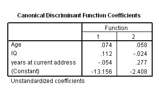
The assessors now only need to measure these three parameters of any male to have a slightly better than 3:1 chance of being right. We can construct the two discriminant functions and the corresponding discriminant 'scores' from the below outputs.
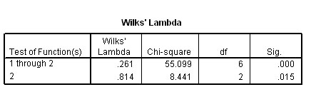
The significance level achieved by the two discriminant functions is shown in the Wilkes lambda output. As you might expect, both are highly significant with Dis_ 1: p< .001 and Dis_ 2: p< .02...
Checking the Discriminant Function equation:
F1: -13.156 + (.074* age) + (.112*IQ) + (-.054*time at address) F2: -2.408 + (.058* age) + (-.024 *IQ) + (.227*time at address) Test on case 24 where Dis1_1 was calculated to be 1.3050 F1: -13.156 + (.074*38) + (.112*76) + (-.054*5.5) = -2.1300 (see SPPS tabulated value below) F2: -2.408 + (.058* 38) + (-.024 *76) + (.227*5.5) = -0.5039 (see SPPS tabulated value below) (slight differences are due to rounding errors) |

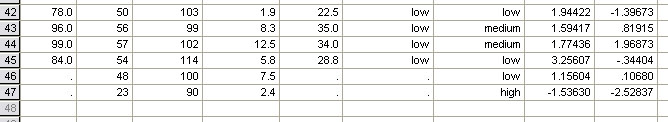
Task: use your derived 'decision rule' formula and enter the following data. Then identify the likely grouping of these two men as far is practical....
| Age |
IQ | Time
at Address | |
|
case 46 | 48 |
100 | 7.5 |
| case
47 | 23 |
90 | 2.4 |
....the result you should obtain is shown below, note how it is only necessary now to utilise the 3 selected variables in order to obtain a predicted grouping for any given individual.
Finally we can plot Dis 1_1 against Dis 1_2.
To
get the output shown below:
In the main Discriminant
window, click on 'classify'
Under 'plots', tick 'Combined groups'. This will
automatically plot the two Dis_functions against each other. This plot will also
give the centroid location for each group.
Notice how the grouped cases (although not perfect) do appear to have separated into 3 fairly distinct 'clouds':
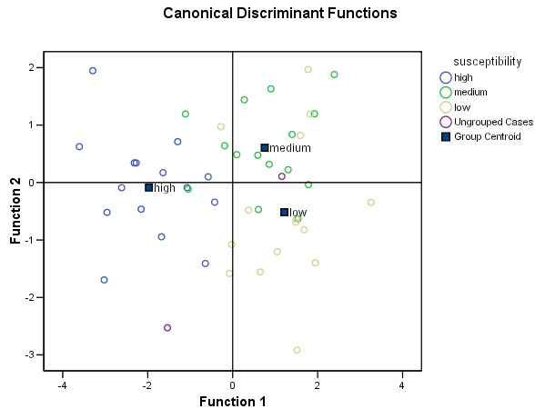
We can now produce an 'easy-to-use' tabulated guide that will help in the allocation of at least two of the types identified and this is based upon their spatial location in the chart above.
| High sus | Medium sus | Low sus | |
| Function 1 (X axis) | always a negative value | usually a positive value | usually a positive value |
| Function 2 (Y axis) | ranges from -2 to +2 | usually a positive value | ranges from +2 to -3 |
|
 Interpretation of research results:
SUMMARY of Focus 14, 15 and 16
The four procedures (Factor + PCA, Cluster and Discriminant) all have one thing in common....they are all attempts to uncover hidden patterns or structure in complex datasets. They are exploratory in approach and they require no preconceived hypothesis... but an open mind for their interpretation will help!!!
In Focus 14, we saw that it is possible to distill data down to it's 'essence', i.e. data reduction. Then, by generating some new 'composite variables', we might also determine if any natural groupings are indicated by the data.
We then saw how Cluster analysis (Focus 15) is an attempt to separate many entities into groups or clusters (on the a priori assumption that groups exist) by quantifying their similarities / differences, even if the variable is only at the Nominal level (e.g. hair colour) and in other circumstances, to quantify the 'distance apart' between all the individuals. These techniques, coupled with the use of Dendrograms are powerful ways to uncover relationships between related entities and to quantify how close or distant those relationships may be.
In this Focus page, we showed that it is possible to place objects into pre-determined / pre-existing groups based upon their numerical profile and to go further by predicting the most likely group membership of any new individual or case.
![]()
Back to 'Quick view' Contents Page