
Introducing 'Descriptive Statistics' |
On the Preparatory page,
we tried to explain that handling quantitative data is something that our brains'
do with great skill all the time. Next, we will be begin to introduce some of
the more formal procedures used when handling valuable commercial, demographic
or scientific data.
| This page will introduce you to most of the themes to be discussed in Focus's 1-11 |
We will be asking the questions : Why do we need statistics at all? and What exactly is the nature of data? The human brain can deal very well with patterns and so we have a natural ability to identify patterns and trends where they exist. Our brain also responds well to 'pictures' and hence the immense contribution to clearer understanding of numerical data that graphs, tables and charts can make.
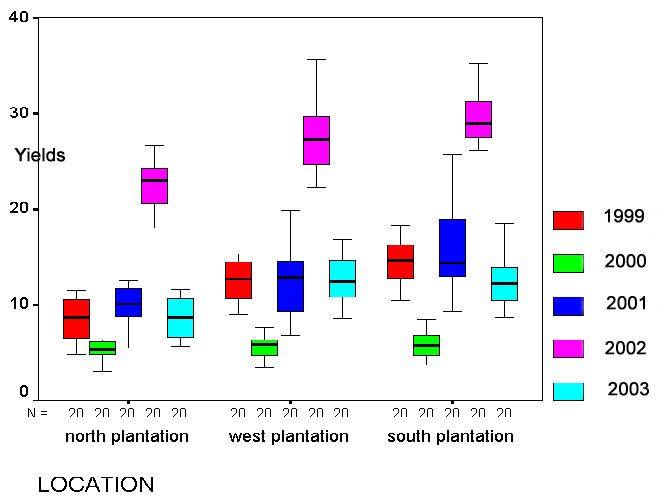
 Look
at the dataset below.... its part of a production report showing yields (Tonnes
/ hectare) from 3 different coffee plantations) over 5 years. In total, there
were 8000 pieces of data !
Look
at the dataset below.... its part of a production report showing yields (Tonnes
/ hectare) from 3 different coffee plantations) over 5 years. In total, there
were 8000 pieces of data !
No one would be able to spot any patterns or trends
amongst all those figures........
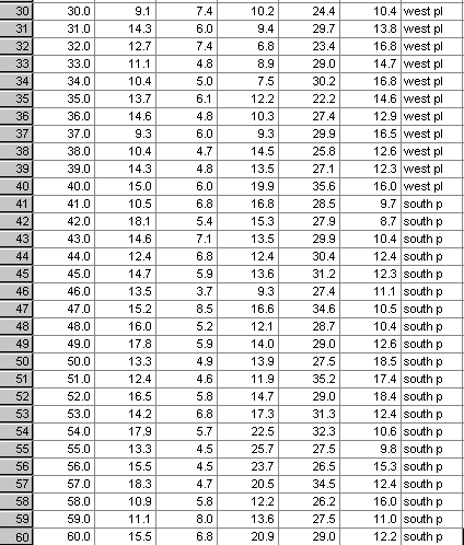
But when analysed using a statistical technique (in this instance:'Discriminant Analysis') the hidden patterns emerge.......
One option is simply to observe and record what we see, the other is to 'interfere', that is, we manipulate a situation and observe the effect that this has. In business terms; this latter approach might lead us into the world of market research and this may direct production, advertising and recruitment. Often market research is 'targeted', that is, we wish to substantiate a trend or confirm the wisdom of a company policy retrospectively . In other instances market research may wish to investigate public opinion / attitudes, public acceptability or personal choices before embarking upon a new media campaign.
With more 'scientific' data we can do more advanced types of testing. If we aim to ensure that only one component in a scenario is altered at a time, we can build a controlled test. We may discover a 'cause & effect' relationship. Today, we might refer to this as the "what if" scenario.
We will discuss the whole issue of "What is a representative sample and what is not?" Invariably, it is never practical to survey a complete population whether it be people, aeroplanes, hotels or washing machines and so it is essential that whatever samples we do use, accurately represent the parameters (at least the ones we are interested in) of the population as a whole.
| This issue of determining how close our results (from working with samples) mirrors the 'real' situation in the whole population is a major branch of statistics; called 'probabilistic' testing. |
'Qualitative
data' suggests that there is no numerical component involved and this may well
be the case. However, there are ways that qualitative data may be 'upgraded' to
yield some, albeit limited quantitative information. The first way we do that
is to use frequencies of occurrence and then a process
of ranking the results.
 Imagine
we recorded the hair colour of 80 people. It would be reasonable to construct
categories ....brown .... blonde .... redhead.... black etc. There is nothing
inherently numerical about the words 'brown' , 'blonde' or 'black' but we can
record the frequency of occurrence for each category.....
Imagine
we recorded the hair colour of 80 people. It would be reasonable to construct
categories ....brown .... blonde .... redhead.... black etc. There is nothing
inherently numerical about the words 'brown' , 'blonde' or 'black' but we can
record the frequency of occurrence for each category.....
|
HAIR
COLOUR | FREQUENCY
OF OCCURRENCE | %FREQUENCY
OF OCCURRENCE |
| BROWN |
28 |
35.00% |
| BLONDE |
21 |
26.25% |
| REDHEAD |
9 | 11.25% |
| BLACK |
22 |
27.50% |
| Totals |
80 |
100.00% |
Thus our qualitative data has yielded quantitative (to a degree)data. We have discovered that brown-haired people are in the majority. We could also produce a graphic representation of this information (see below).
At least, from our small sample this seems to be the case but we have only sampled 0.00015% of the UK population! We may easily have picked an unrepresentative group of people to assess. We will look at methods of calculating how confident we might be that our sample was representative later in the programme.
Any type of data can be conveniently divided into one of just 4 categories:
You will need to be conversant with these terms because the choice of statistical
test that can be applied to a data set will be strictly governed by which of these
4 categories your data falls into.
Have a look at the Signpost Page to see
how crucial this basic categorisation is going to be.
These four scales of measurement are more fully discussed later.
There is
another important division to discuss and that is the differences between nonparametric
and parametric data.
Firstly,
parametric data has to comply with the rules governing a 'normal
distribution'. When drawn as a graph, a normal distribution takes the classic
'bell-shape' with gently sloping 'tails' at both ends
rising steeply to a
crest in the middle (see the graph below). Secondly, the variable must be
able to yield measurable data e.g. height, weight, mileage, cost etc. It is impossible
to embark on any statistical test until the scale of measurement of all the variables
involved have been determined. If in doubt, there are tests for normality that
should be used in advance of the proposed test.
If the variable you are measuring cannot yield metric data and is not normally distributed, then it is nonparametric and will fall into either the nominal or ordinal scales. Again, all this will be covered more fully in Focus 1.
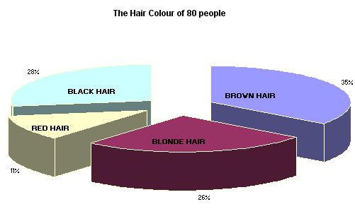
The proportions of the sample exhibiting each hair colour are more quickly understood when the information is displayed graphically and a pie chart is most appropriate here.
Q. Is counting the same as measuring?
A. No!
The
visual representation of data is the ideal way of conveying complex results to
a wider audience
but the process is fraught with potential hazards for the
unwary. It is essential to know what, when
and where to use graphics. One
particular graphic form; the histogram introduces the concept of "frequency
of occurrence", that is; how often has a particular result been obtained.
Once we can define
"How often did that result, reading or event occur?", we can tabulate
and display the results graphically. The final 'shape' of the histogram tells
us something about the distribution of
all the individual values involved.
The most common distribution often shows the bulk of the values conglomerated
around the middle and with the remaining values tailing away in both directions.
This would be the 'normal distribution' pattern.
| Never underestimate the very real value of a well designed graph of your data. Graphs are also an invaluable precursor to any deeper analysis because they will help you to visualise the data in a way that your brain can more readily translate. They will help you to 'see' your way forward. |
In the early pages of this website, much attention is given to the best ways to display your data in graphical form.
The term 'average', when used loosely in everyday language means 'typical' or 'representative'. For example; "Sally is about average at netball but she is well above average at tennis". It is unlikely therefore that any formal measure of central tendency is intended. According to the context of the remark, it may infer the 'mean' of a dataset, the mode, median or mid-range. However, within the world of mathematics and statistics, we need to be much more precise and the term therefore should either be avoided altogether or restricted to referring to the mean only.
Do not confuse the term 'on average' with the term 'on aggregate'...which means 'combined total'... as in 'the team won on aggregate points'.
Frequency histograms can be 'smoothed out' if the individual ranges are made narrow enough until a curve is achieved. This will be fully explained later.
Q. What then is a Normal Distribution?
A. It has many attributes but to begin with, we may think of it as a 'smoothed out' histogram of a very particular shape.
The
properties of a normal distribution curve are quite remarkable and it is fortunate
that the majority of natural and many man-made processes (in terms of frequency
of occurrence) seem to follow this particular type of pattern. Take a look at
this very basic normal distribution curve and make some preliminary deductions
about it for yourself.
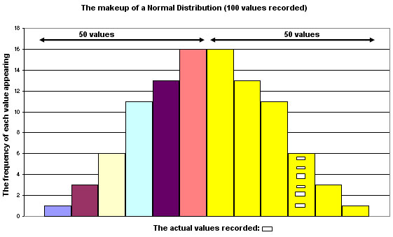
A time test was conducted on 750 people to see how long it took them to fill in a questionnaire.
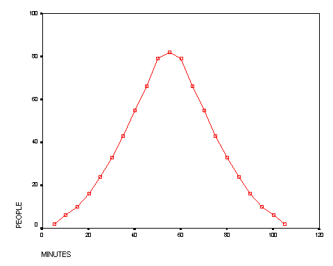
Q.
What general characteristics
does this graph display?
Q. What pitfalls can you foresee when trying to interpret
this chart?
A specific characteristic of the normal distribution curve is that the 'tails' never actually touch the X axis i.e. they are said to be 'asymptotic'.
Q. So if we took a sample from a large population, could we say that the results obtained truly reflect what is happening in the wider population?
A. If the variable under investigation demonstrates a frequency of occurrence that follows a normal distribution pattern and our sample size is large enough, then we can calculate a confidence level. So (with caution), ..YES we can!
It is very important to remember that it is the characteristics of the whole population that we are really interested in and not the characteristics of our samples. We are forced to use samples from which we hope to make inferences because it is quite unreasonable to suppose that we can test every member of a given population whether they be people, invoices, supermarkets or income groups.
Once a normal distribution pattern has been verified, it is possible to estimate a number of other things. The first idea to grasp is that the area under the curve can be equated to 100. If it is a perfect curve, we can divide the area into two halves; 50% on either side of the mid-line and so on......
Note that each 'bar' may accommodate a 'range' of values but still within one class. The bar with 6 slightly different sized squares represents this point. Each of the 6 values is slightly different from the others but have been 'placed' in one particular category where only the upper and lower value limits have been set.
The next step might be to calculate the likelihood of a particular result (or a new incoming result) lodging at a specific location. We now approach the topics of Probability and Confidence levels / limits.

A key strength that statistical analysis can add to many real-life situations is a formal and consistent value to the probability of something happening by chance. This can be something as trivial as "what is the probability of throwing 3 sixes in a row?" to something far more meaningful such as "What is the probability of a 30 year old man who smokes 15 cigarettes a day contracting lung cancer by the time he's 50?" The concept of Probability (of something happening or not) is a key component in all risk analysis.
| Probability is simply a measure, on a scale of 0 to 1, of the likelihood of an event occurring. You may wish to consider 'probability' as a sliding scale from 0.00 ( such an event is impossible) to 1.00 (such an event is certain to occur). |
Most statistical tests will involve calculating a test statistic. This value is usually compared to a table value at a certain level of probability (most commonly: 95%). This gives us a way to measure the validity or truth that our results and conclusions are a fair approximation (or not) to what is really happening.
For instance, we may be trying to answer a specific question such as:
"How confident are we that by calculating the statistical means of two samples, that they came from the same population?
Insurance Companies have to calculate risk and the probability of an event occurring in order to not only calculate the premiums but also to calculate their exposure to loss if the said event did occur.
The next key concept we must grapple with is randomness...Has the result obtained just happened 'out of the blue' i.e. by chance or is it because of the alternative possibility that something 'made' it happen i.e. do we have a 'cause and effect' situation? This area of work is known as Hypothesis testing. Where does 'chance' end and 'cause and effect' begin? We have to set up a process to try to explain our results and the starting point is always the same....to construct a null Hypothesis (always written as Ho.). Initially we can describe the null Hypothesis by saying "nothing special has occurred, the result was arrived at by chance". Then we construct an alternative hypothesis and that has to say: "something special has happened".
Depending upon the circumstances of the data and the test, the null means: "NO RELATIONSHIP WITH " or "COMPLETE RANDOMNESS" or "NO DIFFERENCE FROM". You may see the acronym 'nsd' in a report, this means 'no significant difference' and in such a case, the null hypothesis would be accepted.
The alternative hypothesis, (always written as: H1 ) would indicate that there is a relationship. Again, we will set critical points (critical values) and test whether our test values fall above or below those critical values and that will determine which of the two opposing hypotheses we must accept.
So this is all about accepting or rejecting a proposition. Once the null hypothesis has been carefully worded, a 'confidence interval' is set (usually 95% to begin with) and the chosen statistical test is carried out. If the result falls within the set confidence interval, the null hypothesis is accepted as true. If the result falls outside of that interval, then the alternative hypothesis must be accepted.
|
Here is a quick example, (full workings are explained in Focus 4)
 Floids bank have suggested
that the 'average' cost of providing 12 monthly statements to a business customer
is £40. But: when a survey of 150 of their customers affairs were analysed,
it was found that the true mean was £45 and the standard deviation was £10.
Floids bank have suggested
that the 'average' cost of providing 12 monthly statements to a business customer
is £40. But: when a survey of 150 of their customers affairs were analysed,
it was found that the true mean was £45 and the standard deviation was £10.
The null hypothesis will say " the mean cost of providing this service
will be within the range: £40 ± the values within a 95% confidence
interval". Thus we would expect 19 out of every 20 cases to fall within this
range if the null hypothesis is true.
The alternative hypothesis will say
" the mean cost of providing this service will fall outside of the range
£40 ± the values within a 95% confidence interval". Thus we
would expect less than 19 cases out of every 20 to fall within this range.
When the maths were completed, the range for the mean (necessary in order to accept the null hypothesis) was found to be values between £38.40 and £41.60.
The true mean had been found to be £45 and so we cannot accept the null hypothesis as being a true state of affairs and must therefore accept the alternative hypothesis.
A diagram should help you to understand this....
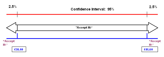
You can see that 'a mean of £45' is well outside of the range necessary to accept H0
We may wish to compare the attributes and make inferences about the reasons for their similarities and differences..
 Suppose 'Jollycars plc', a national car distributor,
wished to study the sales of new cars in their Bournemouth branch and sales in
another branch in Belfast. The two outlets may differ considerably in stock holding
capacity , customer demographics, local market share, supply lines etc etc. With
care however, it is possible to make reliable comparisons concerning say, sales.
This could be very useful. Suppose that the Bournemouth branch sold 60 of one
particular model whilst the comparable figure for Belfast is only 30. Analysis
of factors such as customer types could improve their management and distribution
strategies (and ultimately the sales figures) by targeting each model to a specific
group of potential customers.
Suppose 'Jollycars plc', a national car distributor,
wished to study the sales of new cars in their Bournemouth branch and sales in
another branch in Belfast. The two outlets may differ considerably in stock holding
capacity , customer demographics, local market share, supply lines etc etc. With
care however, it is possible to make reliable comparisons concerning say, sales.
This could be very useful. Suppose that the Bournemouth branch sold 60 of one
particular model whilst the comparable figure for Belfast is only 30. Analysis
of factors such as customer types could improve their management and distribution
strategies (and ultimately the sales figures) by targeting each model to a specific
group of potential customers.
The use of Index Numbers (Focus 7) provides a quick and simple method of 'condensing' information down to a single (non-unit based) figure that can be compared 'on a level playing field' with other figures from the same data set. The Financial Times Share Index (FTSE) and the Retail Price Index (RPI) are two well known examples of the use of Index numbers. These Index numbers can transcend countries and time. They give a 'snapshot' of what is happening.
Depending upon whether the data from our samples is ordinal or on a higher scale (e.g. ratio) and whether it is paired or not, there are many tests we can perform to identify differences (in central tendency) and / or relationships between two sets of results e.g. the Paired t-test and the Mann-Whitney U-test.
Q. What scale of measurement do you think money is?
A. Ratio.... because there are equal distances between the units and there is a true zero. Consequently it is possible to say that an amount of £60.00 is exactly twice as much as £30.00.
We will also look at ways of comparing distributions.
In some cases it is possible to say "What results would we expect to obtain and what results did we actually obtain? and "are the results obtained significantly different from what we expected? The often quoted 'Chi Squared' test (Focus 8a) fits into this category.
The next topic looks at the strength or closeness of the relationship between two variables. This means "the degree of Correlation between values for 'x' and 'y' "
When buying bulk goods from a warehouse, it may be important to see if there is any correlation between distance to destination and price!
Task: Look at this chart (a scattergraph) that indicates the costs that a component manufactures has to contend with when distributing its products. What is the possible relationship between Distance and £ cost?
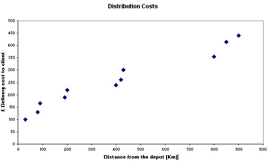
These are some of the questions that Correlation testing might help to answer...
Q. How 'close' is the relationship between cost and distance?
Q. Is it reasonable to work out a hypothetical cost given a specific distance?
We can put forward a hypothesis on the matter...
The Null hypothesis (H0) would be...
"There is no relationship between cost and distance.
...and the corresponding H1 hypothesis would be
"There is a relationship between cost and distance"
"It is possible to carry out correlation tests on Ordinal data (Spearman's Rank test) and another test (Pearson's) on Interval / Ratio data to measure the strength of the relationship and to estimate which of the two statements is most likely to reflect the truth". We can also determine the level of confidence we have in our findings. So in Focus 10 and 10a we discus how the use of Correlation allows us to determine if a relationship exists (and its strength) between two variables.
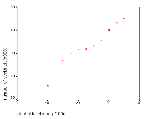
The companion technique of Regression (Focus 11) sets out to produce a model of that relationship with a view to being able to 'predict' values for one variable just by using known values for the other. The use of scattergraphs is central to this process. The idea of 'the line of best fit' is explained and the process of interpolation is introduced.
For example: a 'line of best fit' superimposed on the chart below would allow us to estimate the likely number of road accidents in the UK based on police data concerning the blood / alcohol levels of people involved.
Remember....when you encounter a term that is unfamiliar to you, go to the Glossary Page for a quick explanation. |
![]()
Go to the 'Quick View' Contents Page