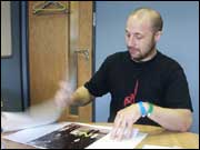
Bang is a new music magazine produced by Future
Publishing in London. The team produces twelve magazines
each year and each of these comprises 150 pages. The
magazine was started by a couple of guys with the idea
of making a different, raw music magazine and, with
a lot of hard work and good timing, the project was
taken on by Future Publishing. The first issue was
published in March 2003.
|
|
|

 |
Working to a brief
Basically we started out saying we wanted to review 70 albums
a month over X amount of pages, so then you start working out how
many you could physically review on a spread to make up the numbers,
because obviously you can't start at the end. It's more of a mathematical
problem the reviews, and we wanted a certain amount of reviews
that were larger, the more important albums of that month as opposed
to the smaller ones, so those were problems as opposed to problems
you had to solve with design, as opposed to how can I make this
look really good?
Everyone knows if you're going to buy a music
magazine it's going to have a review section in so it doesn't
have to be the best thing
in the world. We decided to make the pictures slightly different
than you see in normal review sections, just to kind of have
that impact really and to lead you into places. You're not overwhelmed
by words. When I look at this spread I can quite happily read
these
six album reviews and not be too bogged down with it all, so
that was the kind of solution there.
Understanding the audience or user
I suppose it's aimed at that 18 to 25 year olds, but then again
no one really knows, it just depends what people are into. People
who are older and younger probably buy it so it's definitely
a young person's music magazine I suppose and it just depends
when you grow up how much you keep hold of your music, how often
do you go to a gig if you're 30? Some people do, some people
don't and it's kind of everyone who goes to see music really
and likes music.
Research techniques and methodologies
We did a piece on Ladytron. The strength of
this piece is the strength of the photographs and the idea of the
photographs really. We gave each one of the guys a portable flash
device which had no wire on it, so when the photographer took a
picture the flash would go off into their face or wherever they
had it.
That was a spread there, obviously cut down the middle,
but the photograph seemed to just do the work without actually
doing much
else. They were good photographs of these guys and it was like
a simple idea made strong really and you need obviously the participation
of the people doing it, so that was the idea of that, that was
the classic idea of having something landing on your desk really
and doing it quite easily.
Design methods
and practical development
The first piece was a piece on Interpol, which is a New York based
band and it was six pages in a magazine and it was quite a simple
idea really. The first spread was quite a standard stark shot of
the guys in the band, then the very last page was them walking
away from the camera and the typography for it was a very simple
piece of work really, the columns and all the fonts and everything,
there was nothing new in any way. The only kind of twist on it
really was the Interpol headline was kind of weaved in and out
of the guys in the main image just to give it that three dimensional
look and feel. So it's nothing new, but more kind of classical,
and the way they were dressed, they were all suited up and I think
it fitted them quite well really.
Originally when I'd done it I
placed the words on top of them, and this is just again through
trial and error. We went well what
if we'd done it through, and we did, and it just jumped out so
much more, so that's a classic example of how we'd done one thing
and it led to another. The way they were almost stood as four
kind of columns as it were just seemed quite a natural idea to
do at
the time, with the trees and the colours and everything, it just
seemed really good.
Creation and construction
The Faint thing was very tricky and that was just coming up with
a creative solution that was in my head really and there was no
kind of right or wrong way to do it. This was a hand done piece
of type, Faint It Black was the headline which seemed to be quite
dense in black as well and which seemed to work with the piece.
It was all a bit off the wall and the photographs were a bit off
the wall as well, so very unique I think in that sense.
It was about
the third thing that I came up with and it looked completely
different to what I had originally. It was quite tricky
but I'm pleased with the results. But that's what I'm saying,
you look at something and you go this isn't working and I've got
to
do it again, and that's exactly what the case was, it was like
this just doesn't work for me...
Presenting and gathering feedback
You kind of know if it's right or wrong just
by it being out there really and seeing what reviews are from other
companies. Once we get a magazine back we'll have a discussion
or critique...thoughts, comments and sometimes we'll have a post
mortem, so it's kind of a review for ourselves really. |

